

Overview
Balance on the Bay is a cozy, community-driven yoga studio focused on creating a welcoming and grounded space for practitioners of all levels.
I developed a complete visual identity system designed to differentiate the studio within a competitive local market while capturing its warm, down-to-earth personality.
The goal was to create a brand that felt inviting, modern, and versatile across digital and print applications.

The Opportunity
Within the community, another yoga studio already had an established presence. Balance on the Bay needed a visual identity that:
- Clearly communicated “Yoga Studio” to new audiences
- Stood apart from local competitors
- Felt warm, approachable, and inclusive
- Scaled across digital platforms and future print needs
- The identity needed to balance calmness with personality.
- Clearly communicated “Yoga Studio” to new audiences
- Stood apart from local competitors
- Felt warm, approachable, and inclusive
- Scaled across digital platforms and future print needs
- The identity needed to balance calmness with personality.
My Role
Brand & Visual Designer
Brand & Visual Designer
Responsible for:
- Market research and competitor analysis
- Concept development
- Logo design and variants
- Colour palette development
- Typography selection
- Brand tone and visual direction
- Social media starter templates
- Print-ready applications
- Market research and competitor analysis
- Concept development
- Logo design and variants
- Colour palette development
- Typography selection
- Brand tone and visual direction
- Social media starter templates
- Print-ready applications


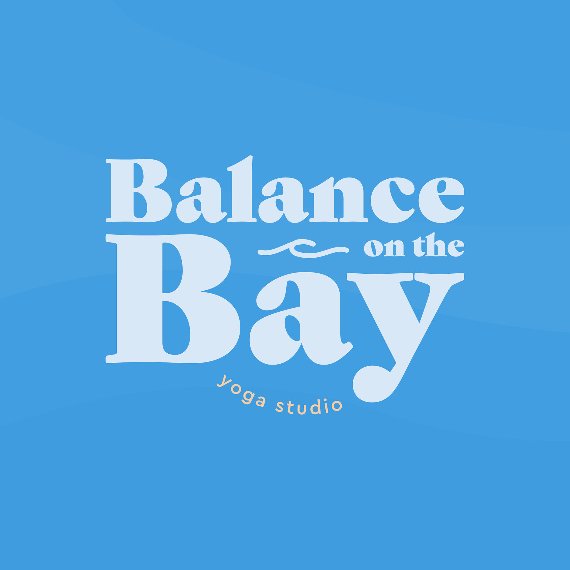
Visual System
The final identity introduced:
- A warm, neutral primary palette
- Complementary blue hues for calm-focused classes
- Warmer tones for higher-intensity offerings
- Strong contrast for digital readability
- A warm, neutral primary palette
- Complementary blue hues for calm-focused classes
- Warmer tones for higher-intensity offerings
- Strong contrast for digital readability
This colour logic created visual clarity while supporting class differentiation.
Typography was selected to feel grounded and modern, reinforcing the studio’s approachable tone.
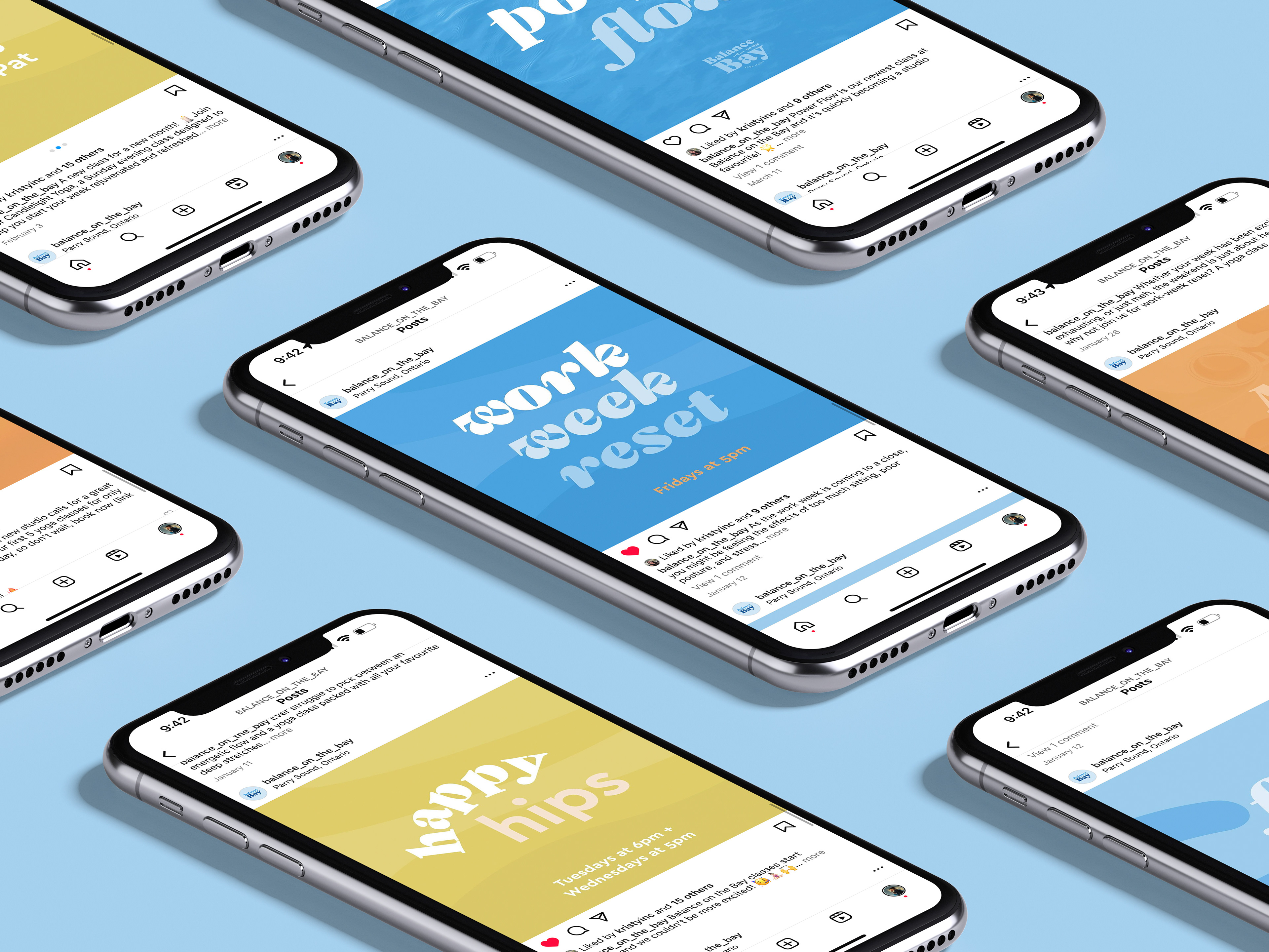
Application
Application
The identity was designed with a digital-first approach, including:
- Social media templates
- Profile imagery
- Promotional graphics
- Social media templates
- Profile imagery
- Promotional graphics
Print-ready assets were also developed to support future expansion, including signage, business cards, and posters.

Impact
The new identity positioned Balance on the Bay as a distinct, recognizable presence within the local wellness market.
The studio has grown into a thriving business offering multiple weekly classes, and the client continues to engage me for ongoing brand and marketing materials.
Reflection
Strong local branding requires the same strategic thinking as large-scale campaigns — clarity, differentiation, and emotional alignment.
By combining warmth, structure, and flexibility, the Balance on the Bay identity set a foundation for long-term growth and community recognition.