

Overview
Bright Side Skate Supply is an independent skateboard shop focused on building a strong local skate community in Waterloo, Ontario while offering a curated selection of decks, apparel, and accessories.
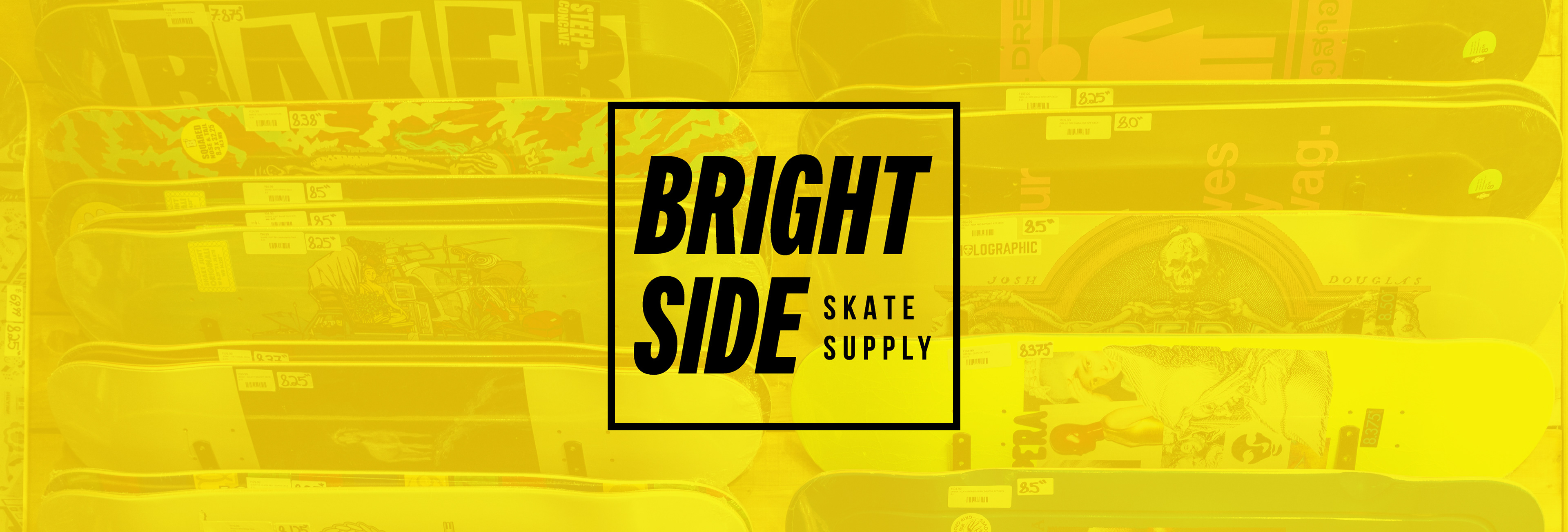
I developed a visual identity that reflects the culture of skateboarding, expressive, bold, and slightly raw all while still feeling approachable and recognizable within a retail environment.
The goal was to create a brand that felt authentic to skate culture while standing out within the local market.
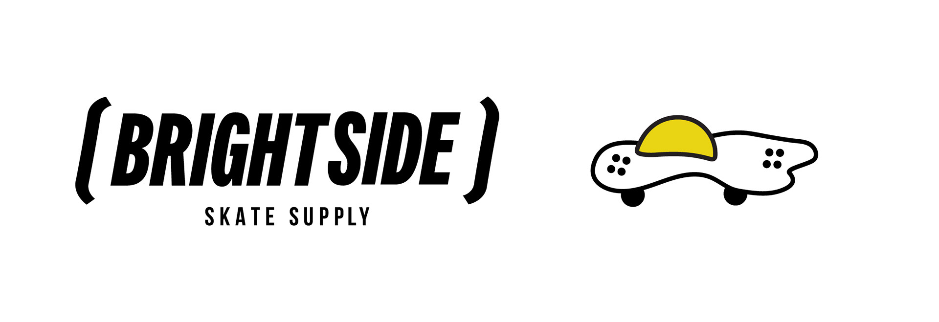
Logo & Wordmark
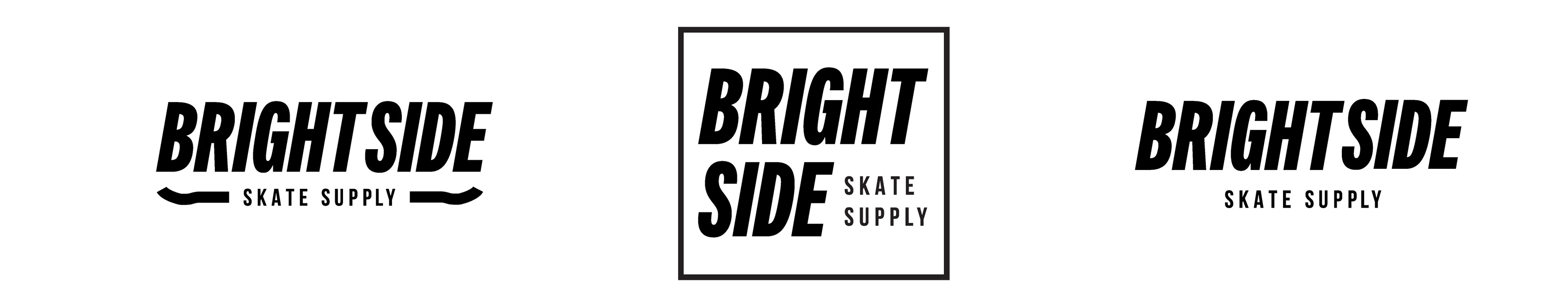
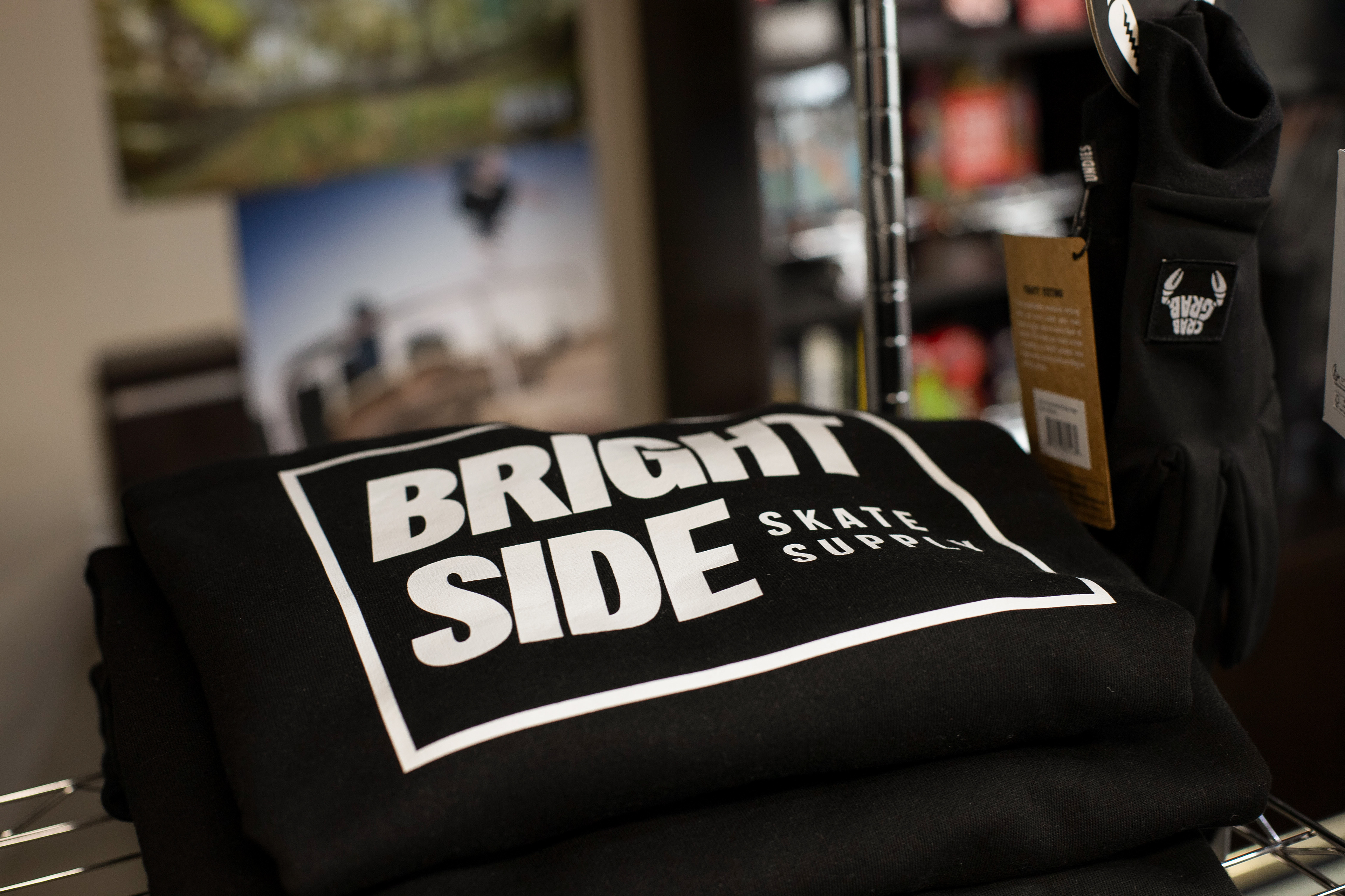
The logo is designed to feel clean and confident while still carrying personality.
The wordmark uses strong, straightforward typography, allowing it to:
- Translate easily across decks, apparel, and signage
- Maintain legibility at multiple scales
- Feel grounded within skate culture without relying on trends
Brand Concept
- Translate easily across decks, apparel, and signage
- Maintain legibility at multiple scales
- Feel grounded within skate culture without relying on trends
Brand Concept
The brand is built around the idea of optimism and community within skate culture.
“Bright Side” reflects both: A positive, inclusive outlook and the energy and momentum of skateboarding.
The identity embraces contrast, bold yet minimal, structured yet expressive, mirroring the duality of skate culture itself.
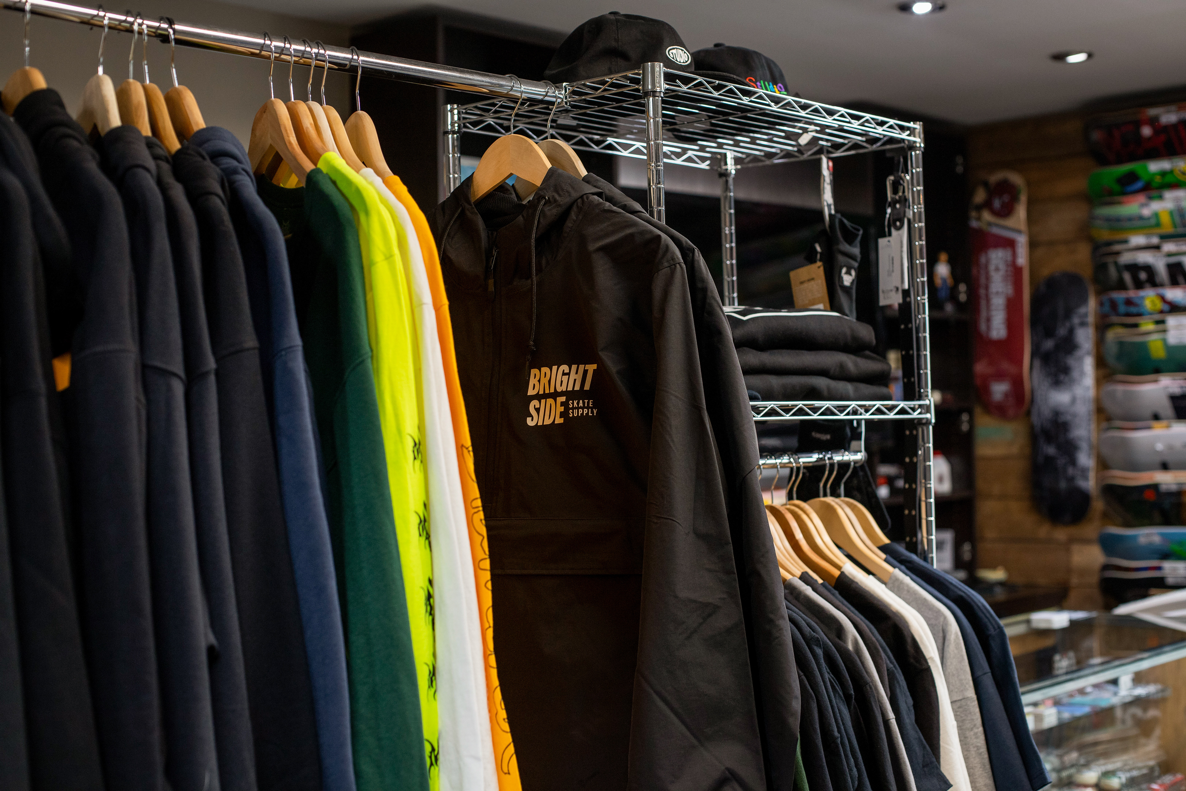

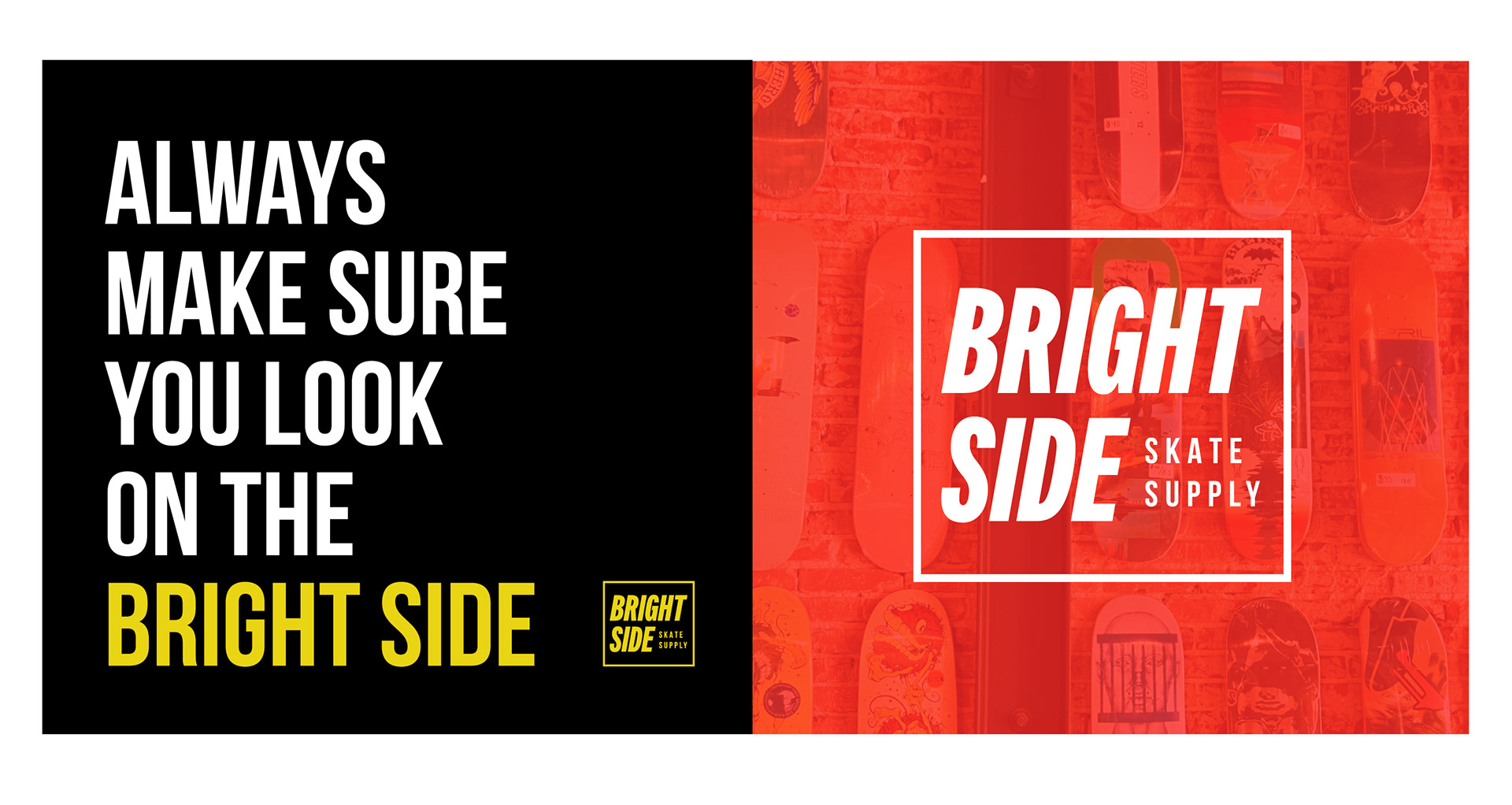
Colour System
The palette balances neutral tones with bold accents.
This allows the brand to:
- Adapt across product types
- Maintain flexibility for seasonal drops
- Stand out in retail environments
- Adapt across product types
- Maintain flexibility for seasonal drops
- Stand out in retail environments
Colour is used strategically, not decoratively, to support hierarchy and product visibility.
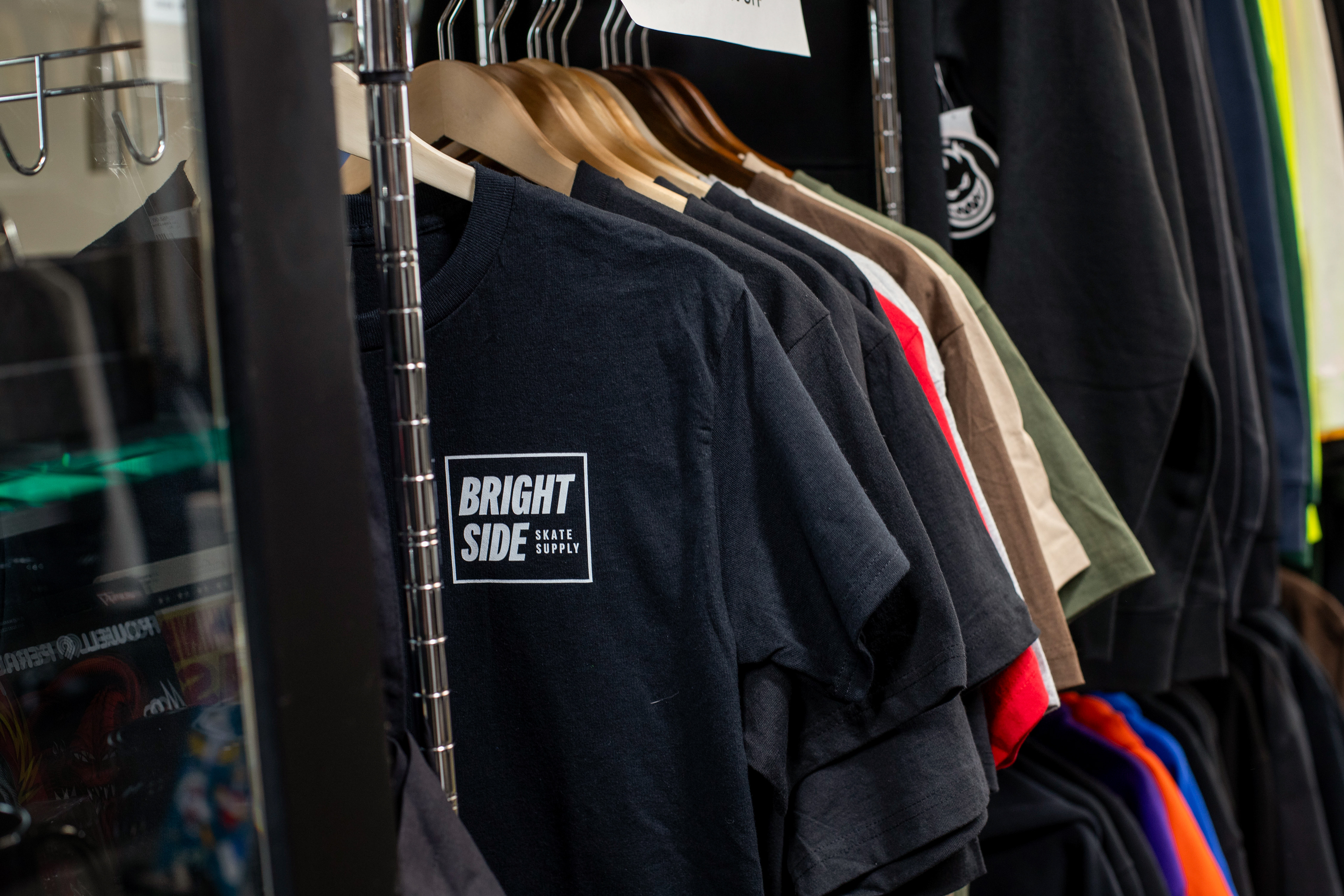
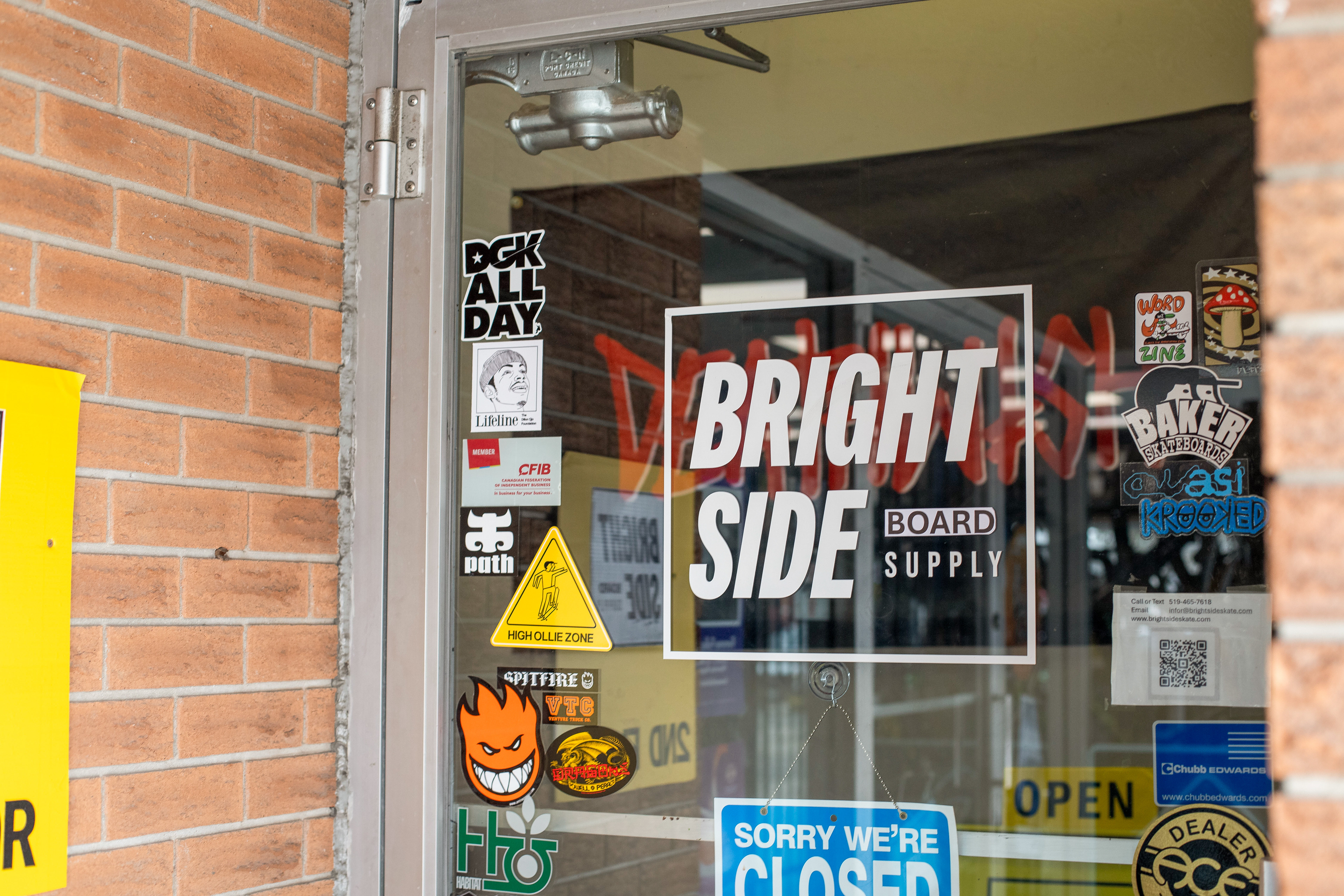
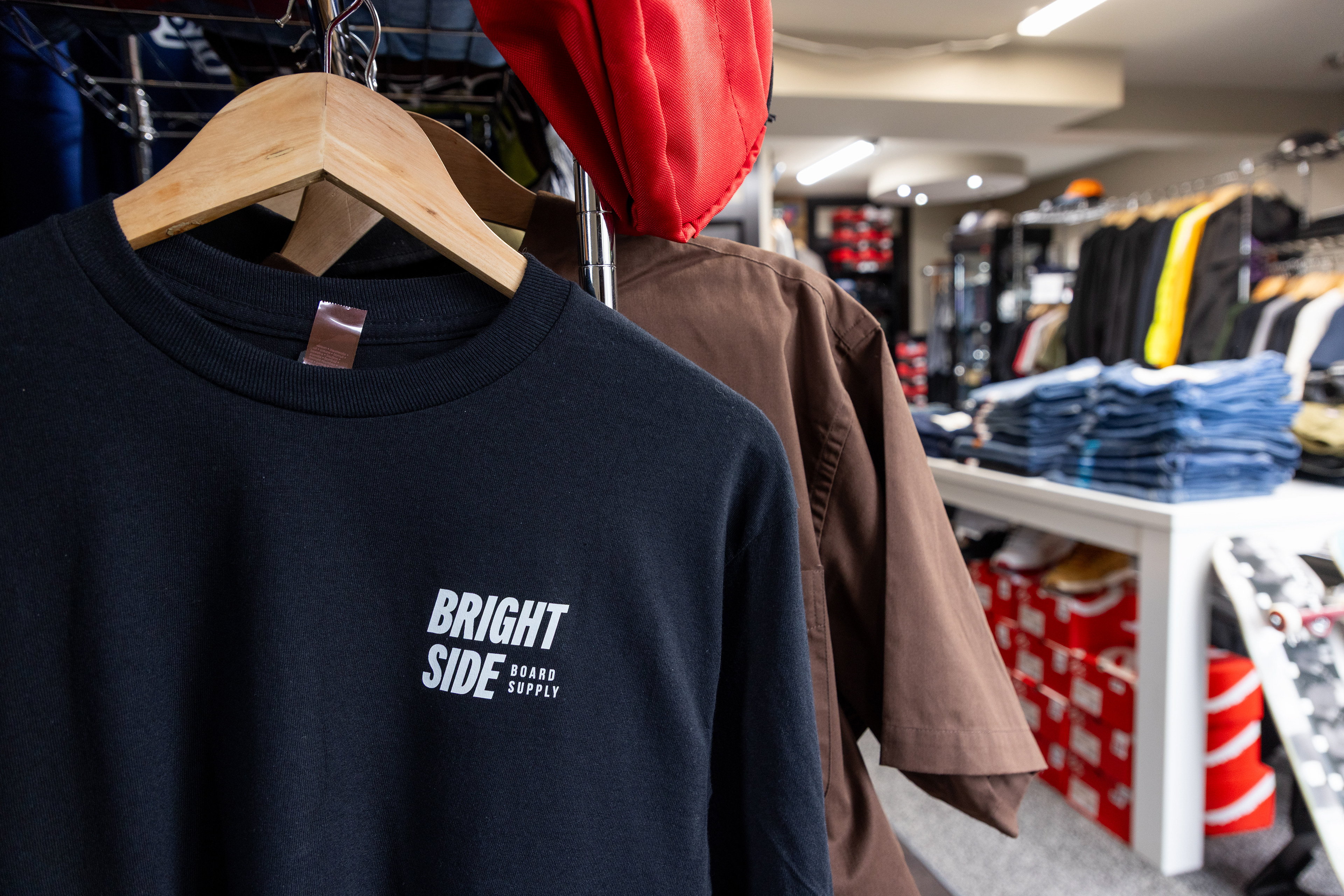
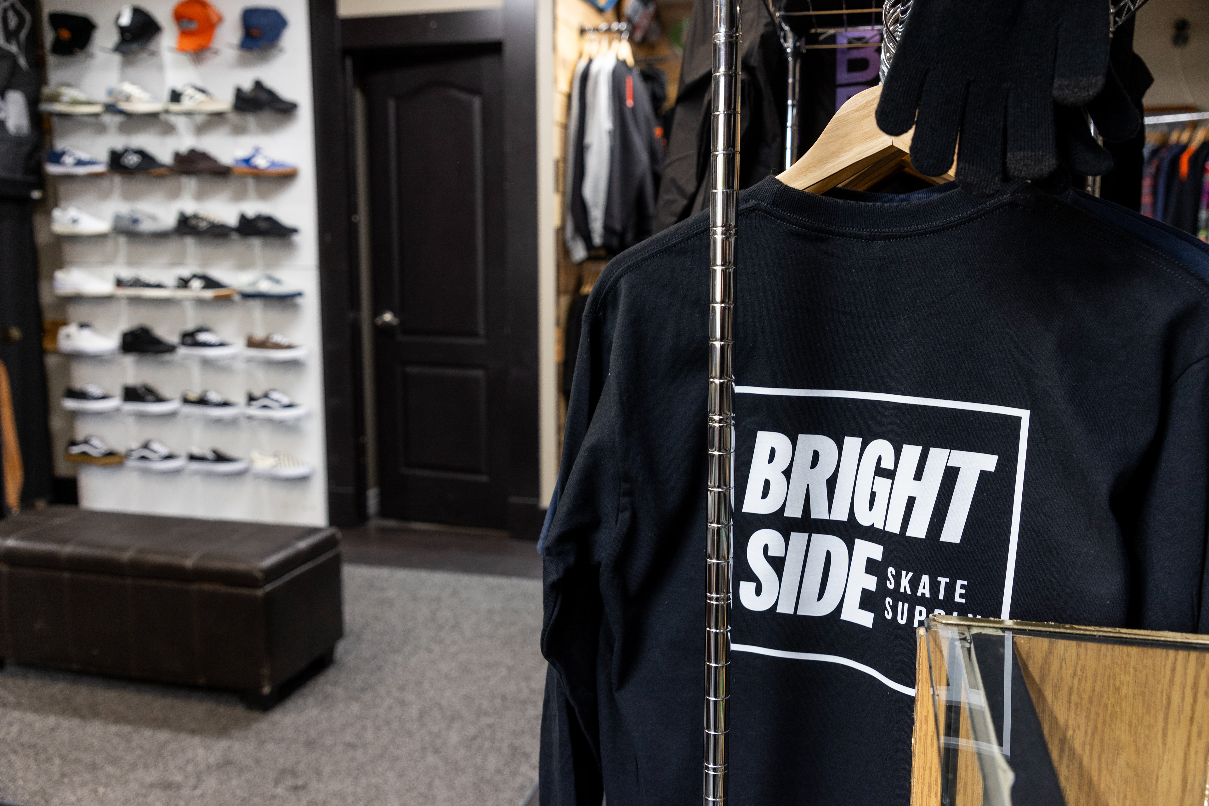
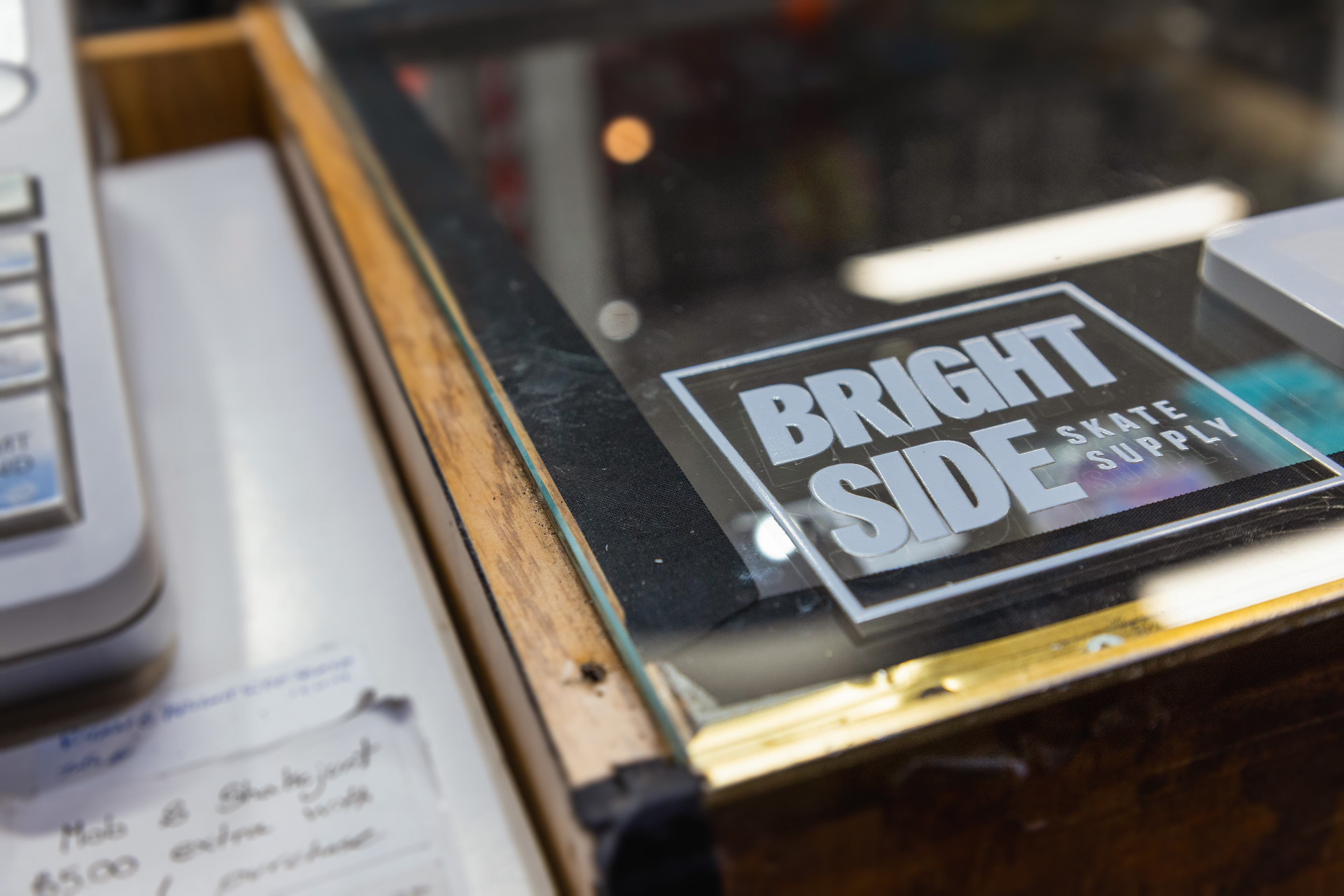
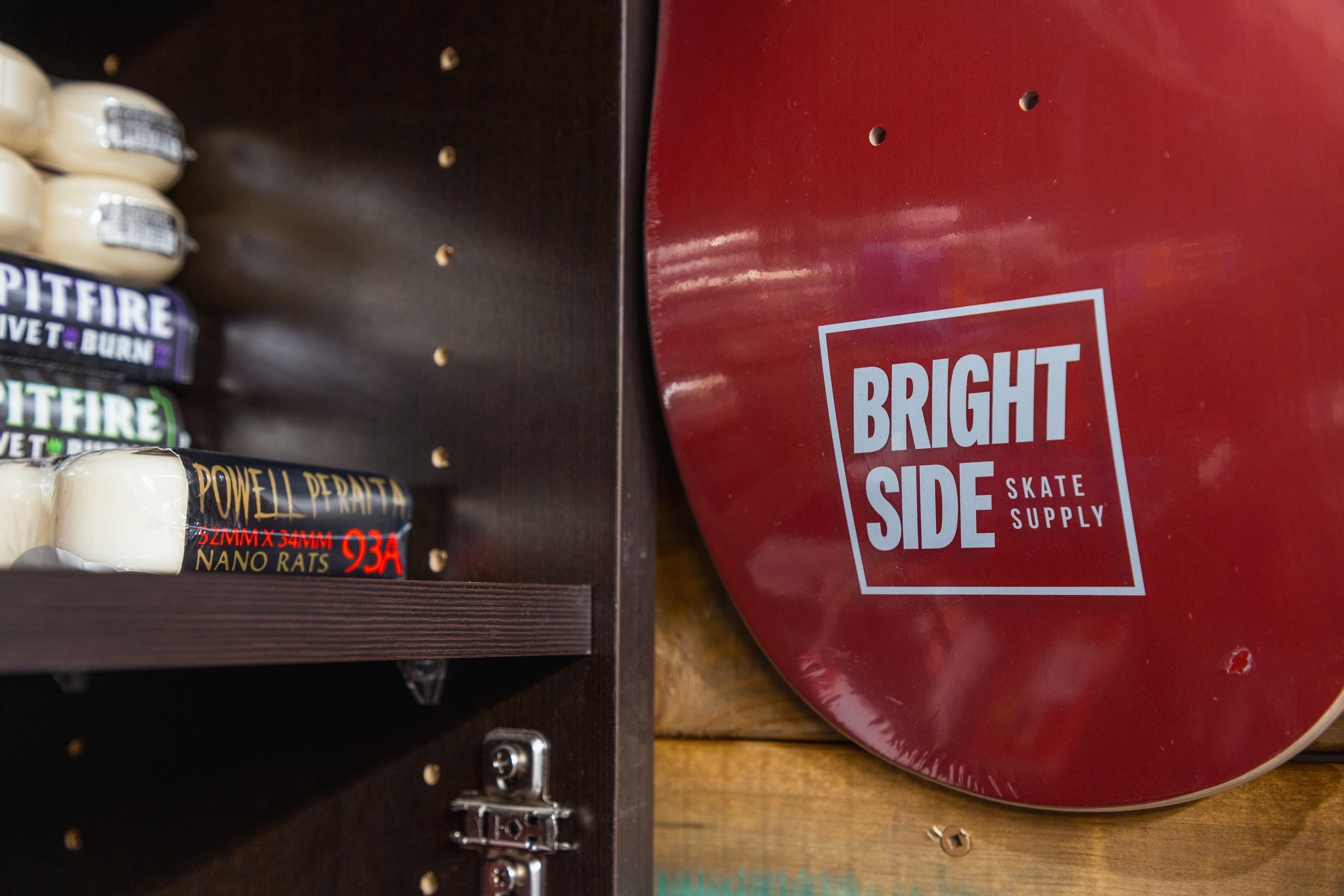
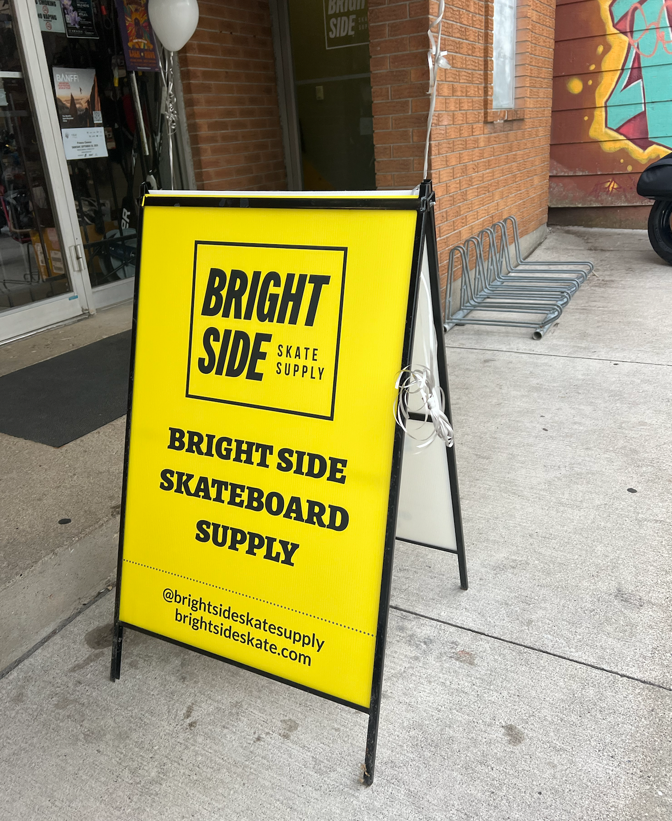
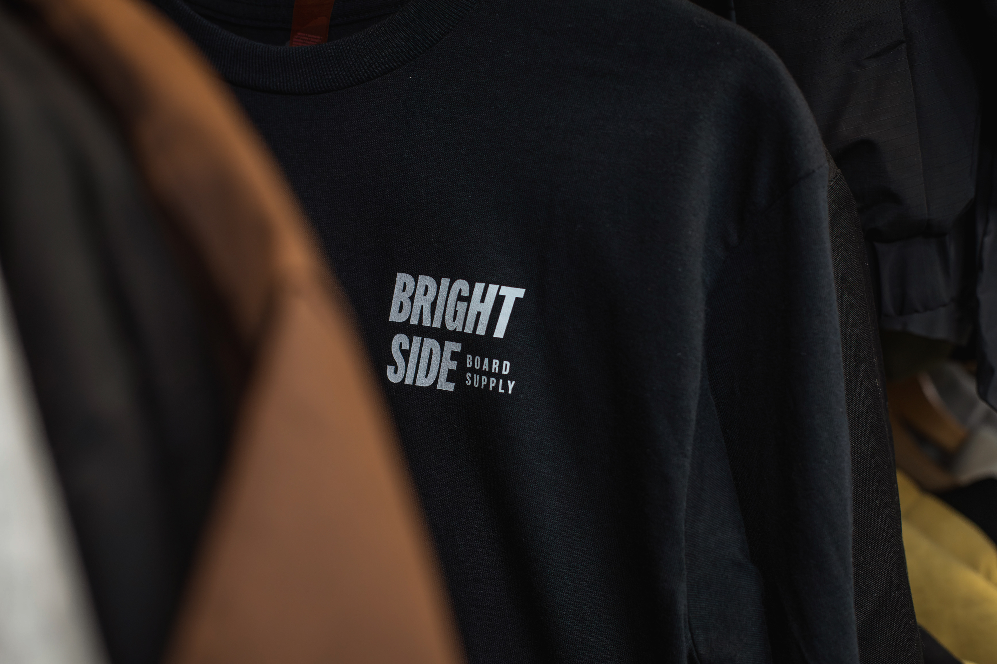
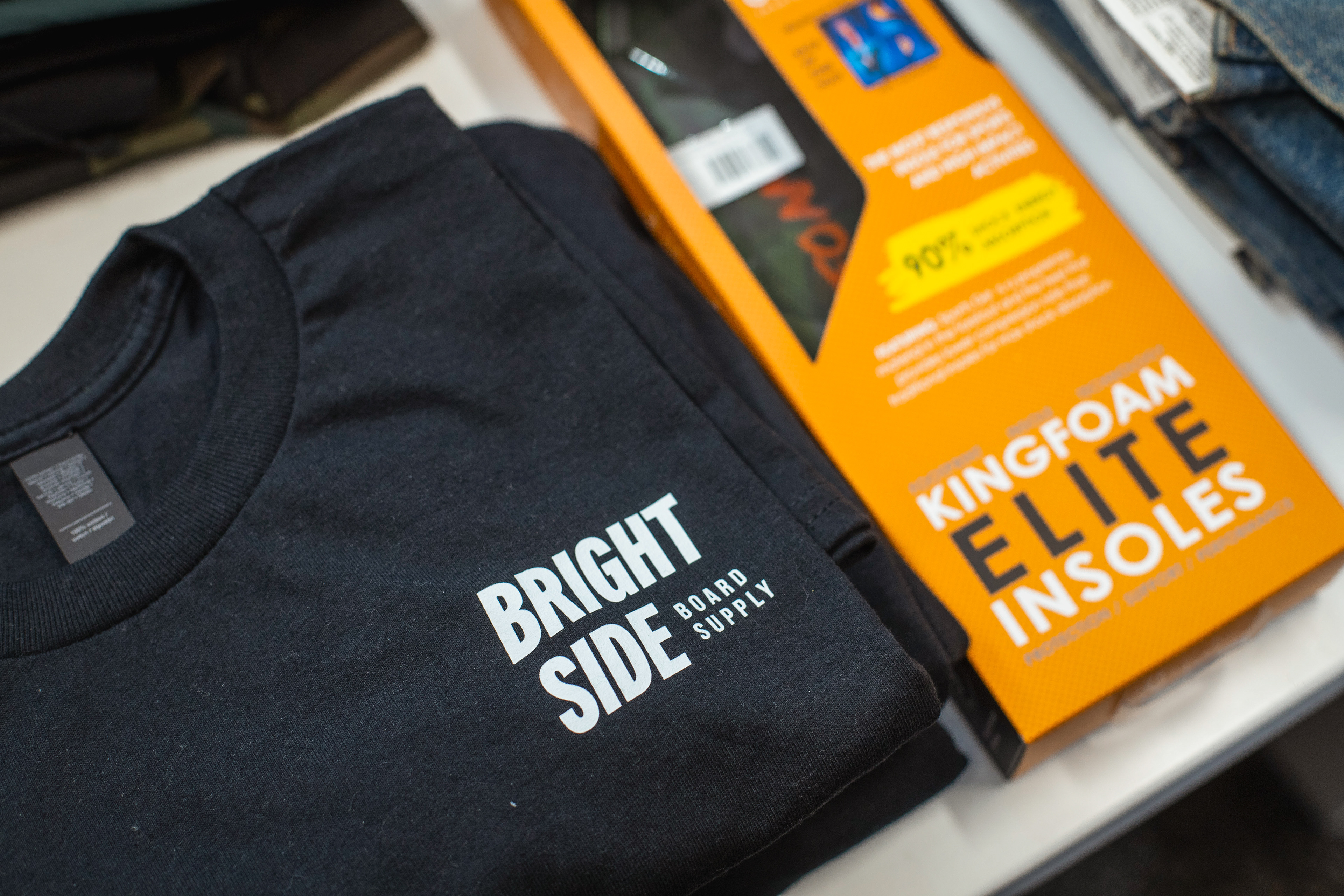
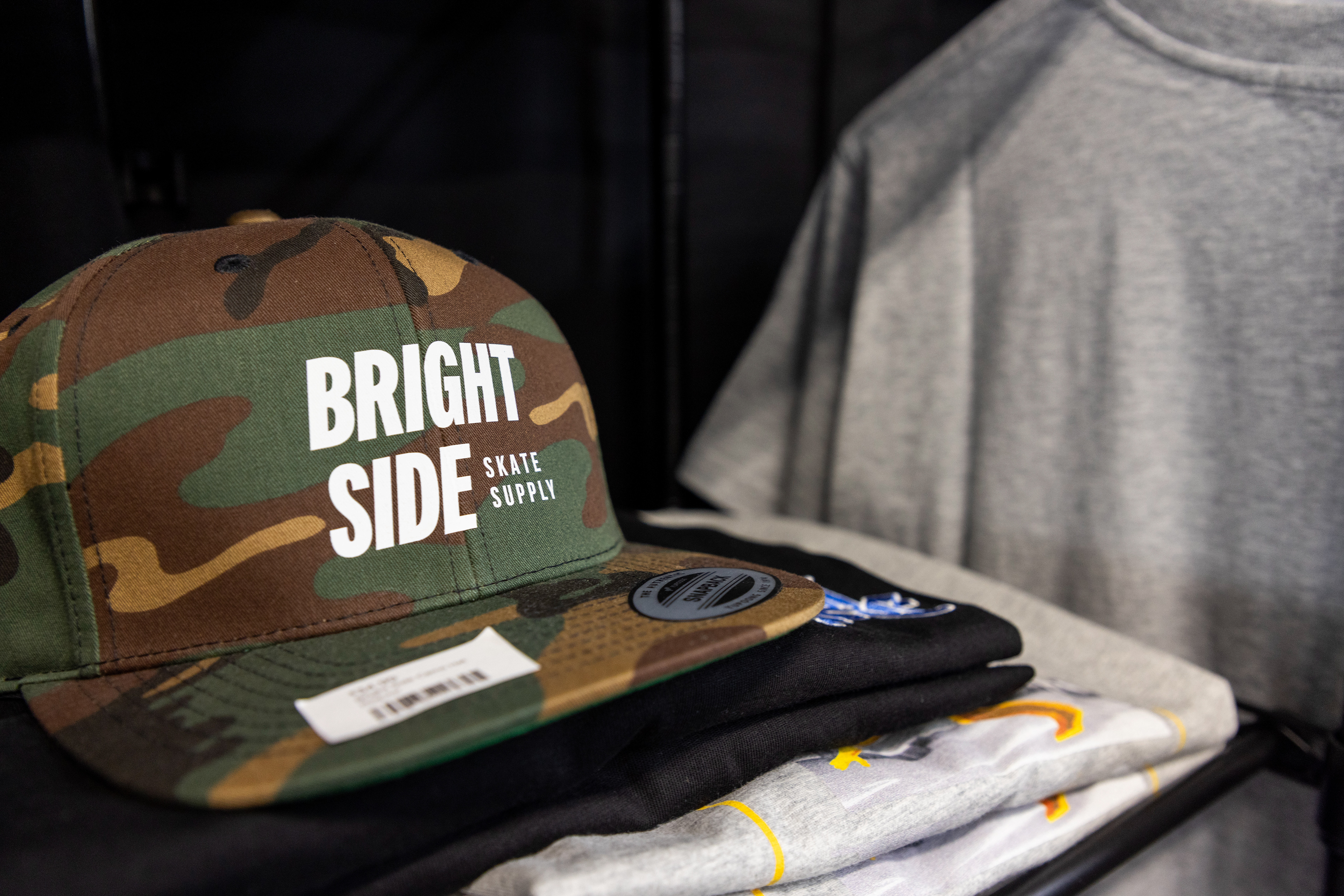
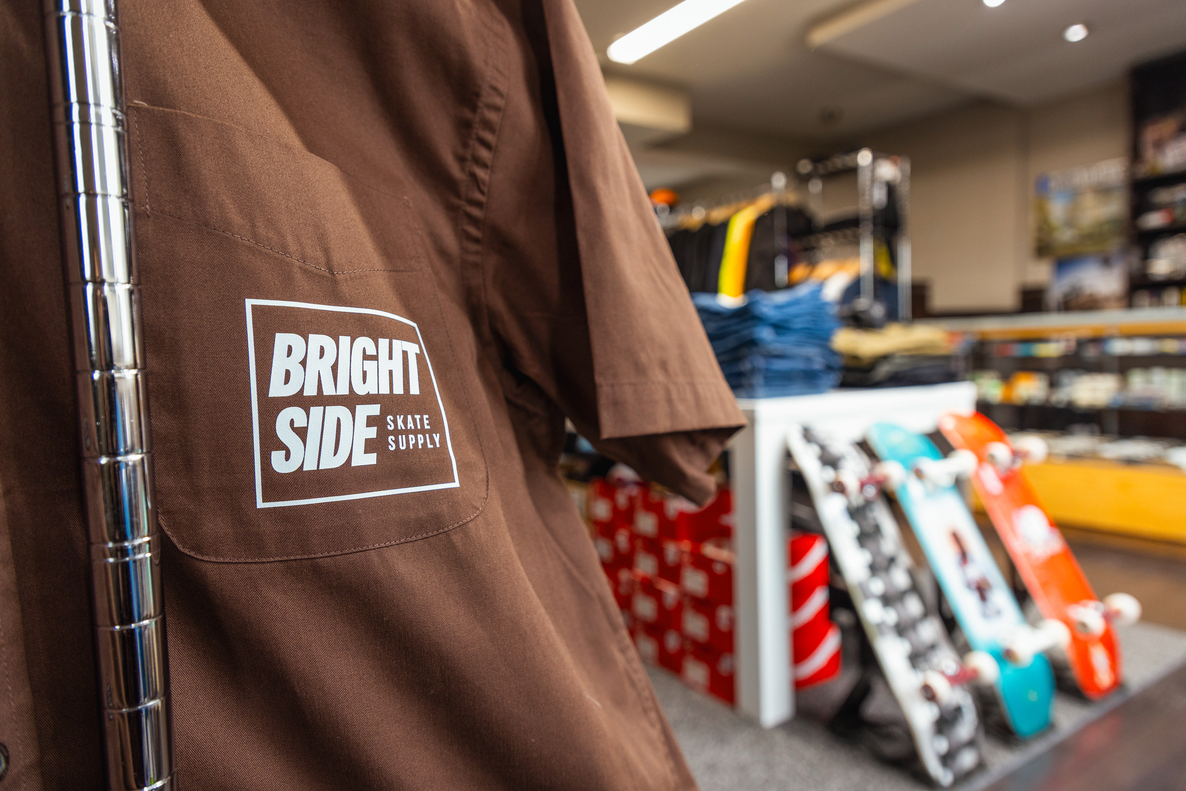
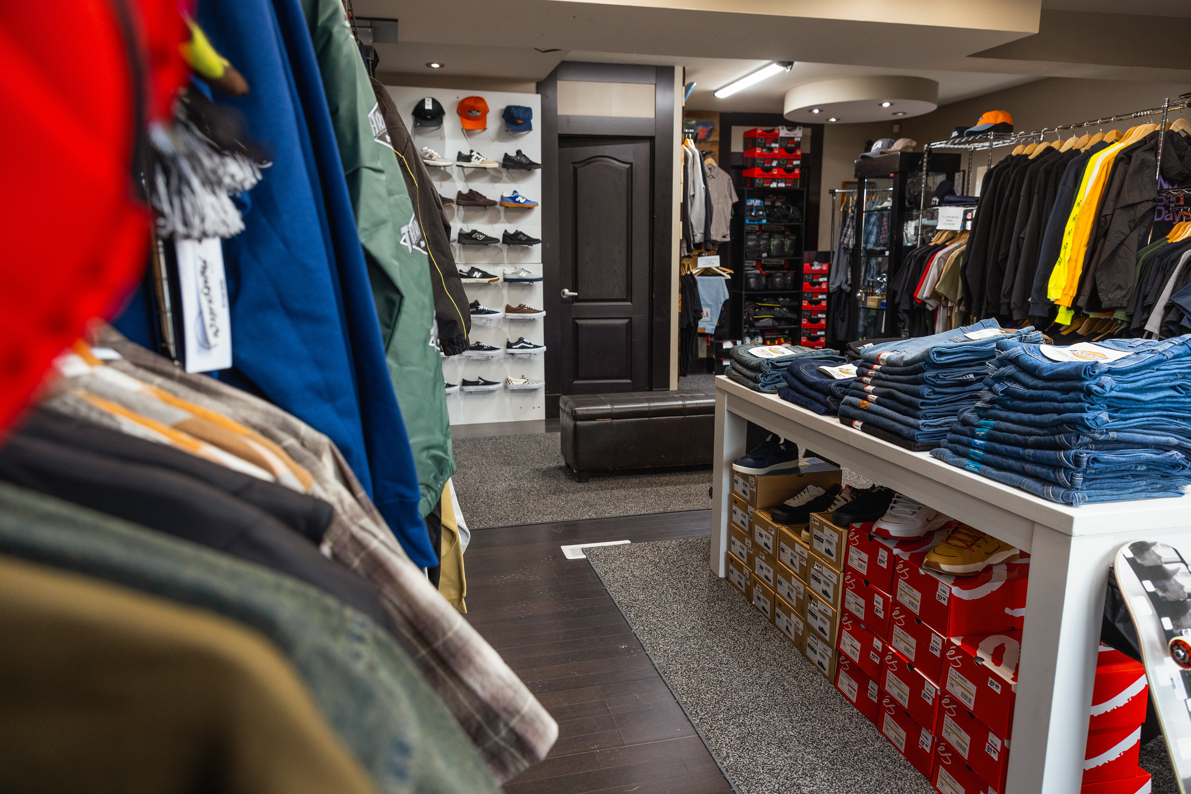
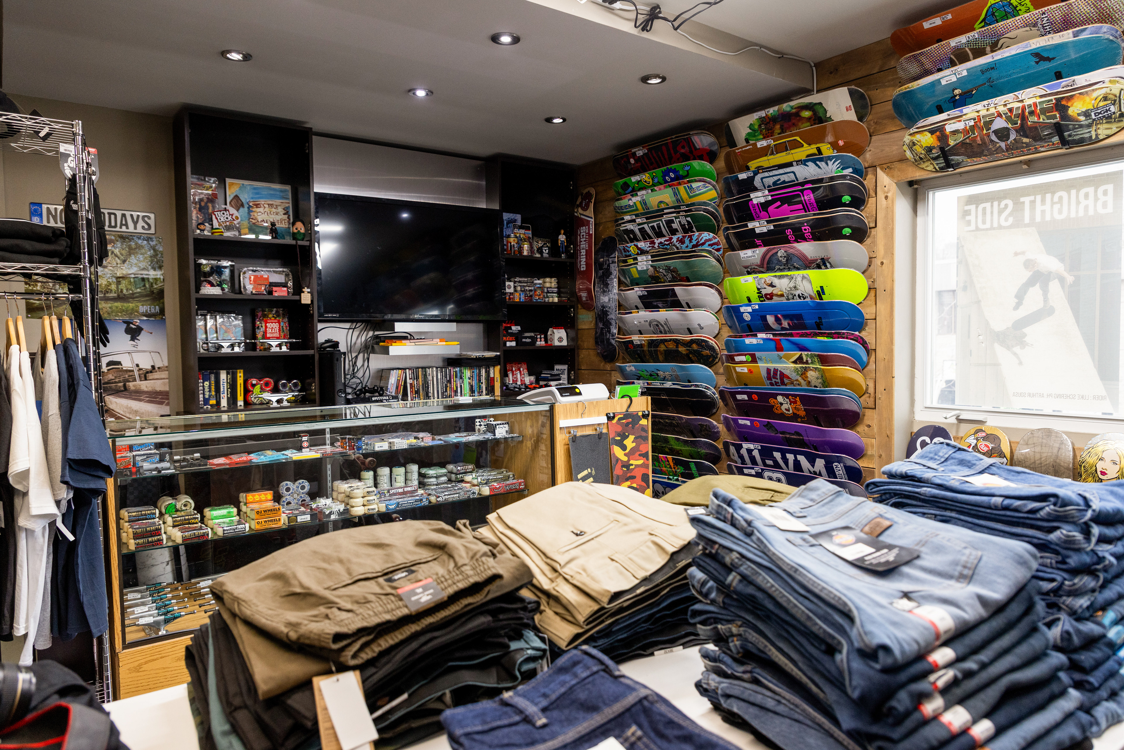
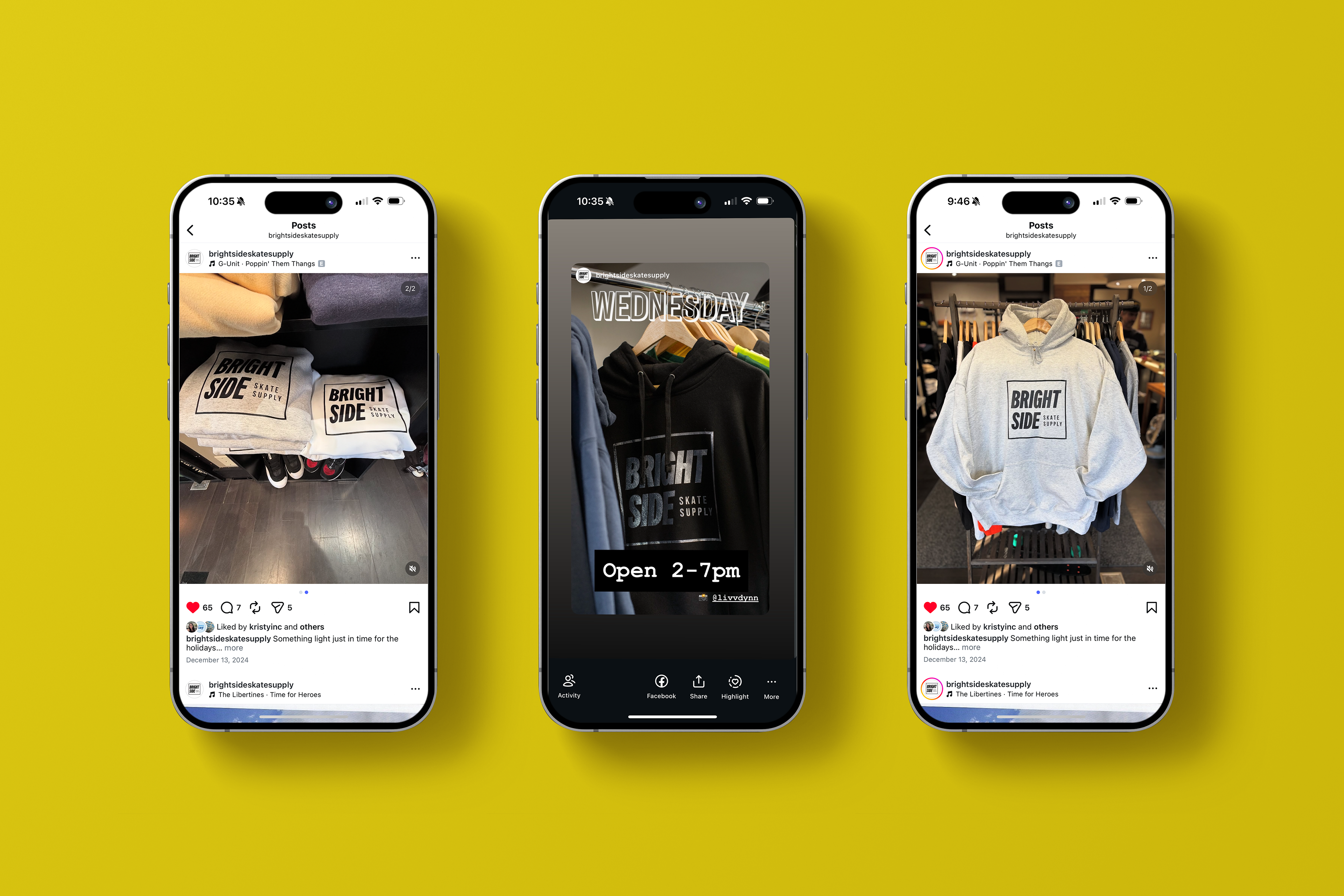
Application
The identity was designed to live across multiple touchpoints, including:
- Apparel and merchandise
- Skate decks and accessories
- In-store branding and signage
- Digital content and social
- Apparel and merchandise
- Skate decks and accessories
- In-store branding and signage
- Digital content and social
Each application reinforces the same core visual language while adapting to the context of use.
Outcome
The final identity establishes Bright Side as a recognizable and cohesive presence within the local skate community.
By balancing authenticity with clarity, the brand is able to appeal to both core skaters and a broader audience, supporting both retail visibility and community growth.

Concept Development
A range of logo concepts were developed to explore how the brand could exist within skate culture.
These explorations included:
- Strong typographic wordmarks emphasizing clarity and impact
- More expressive, character-driven marks introducing personality and play
- Hybrid approaches combining both structure and illustration
- Strong typographic wordmarks emphasizing clarity and impact
- More expressive, character-driven marks introducing personality and play
- Hybrid approaches combining both structure and illustration
This process helped refine the final direction, ensuring the chosen identity felt both authentic and adaptable across applications.