Overview
Coldest Night of the Year (CNOY) is a national winter fundraising walk supporting charities that serve people experiencing hurt, hunger, and homelessness.
For the 2026 campaign, I served as the Visual Design Lead, owning the visual identity, systems, and creative execution across all touchpoints — print, digital, outdoor, social media, merchandise, and partner toolkits.
The objective was to refine and unify the brand system to improve readability, accessibility, and visual cohesion, while driving campaign engagement and fundraising performance.
The Opportunity
Prior to 2026, CNOY had strong recognition, but inconsistent visual execution (a new visual theme each year) impacted recognition across regions and media.
Key changes included:
- Fragmented typography and colour usage
- Overly filtered photography that reduced emotional clarity
- Lack of a unified visual system that could scale across hundreds of local campaigns
- Fragmented typography and colour usage
- Overly filtered photography that reduced emotional clarity
- Lack of a unified visual system that could scale across hundreds of local campaigns
For 2026, the brand needed a cohesive system that:
- Scales nationally and locally
- Improves accessibility and readability
- Supports multiple languages (English/French)
- Performs across digital, print, social, and merchandise
- Scales nationally and locally
- Improves accessibility and readability
- Supports multiple languages (English/French)
- Performs across digital, print, social, and merchandise
My Role
Visual Design Lead (Team of One)
I was responsible for:
- Refining the national visual identity
- Defining typography standards (introducing Montserrat)
- Clarifying colour hierarchy for contrast and accessibility
- Developing a modular graphic language
- Designing key campaign assets and templates
- Leading social media creative direction
- Overseeing and producing merchandise design
- Packaging visual systems for partner use nationwide
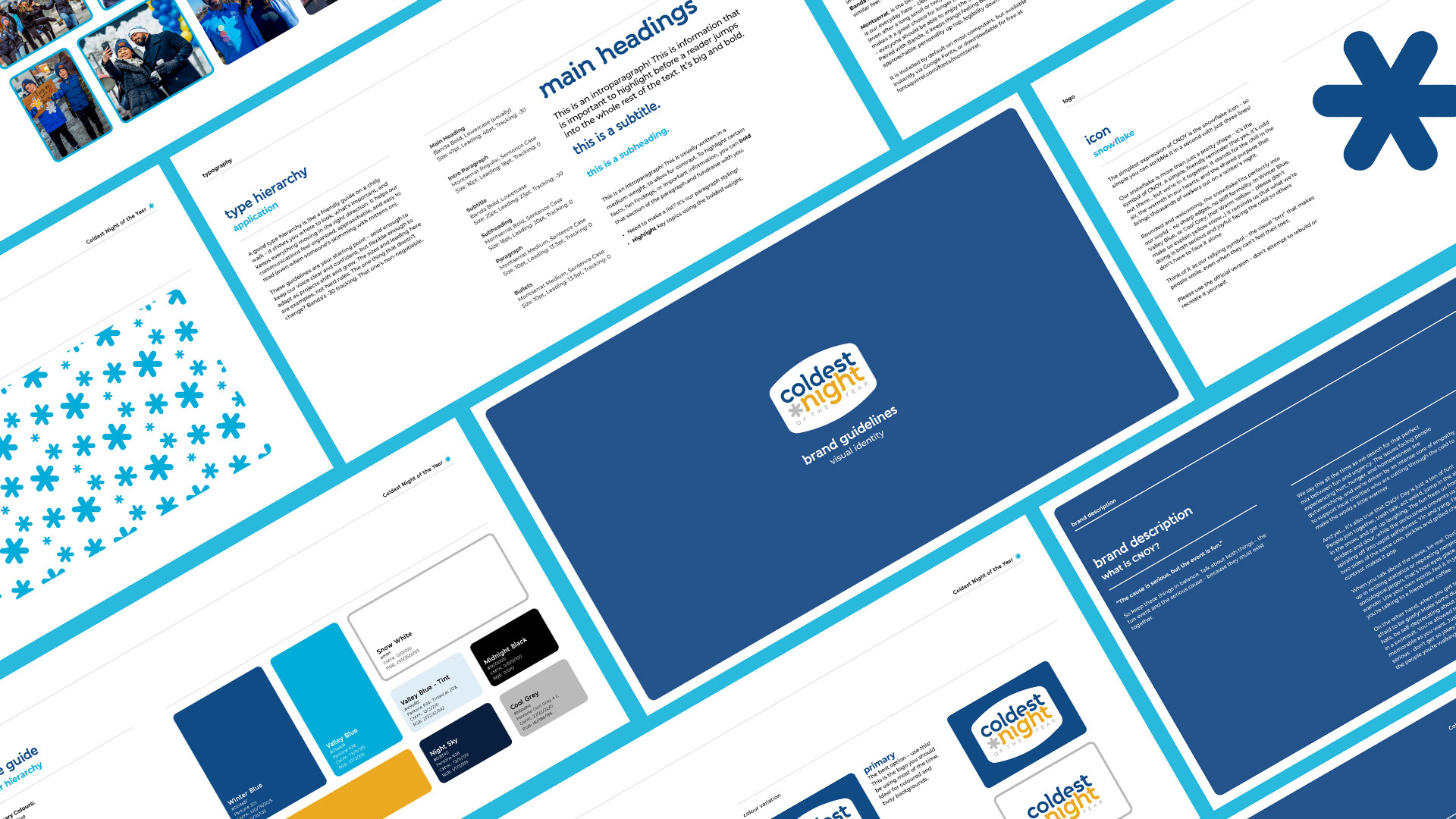
Brand System Strategy
Typography & Readability
I introduced Montserrat as a core typeface to improve hierarchy and long-form readability, while retaining Banda for expressive headlines.
I introduced Montserrat as a core typeface to improve hierarchy and long-form readability, while retaining Banda for expressive headlines.
This combination supports legibility in print and digital, improves accessibility compliance and provides clear visual hierarchy across materials.
Colour Hierarchy
The refined colour system focuses on full-tone colours for high contrast, a restrained use of accent colour for emphasis and clear rules for primary and secondary usageThis ensures consistency across assets and strengthens visual recognition.
The refined colour system focuses on full-tone colours for high contrast, a restrained use of accent colour for emphasis and clear rules for primary and secondary usageThis ensures consistency across assets and strengthens visual recognition.
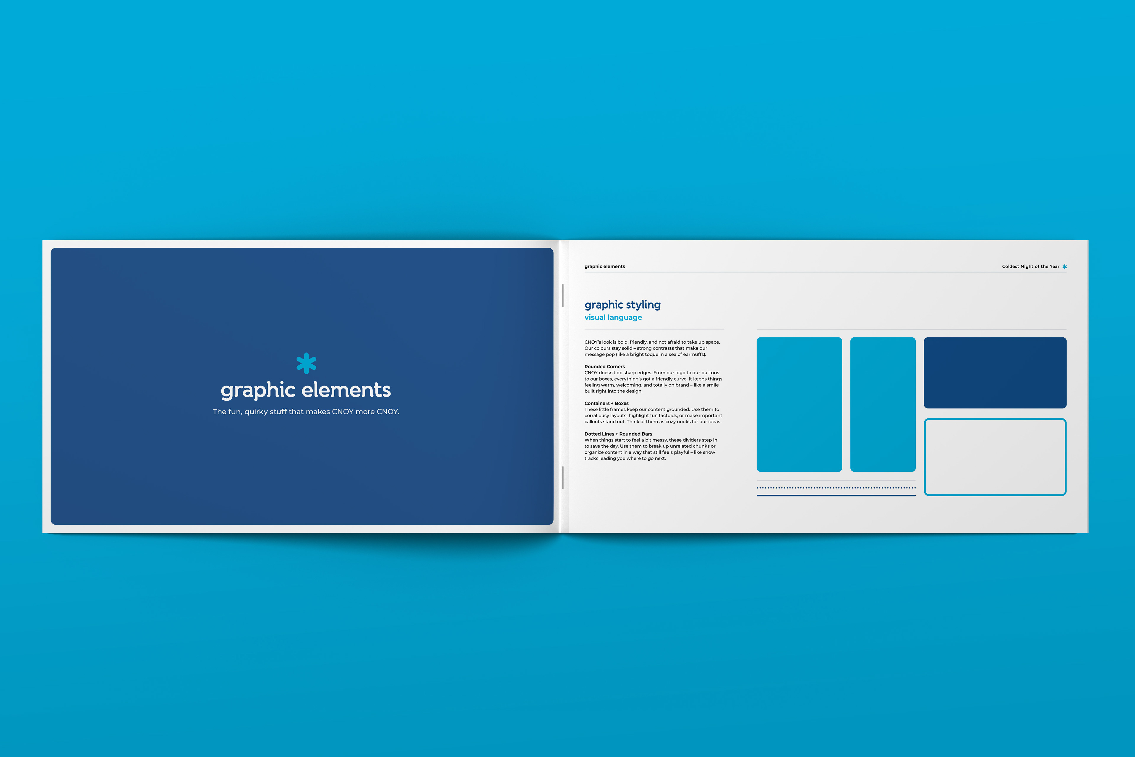
Graphic Language
I formalized several system elements to include rounded containers, a snowflake-inspired pattern usage, iconography standards, and modular layout frameworks.
I formalized several system elements to include rounded containers, a snowflake-inspired pattern usage, iconography standards, and modular layout frameworks.
This graphic language allows assets to scale from postcards to billboards.
Brand Refinement
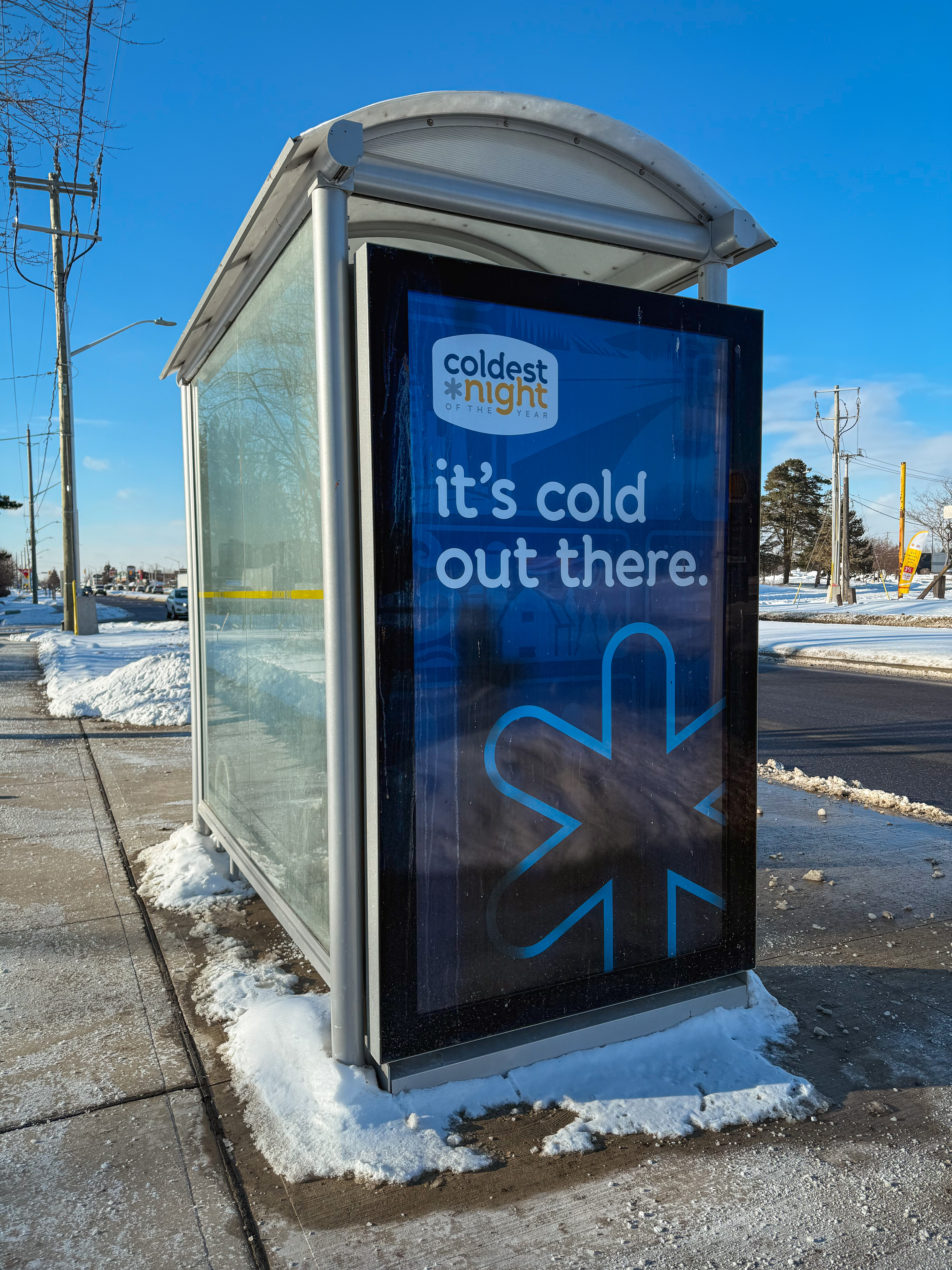
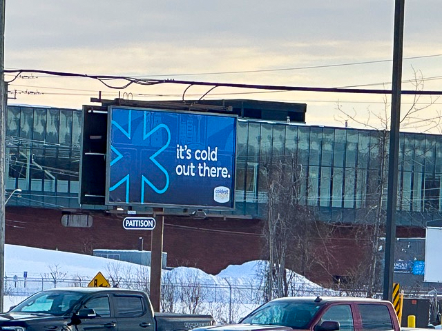
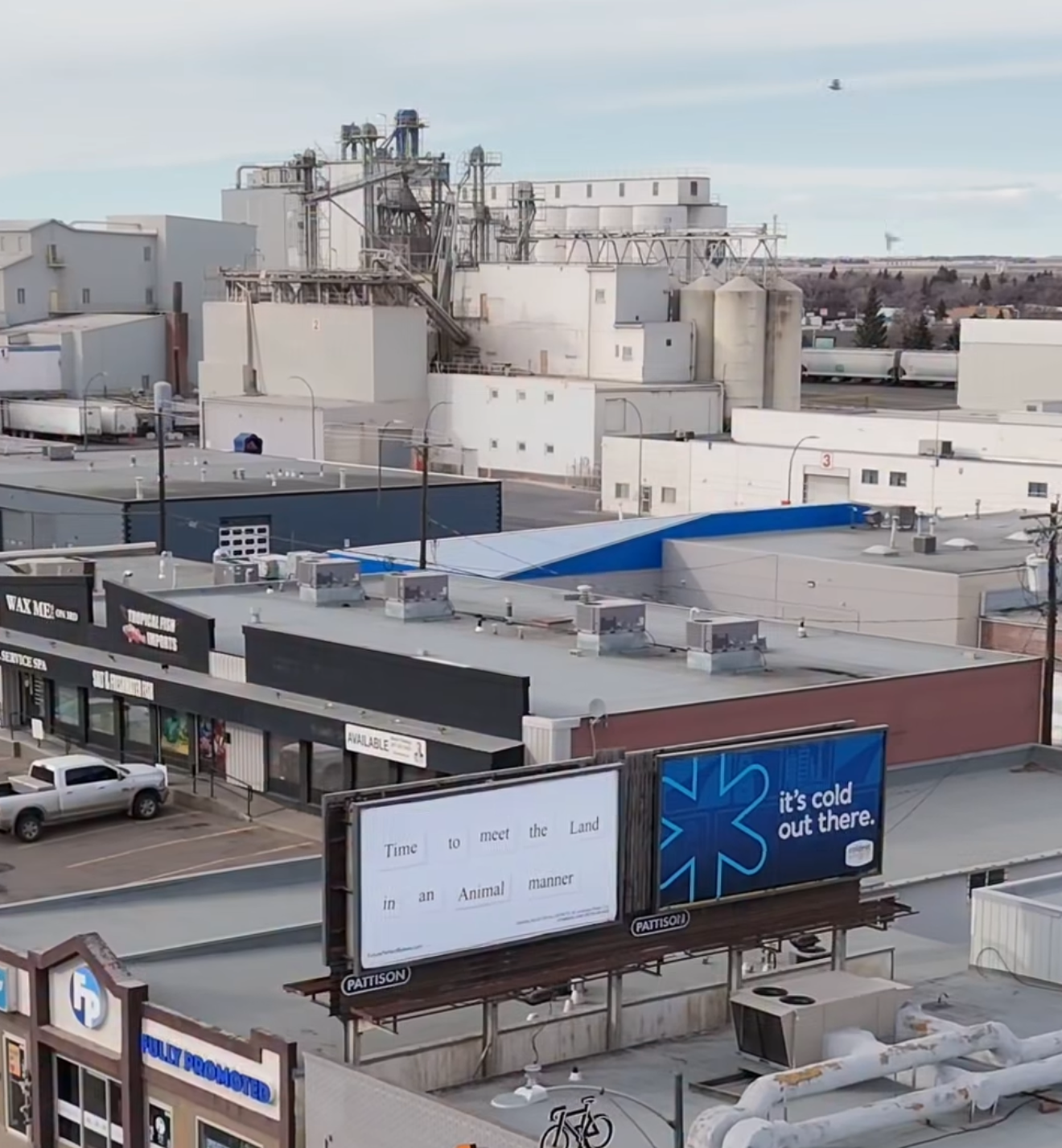
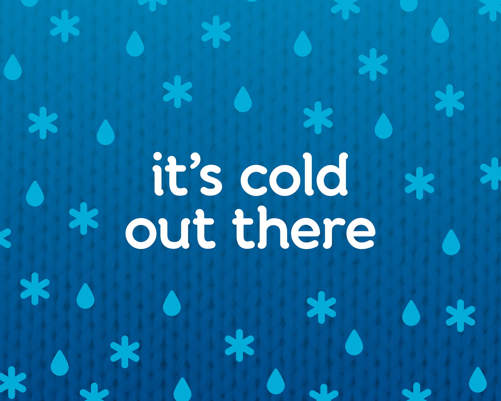
Brand Identity: “It’s Cold Out There”
The 2026 campaign adopted the tagline: “across the country, close to home”
Brand Identity: “It’s Cold Out There”
The 2026 campaign adopted the tagline: “across the country, close to home”
These served as the visual and emotional anchors for the identity.
A modular grid system was developed to ensure:
- Consistent compositions
- Flexible bilingual application
- High impact at multiple formats and scales
- Consistent compositions
- Flexible bilingual application
- High impact at multiple formats and scales
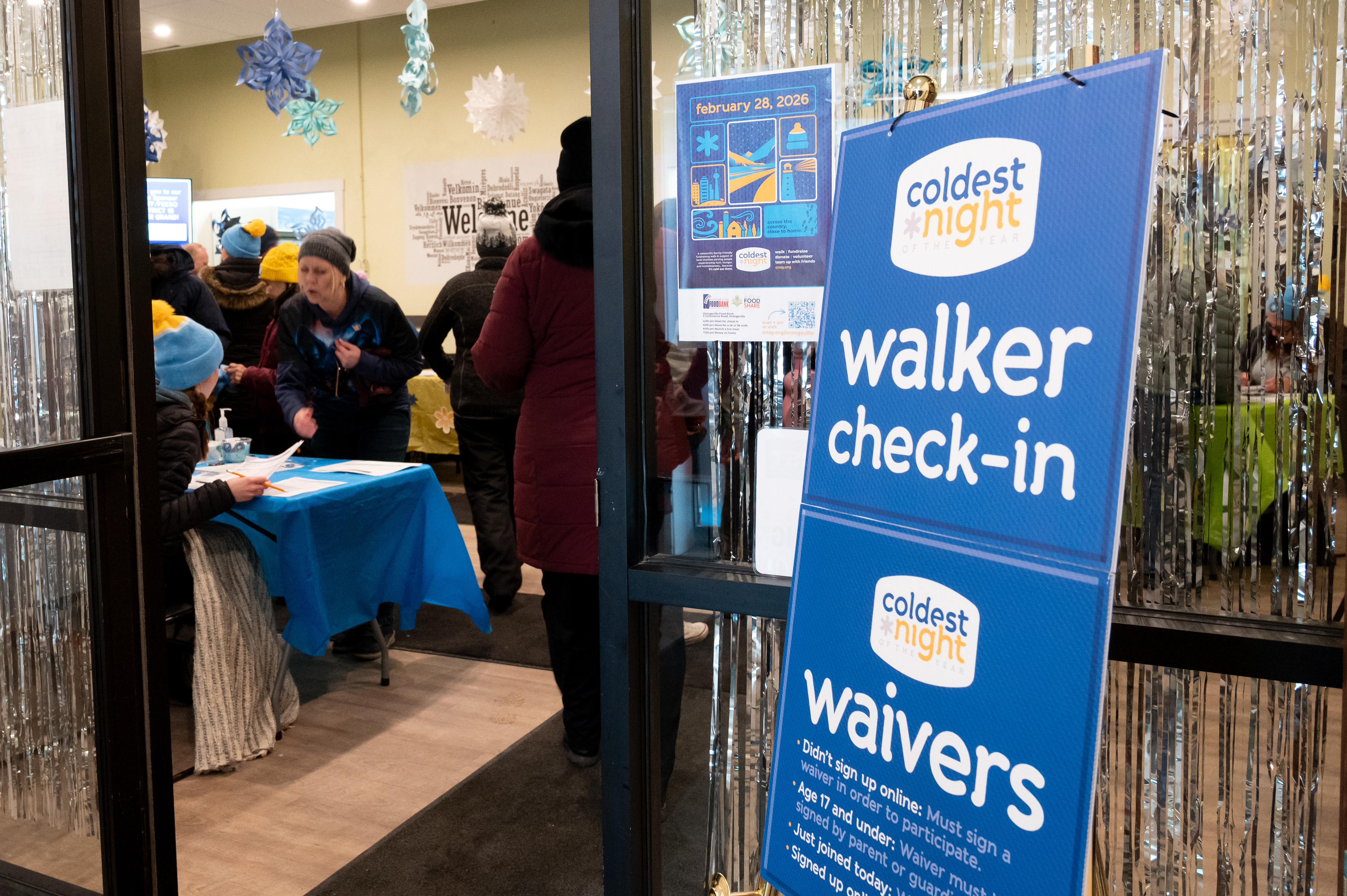
System Applications
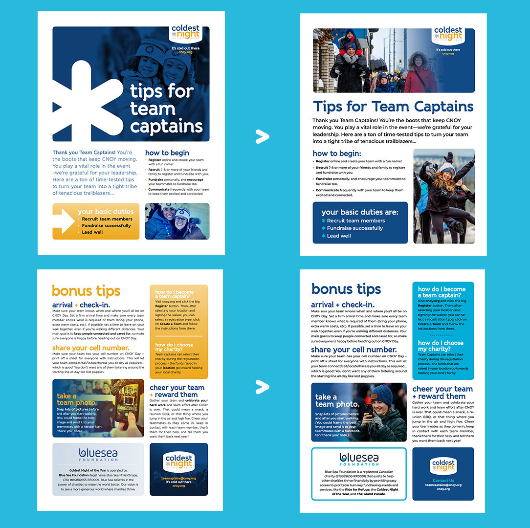
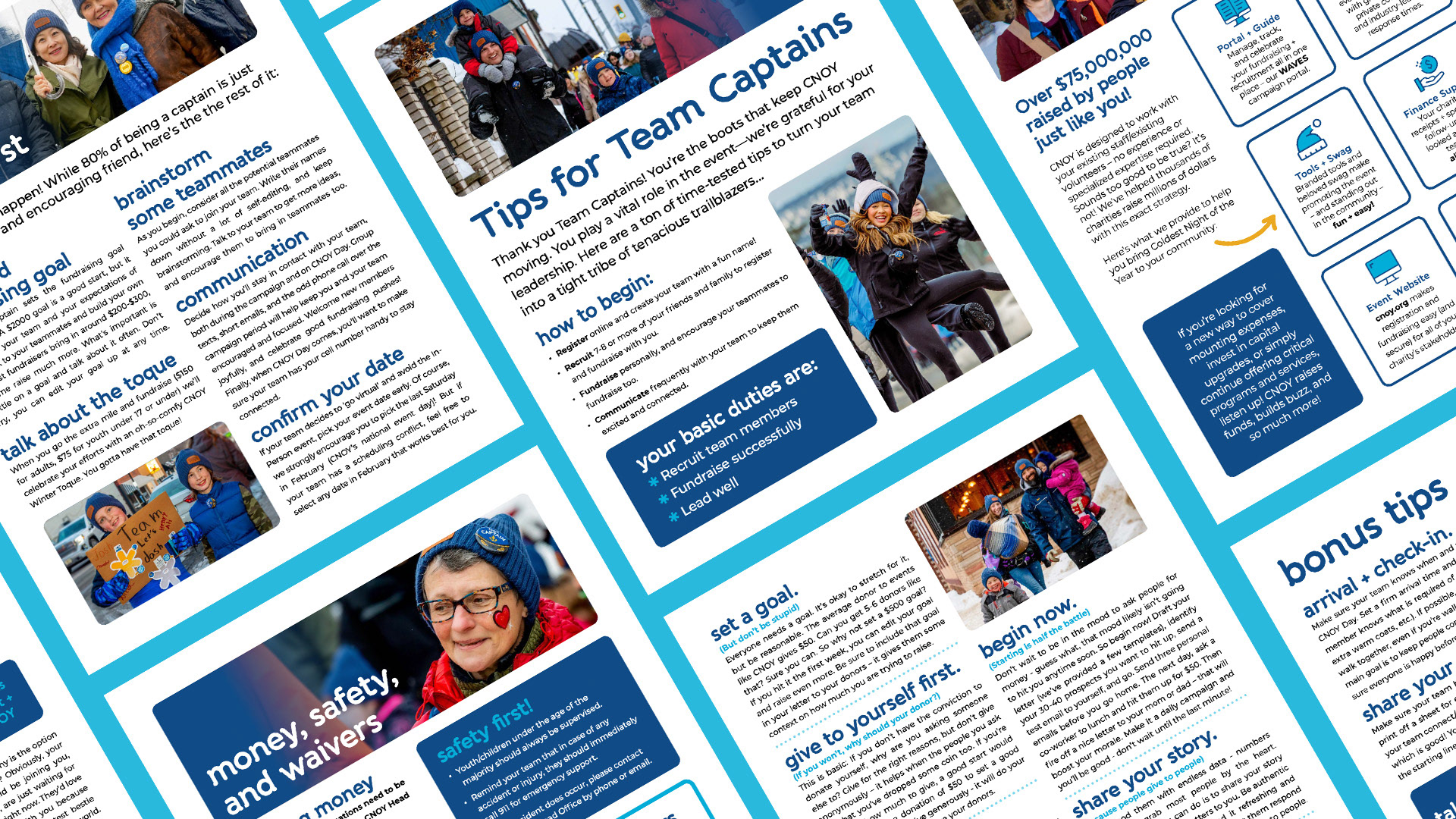
Print & Long-Form Materials
Print & Long-Form Materials
Worked examples ranges from, Team Captain and Fundraising Guides, to Posters (English, French, Bilingual), to even Postcards and Thank-You Cards.
All templates emphasize clarity, accessibility, and strong visual hierarchy.
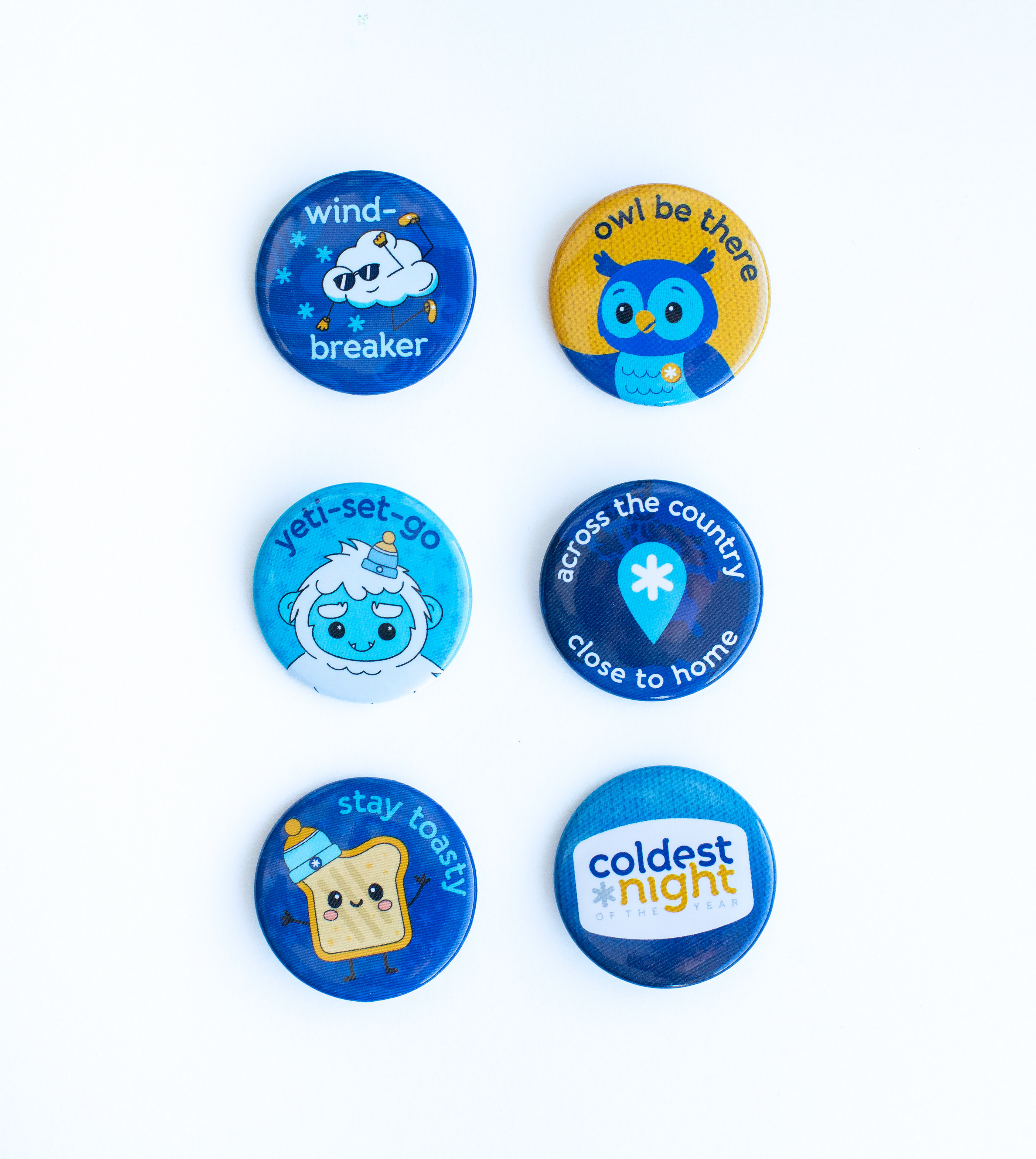
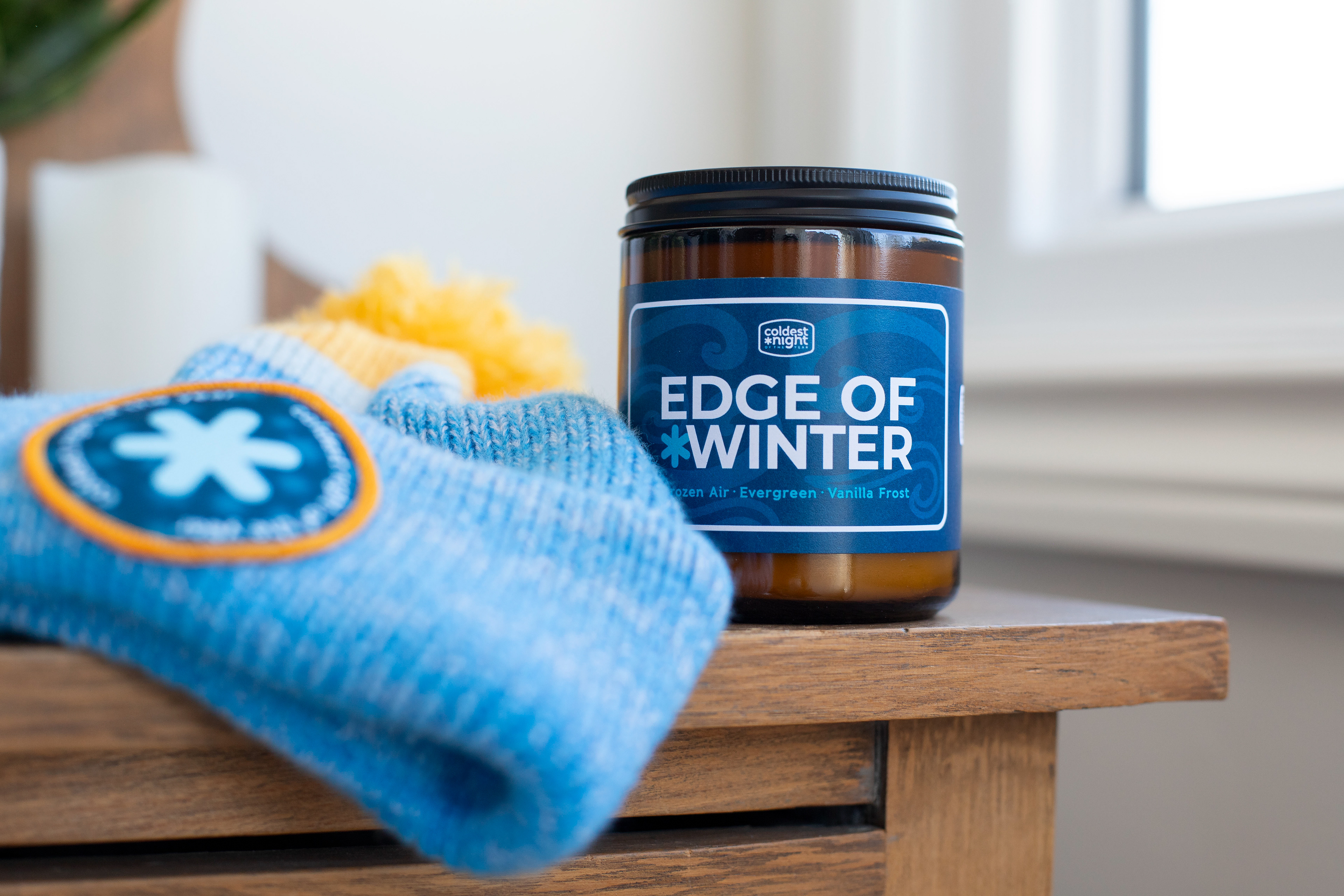
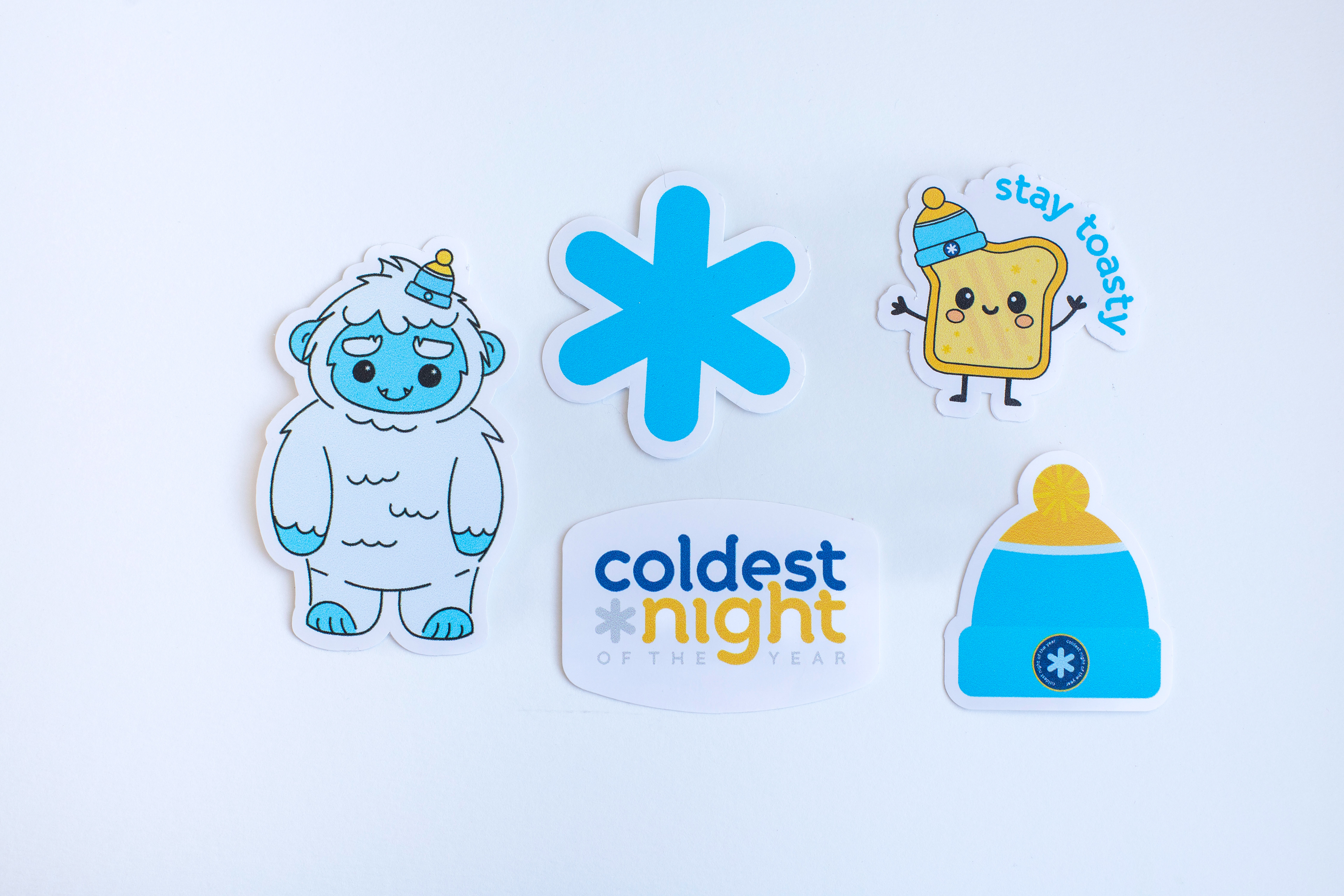
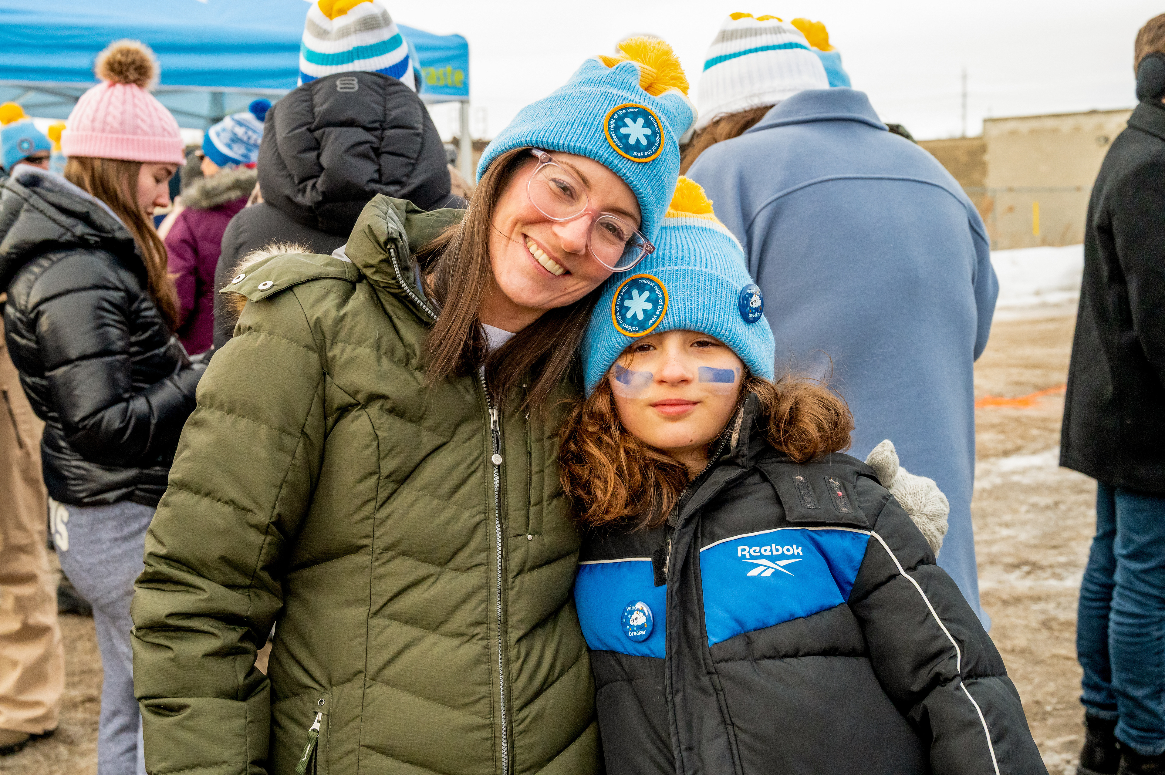
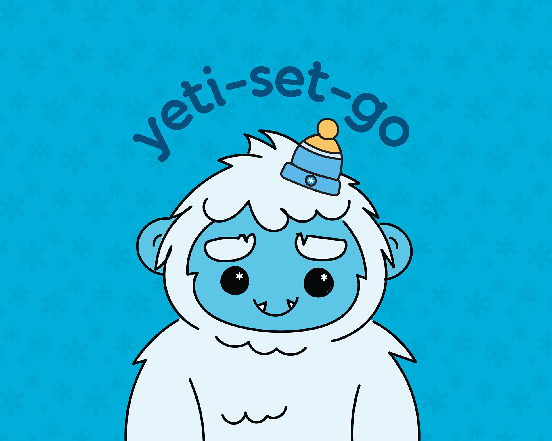
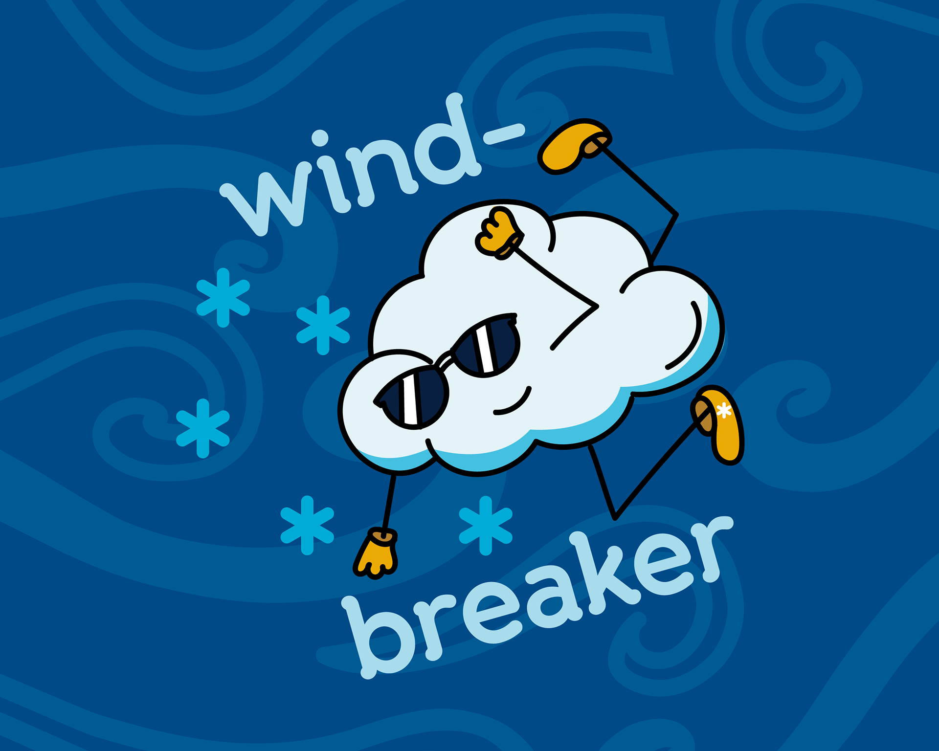
Collectibles & Small Goods
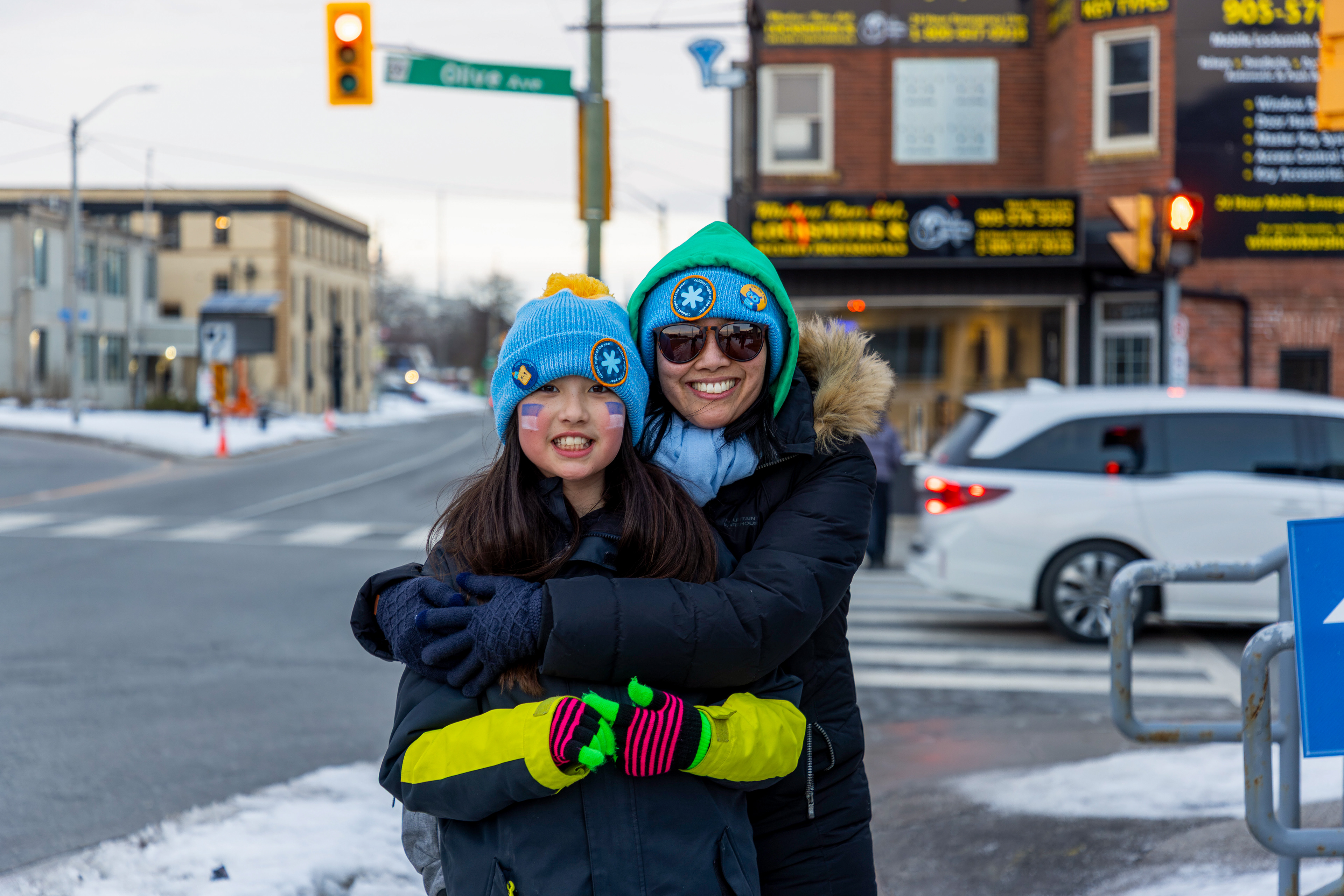
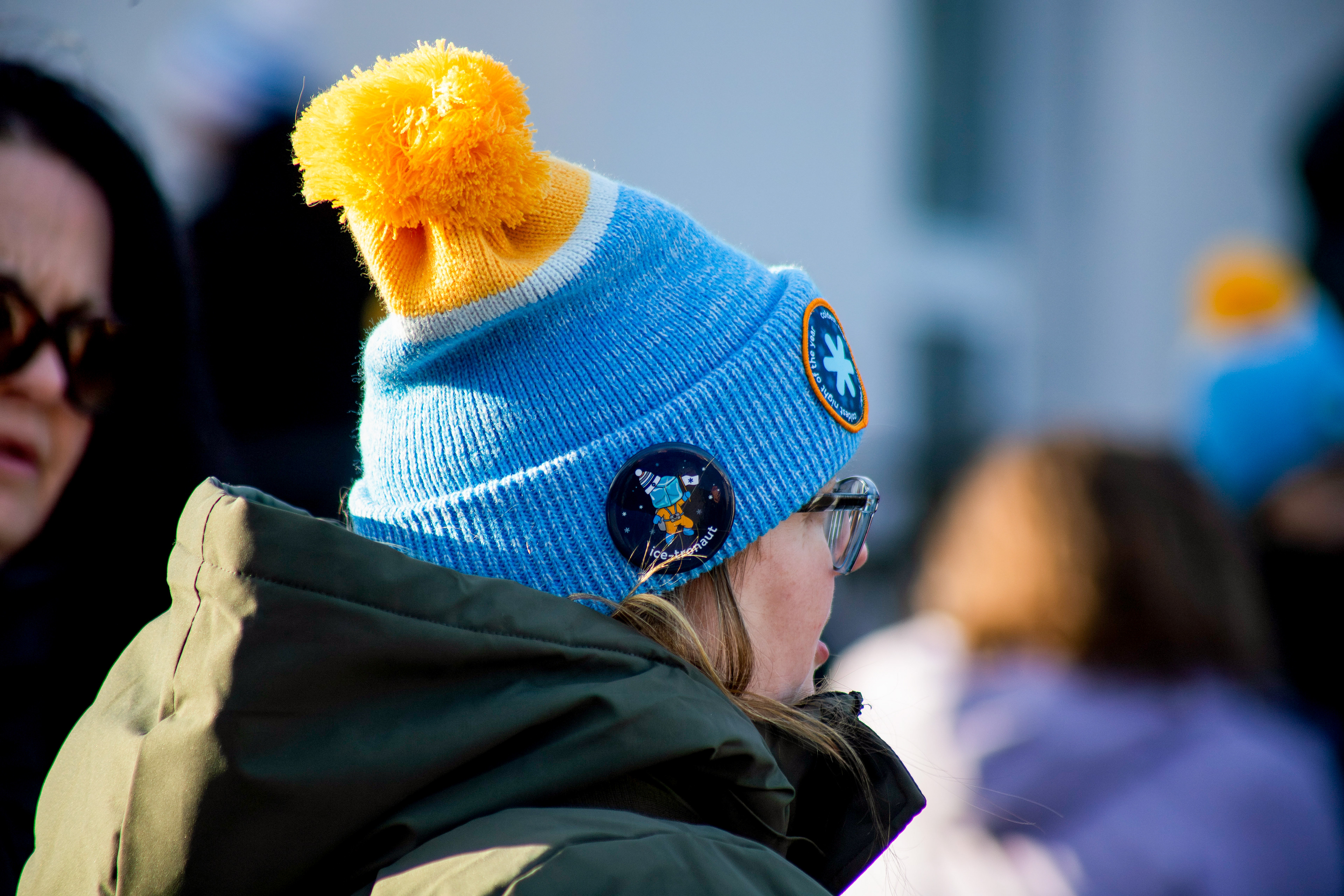
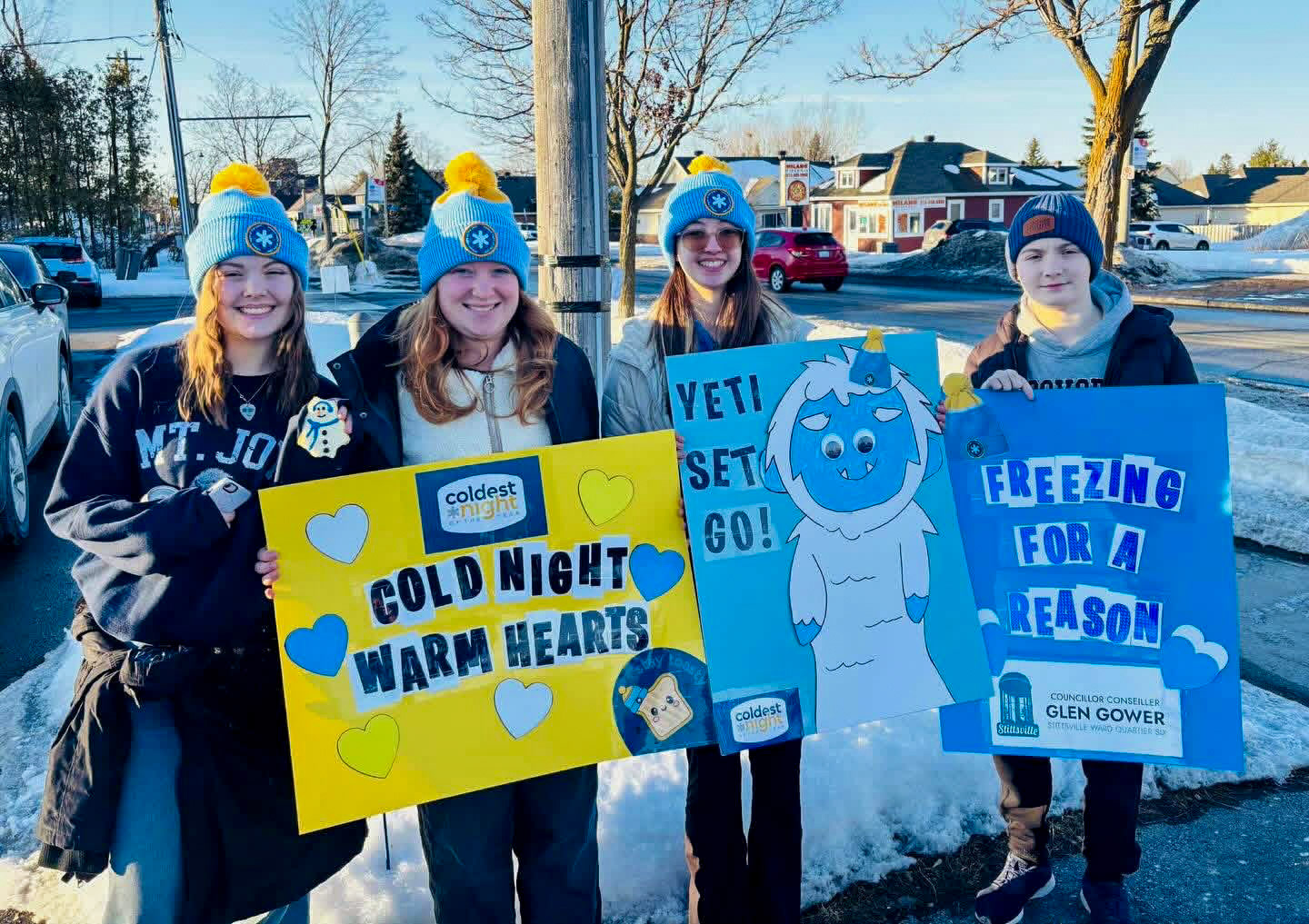
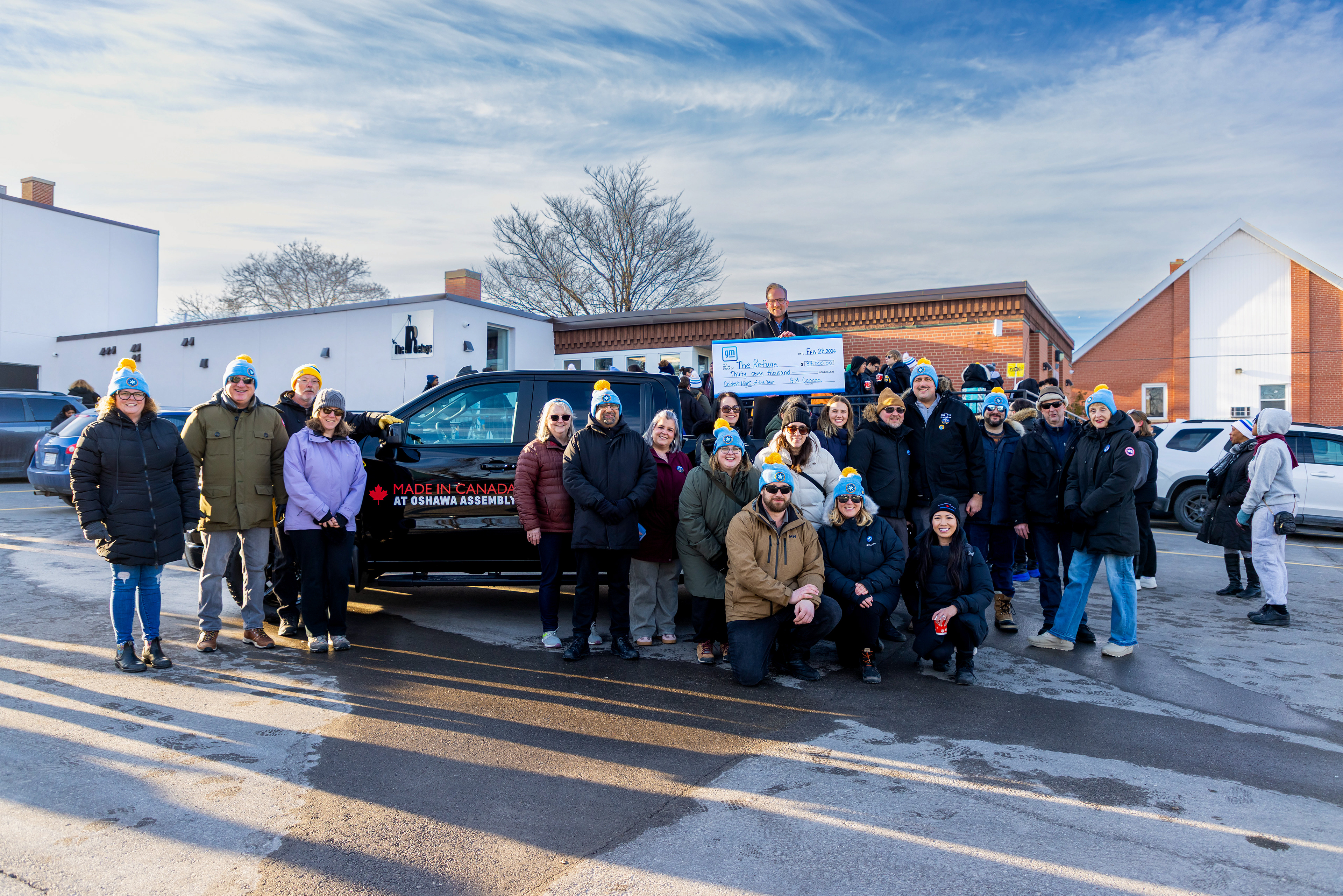
Smaller merchandise items such as buttons and stickers were designed as playful extensions of the brand system.
These pieces allowed for greater experimentation with the campaign’s illustration language, introducing friendly characters and iconography inspired by winter weather and community themes.
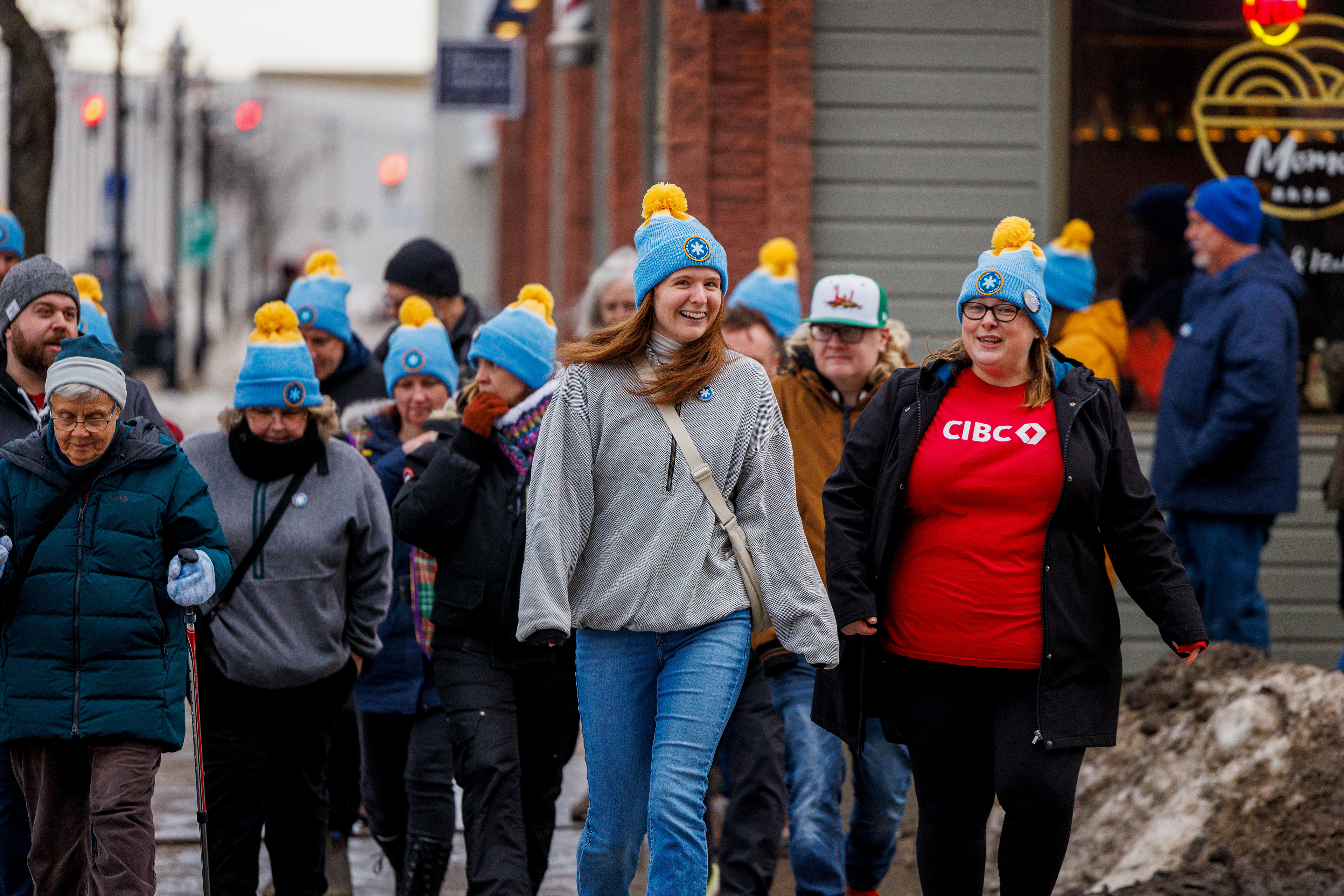
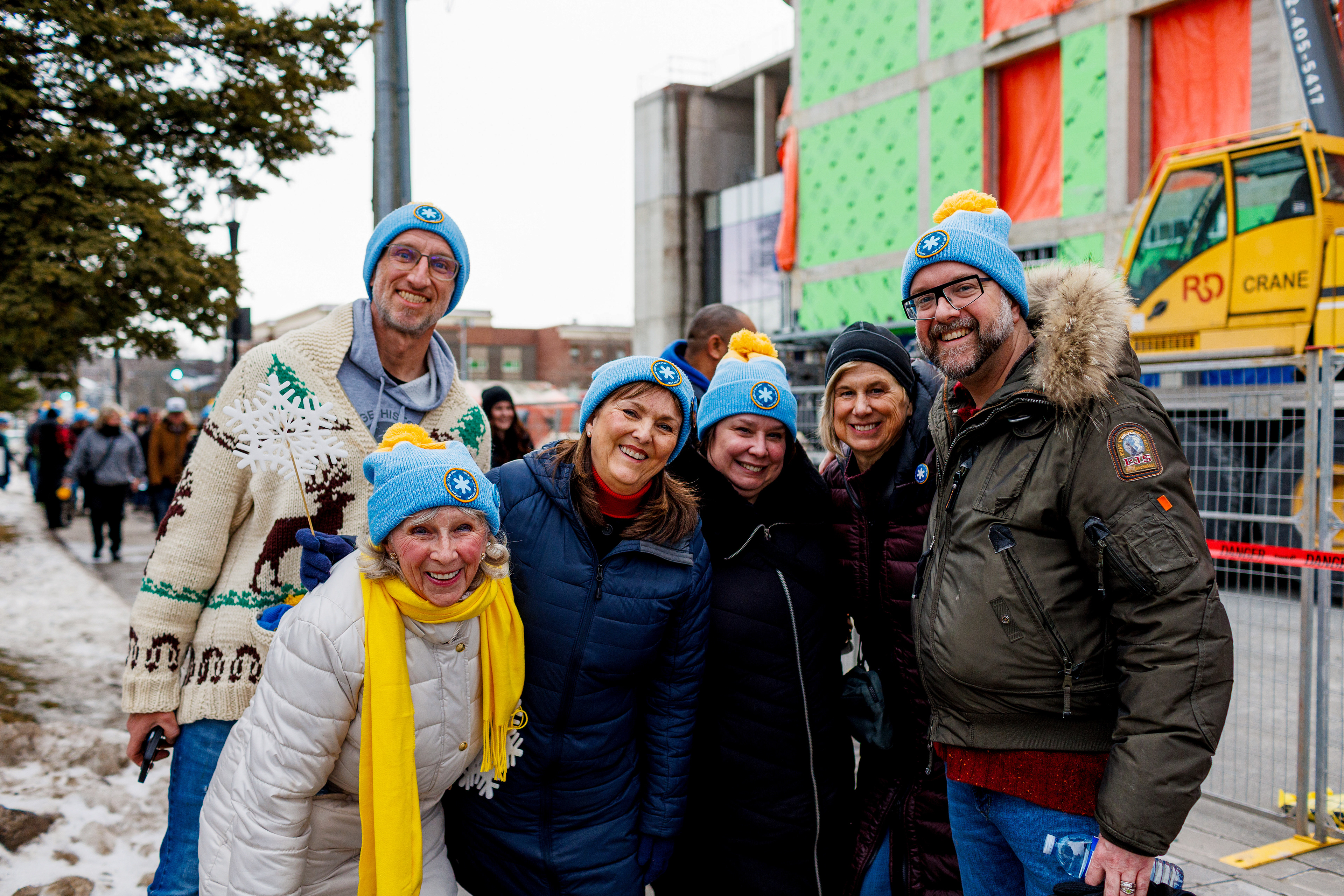
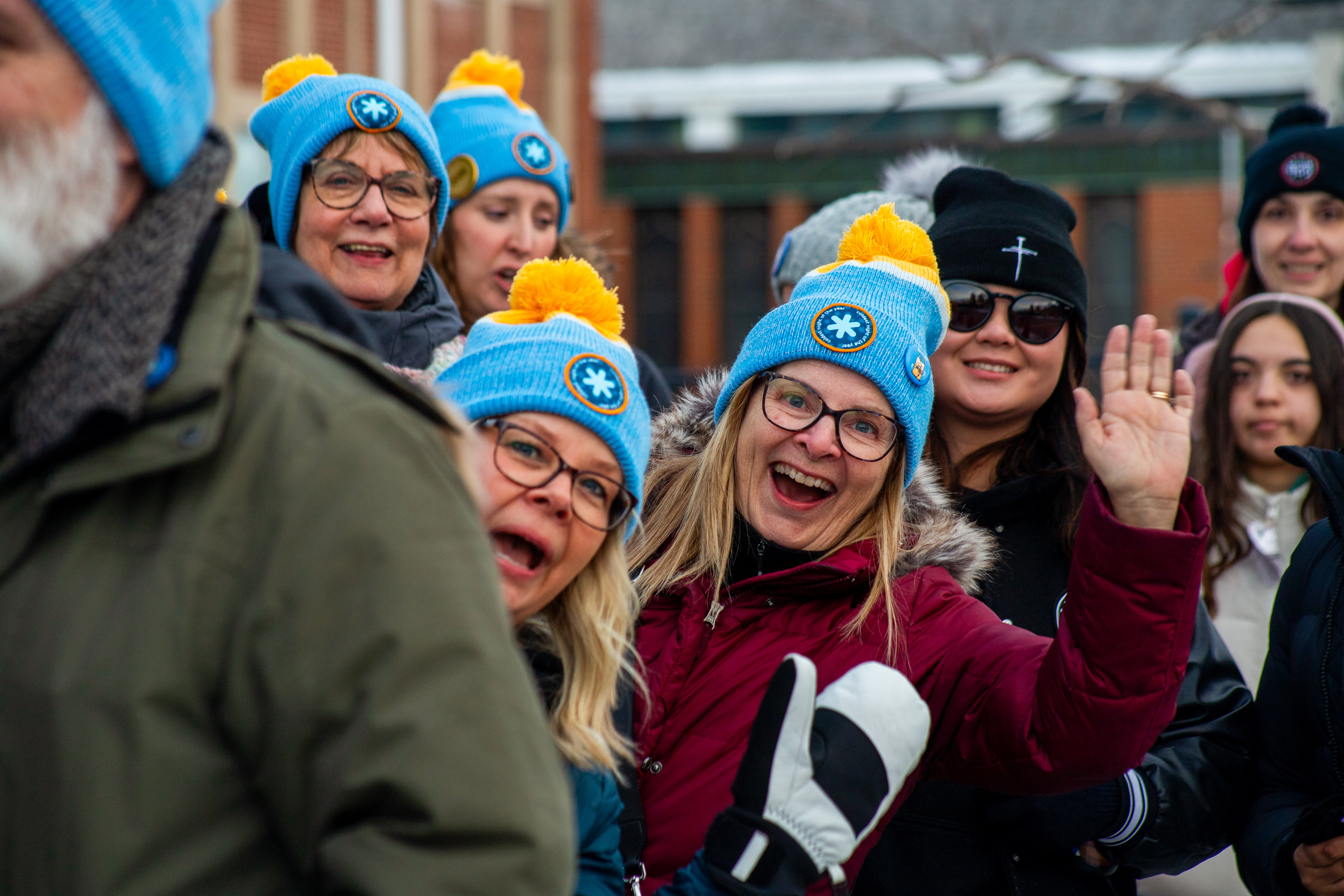
These items were often worn or shared by participants during the event, helping create a cohesive and visually engaging experience across hundreds of local walks.
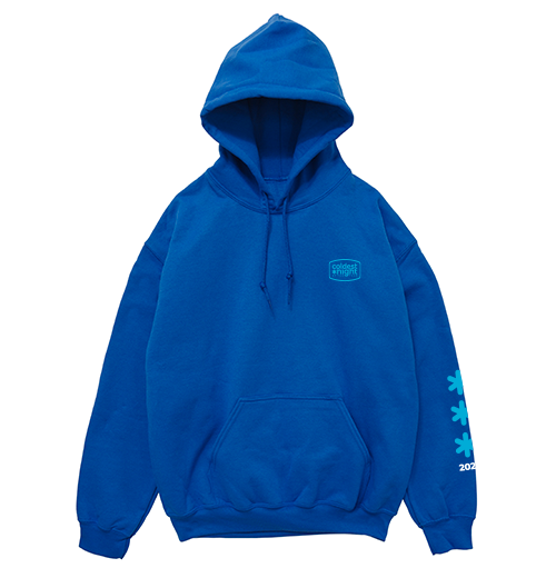
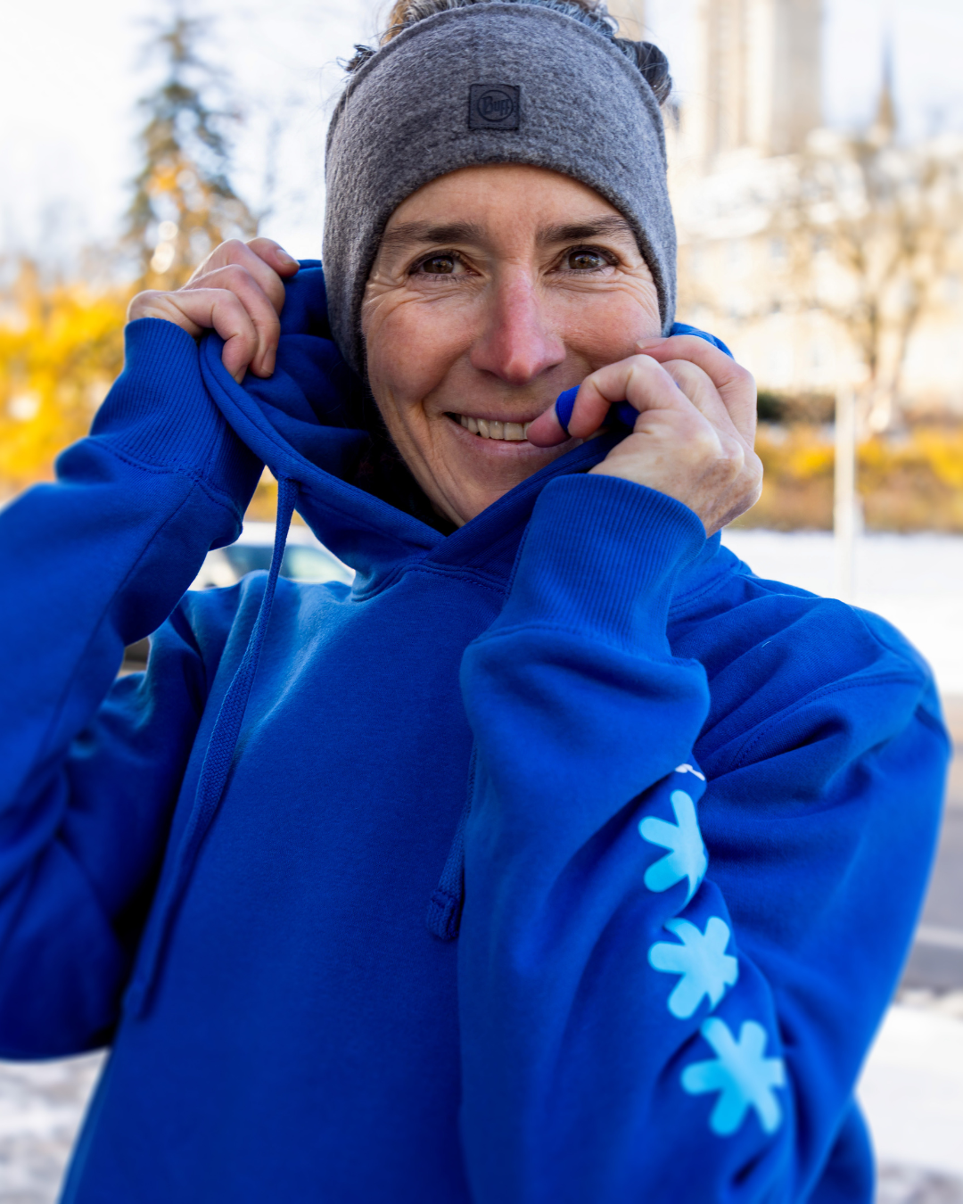
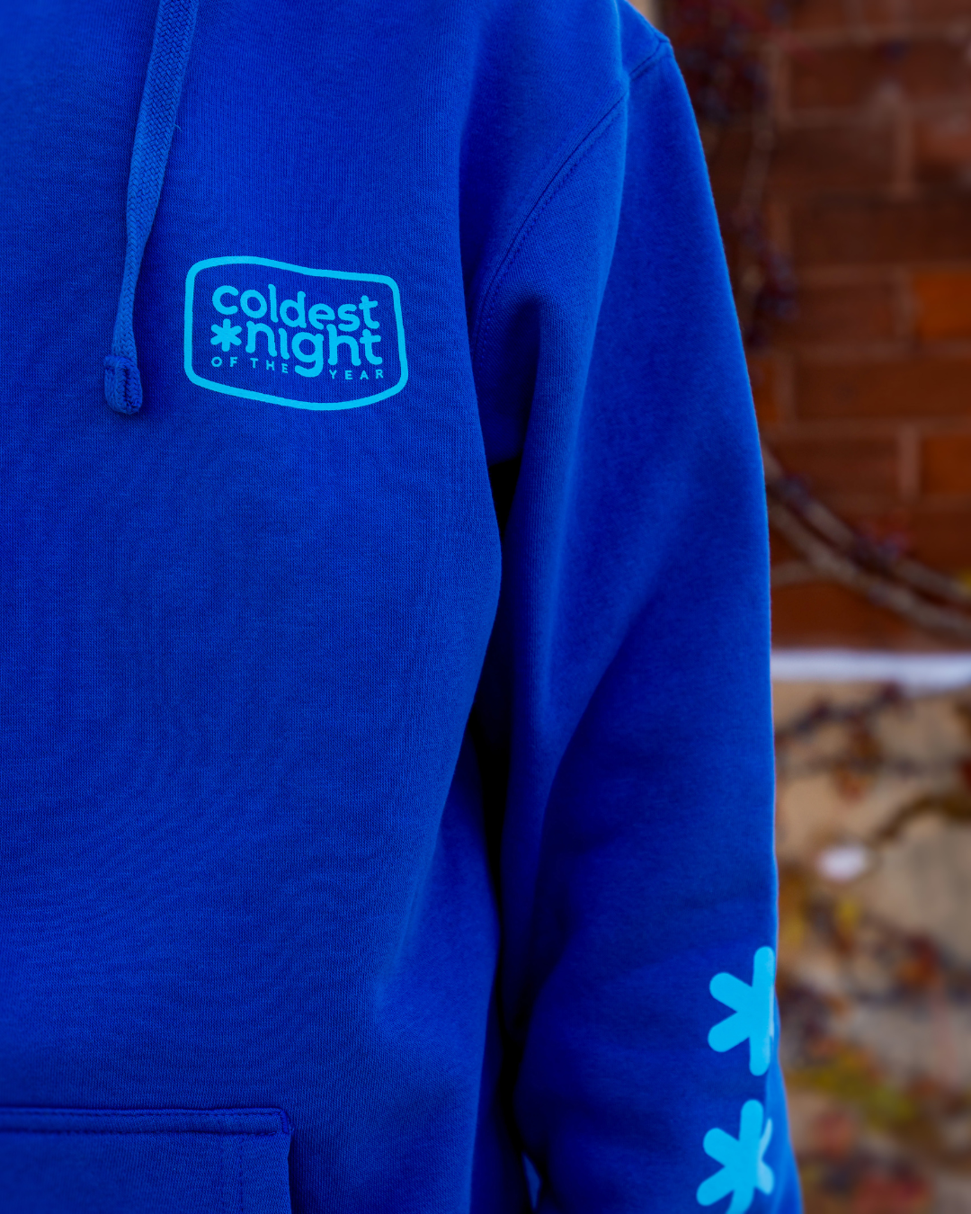
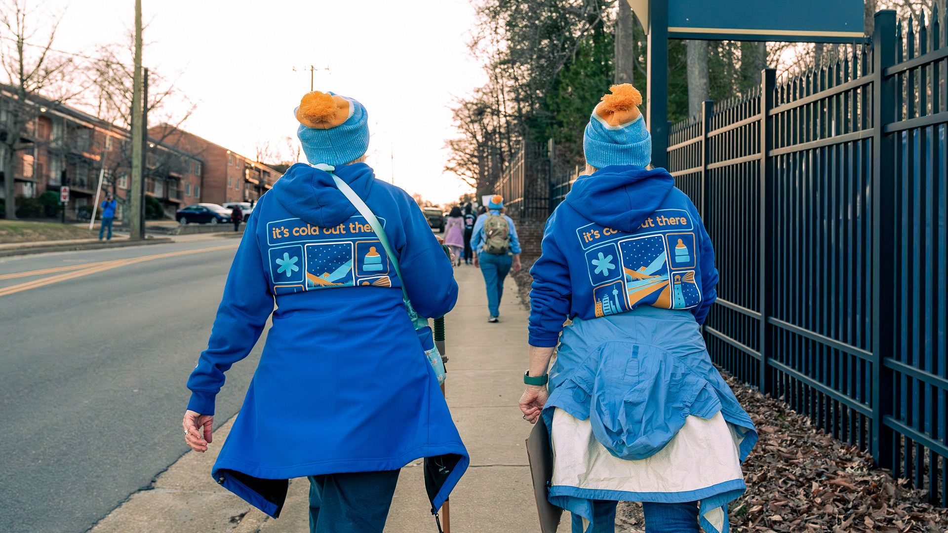
Wearables
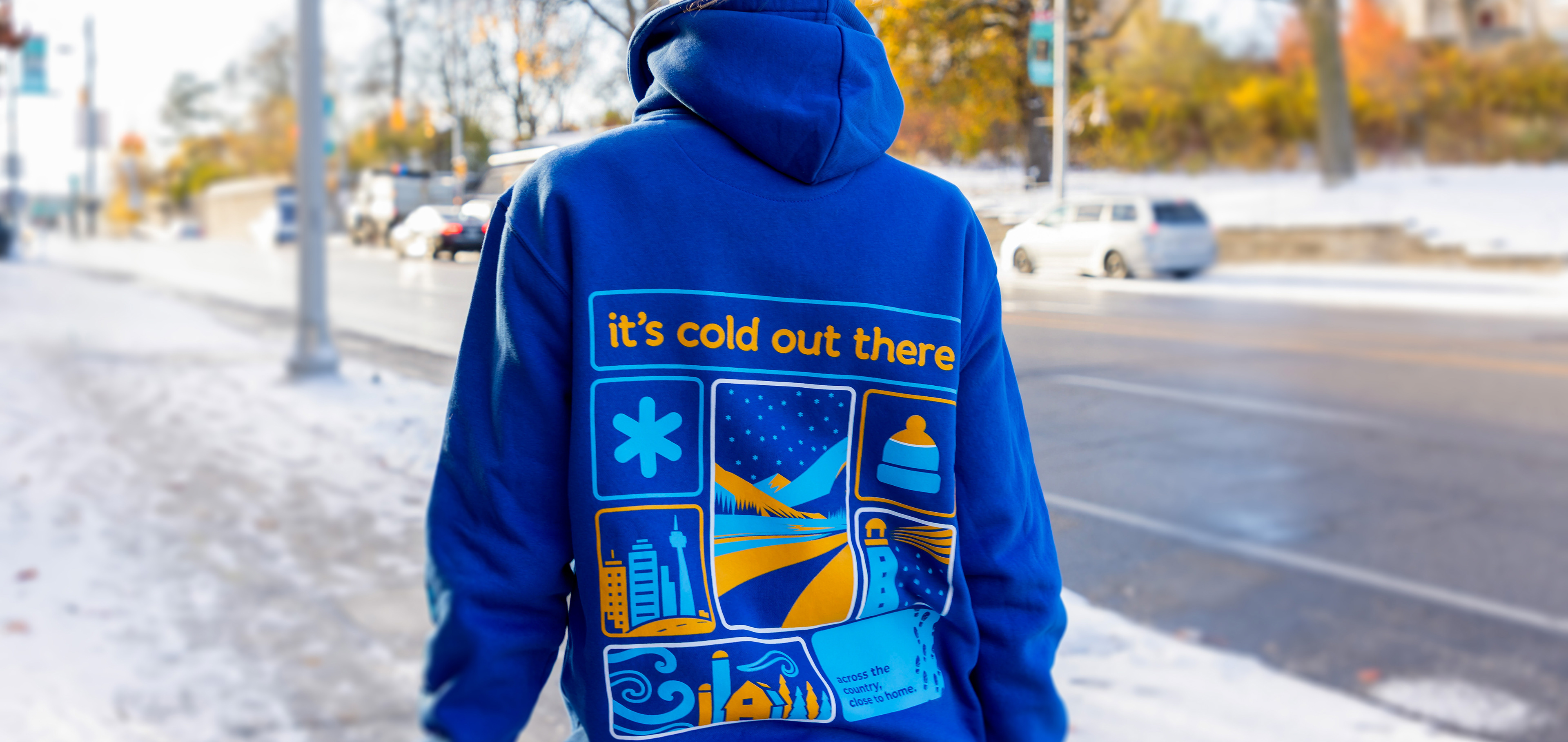
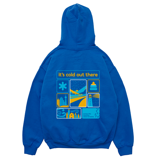
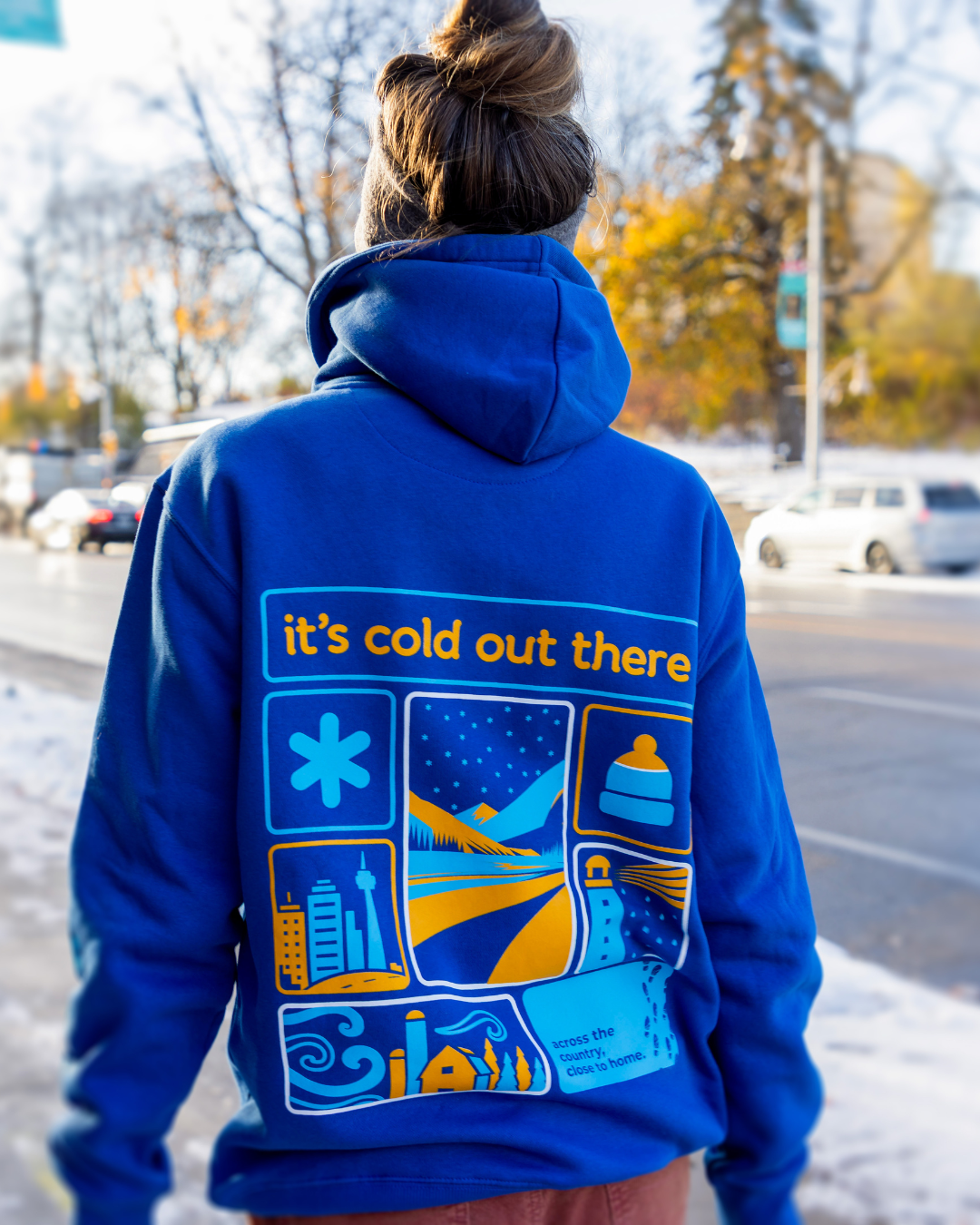
The hoodie and toque served as the hero pieces of the collection.
The hoodie design features the campaign messages: “It’s cold out there" and "across the country, close to home" paired with a grid of winter-inspired illustrations. These graphics reference the idea that from coast to coast, communities across the country are walking together in support of our neighbours experiencing hurt, hunger, and homelessness. The graphic reinforces this in a visually engaging way.
The design balances bold colour blocking with simple iconography so the graphics remain legible at distance and recognizable in photography and social media.
Additional design considerations included:
- Maintaining brand consistency across apparel and campaign materials
- Ensuring high contrast for readability
- Creating artwork that works on both dark and bright fabric colours
- Designing graphics that feel wearable rather than overly promotional
- Maintaining brand consistency across apparel and campaign materials
- Ensuring high contrast for readability
- Creating artwork that works on both dark and bright fabric colours
- Designing graphics that feel wearable rather than overly promotional

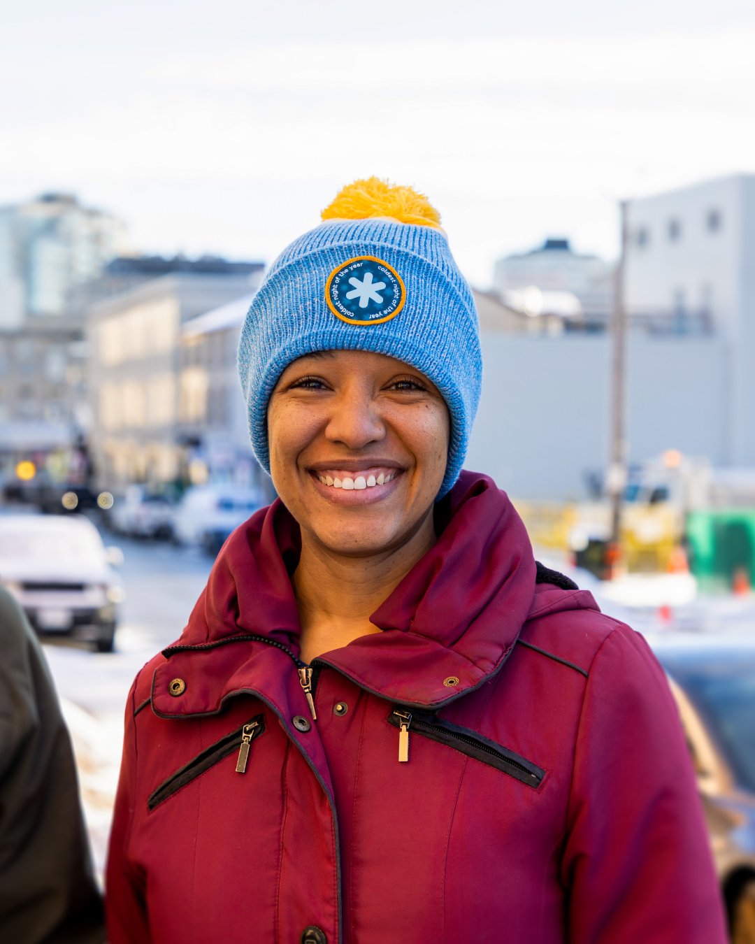
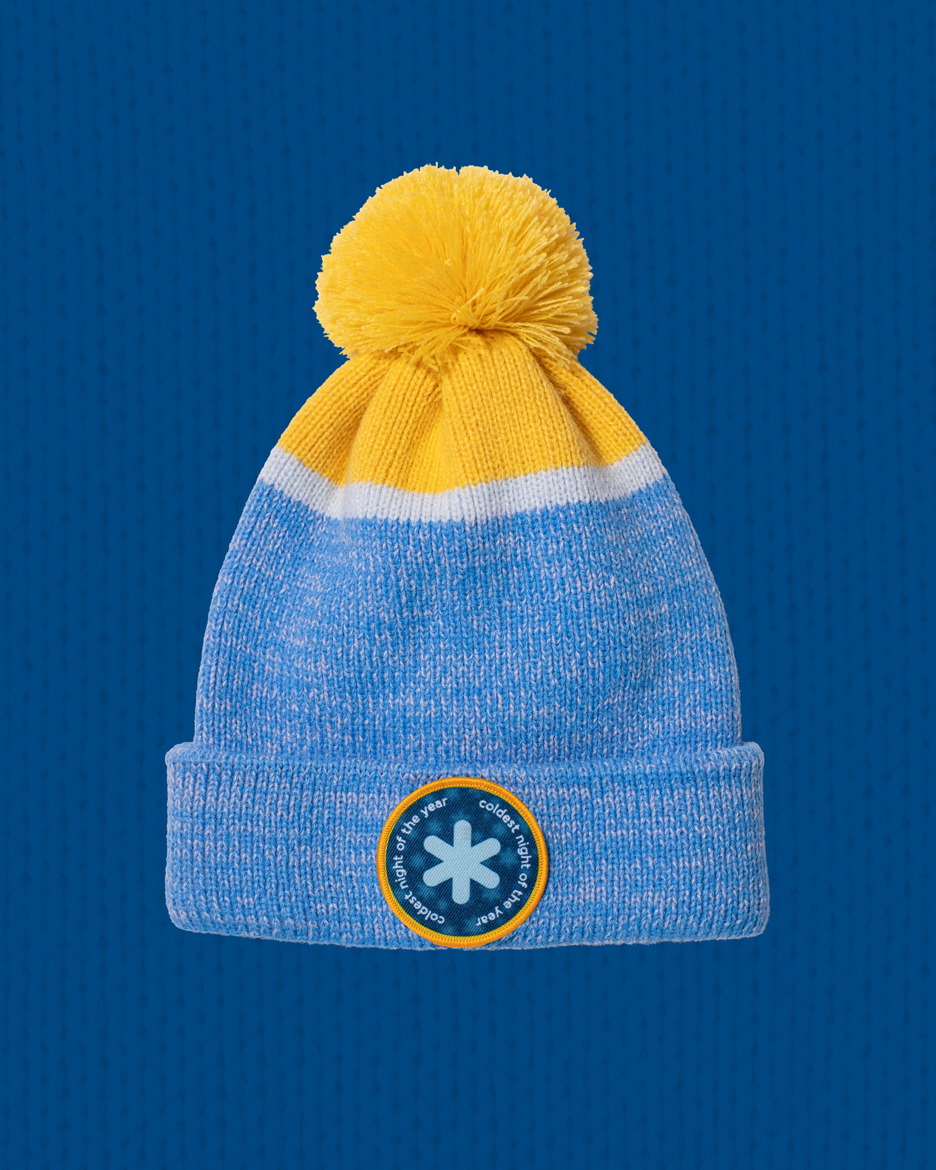
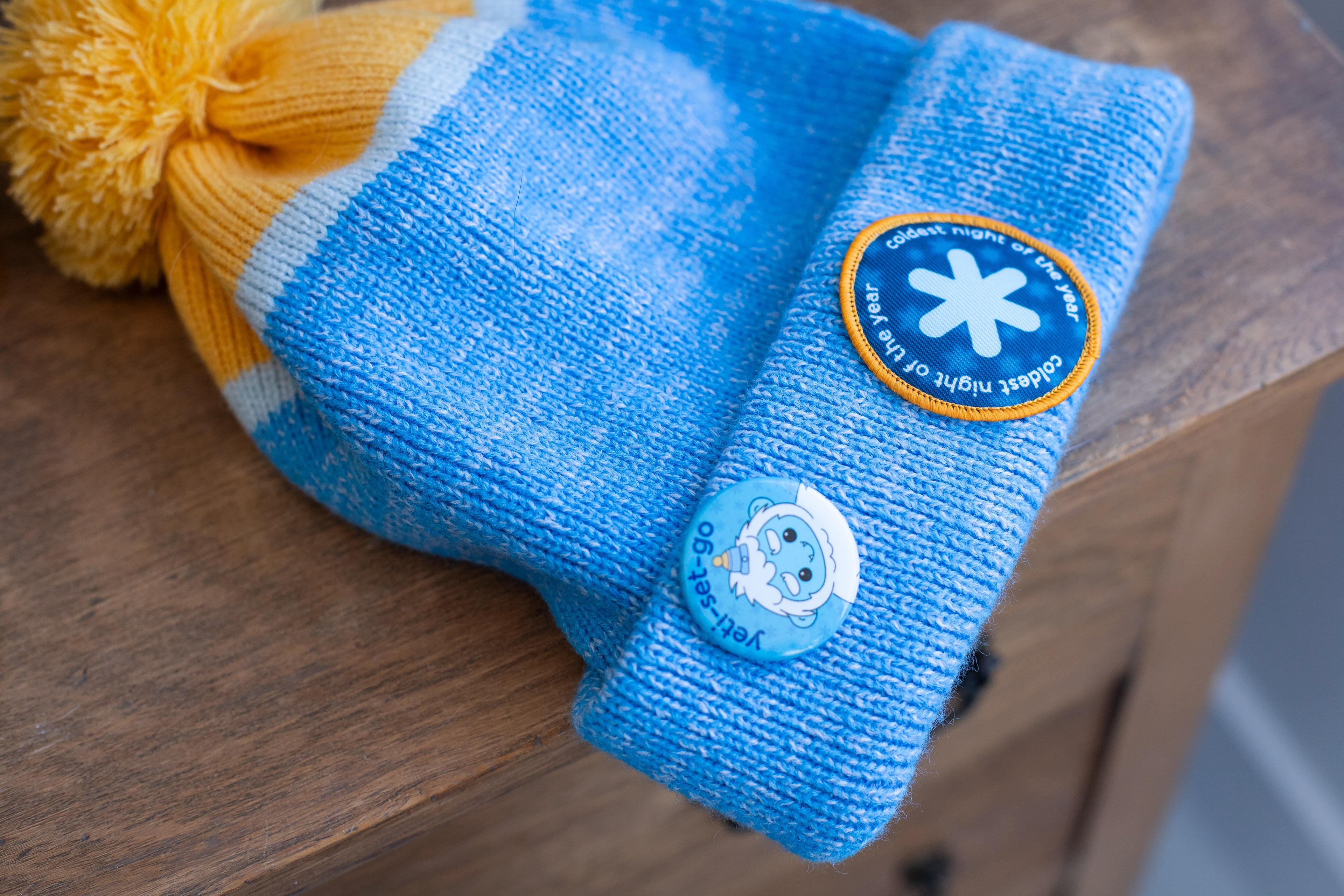
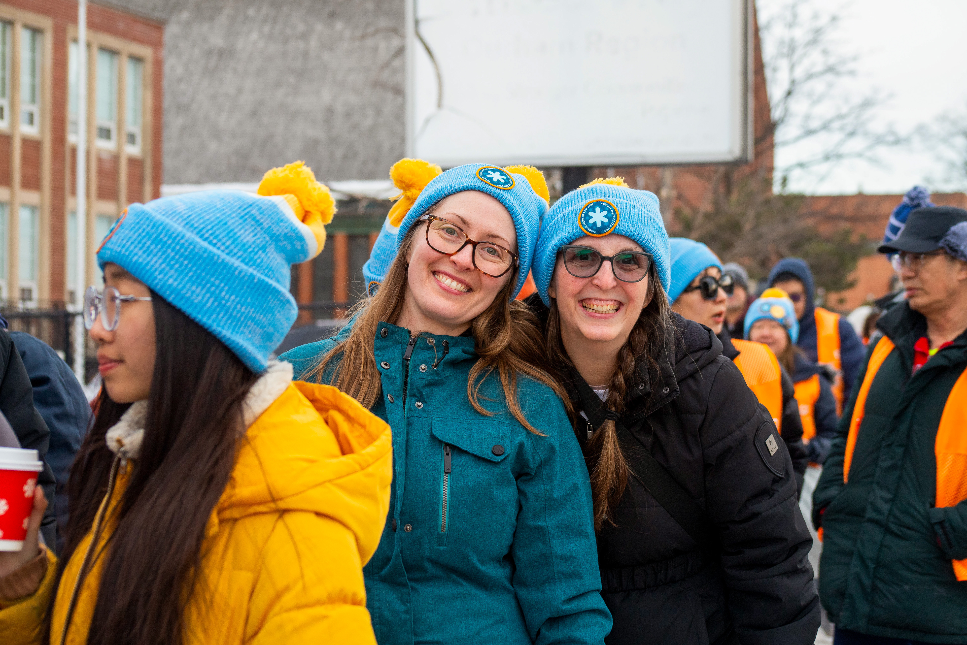
Toque Design & Product Development
For the 2026 campaign toque, I was responsible for the full product design process.
Rather than simply applying the logo to an existing template, I developed the toque from the ground up by:
- Selecting yarn colour swatches to match the campaign palette
- Designing the knit colour blocking pattern
- Creating the woven patch featuring the CNOY snowflake emblem
- Preparing a detailed product design file for manufacturing
- Ensuring a wash tag and instructions was included
- Selecting yarn colour swatches to match the campaign palette
- Designing the knit colour blocking pattern
- Creating the woven patch featuring the CNOY snowflake emblem
- Preparing a detailed product design file for manufacturing
- Ensuring a wash tag and instructions was included
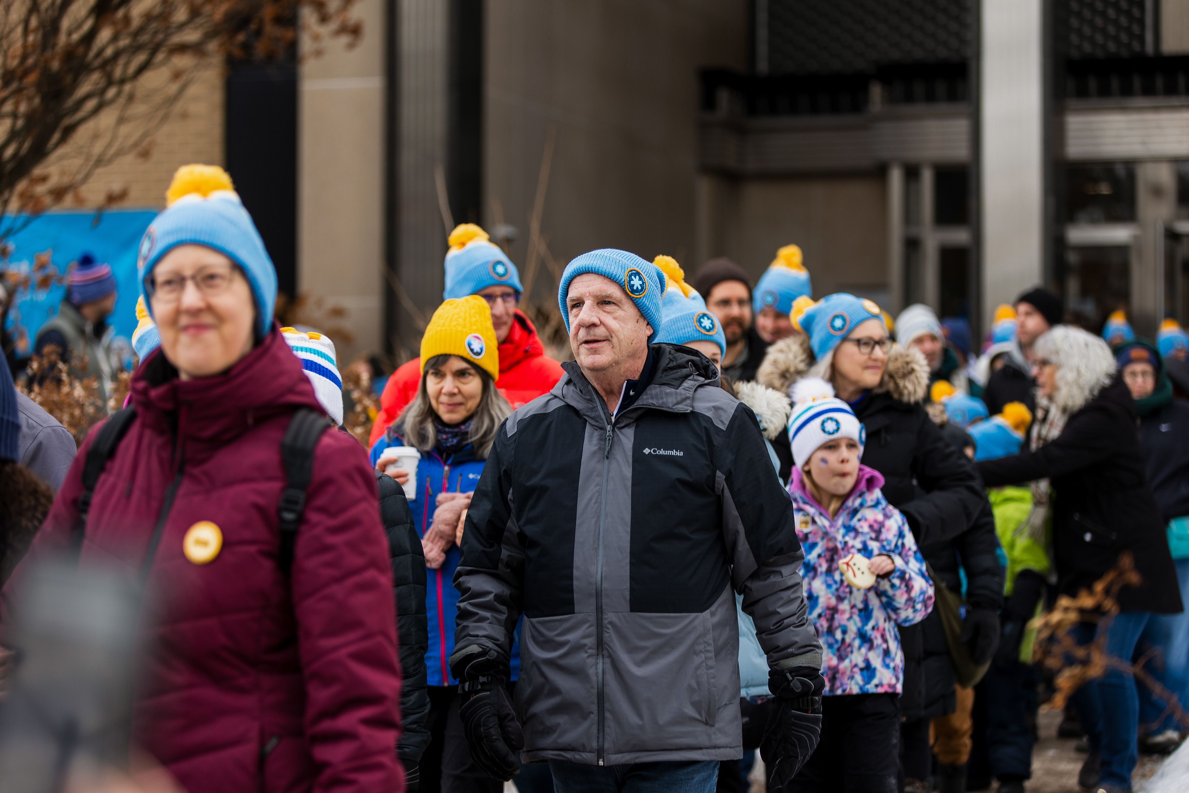
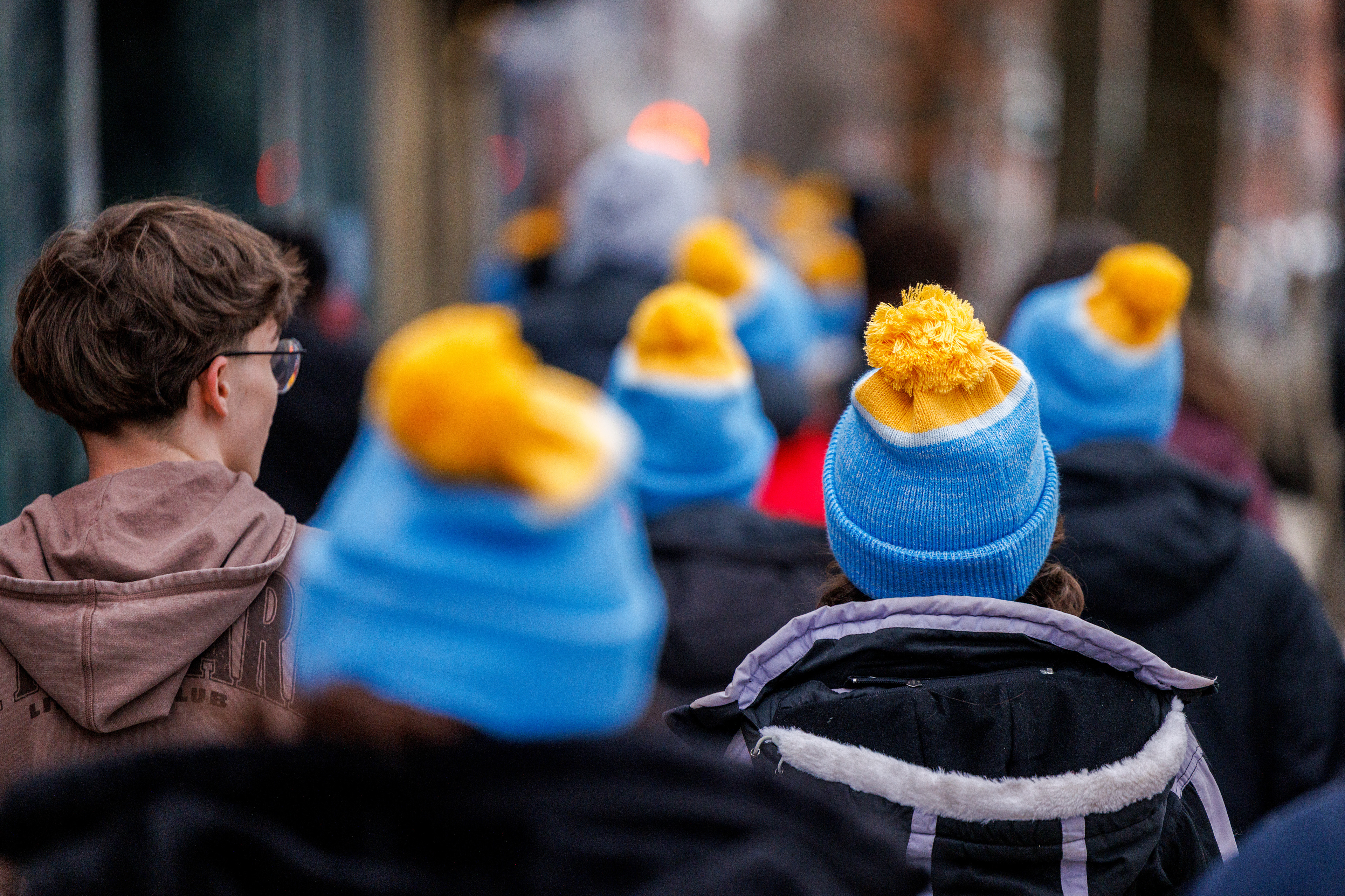
The final design combines a bright yellow pom with blue and white knit bands, creating a recognizable winter accessory that feels playful, warm, and unmistakably tied to the campaign.
By designing the toque at the product level — from yarn selection to patch placement — the piece became both functional winter apparel and a strong extension of the campaign’s visual identity.

Wearable Impact
The merchandise program demonstrated how the campaign identity could translate seamlessly across different mediums, from digital advertising and print collateral to apparel and collectible goods.
By designing these items as part of the broader brand system, the merchandise became more than promotional products, it became a way for participants to visibly express their involvement in the event. Participants wearing the hoodies and toques created a recognizable visual identity across local walks, reinforcing the campaign’s sense of community while extending the brand beyond traditional marketing channels.
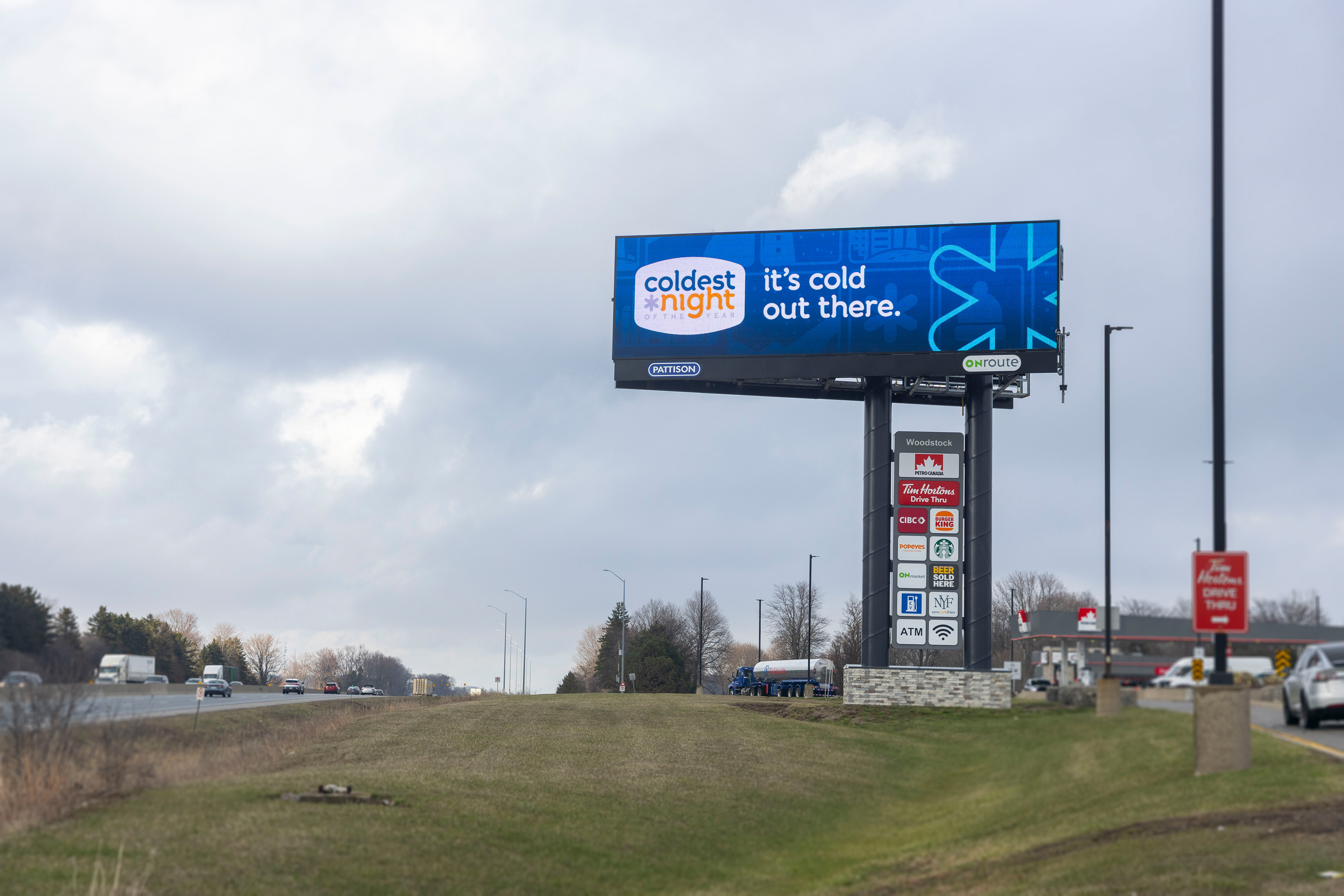
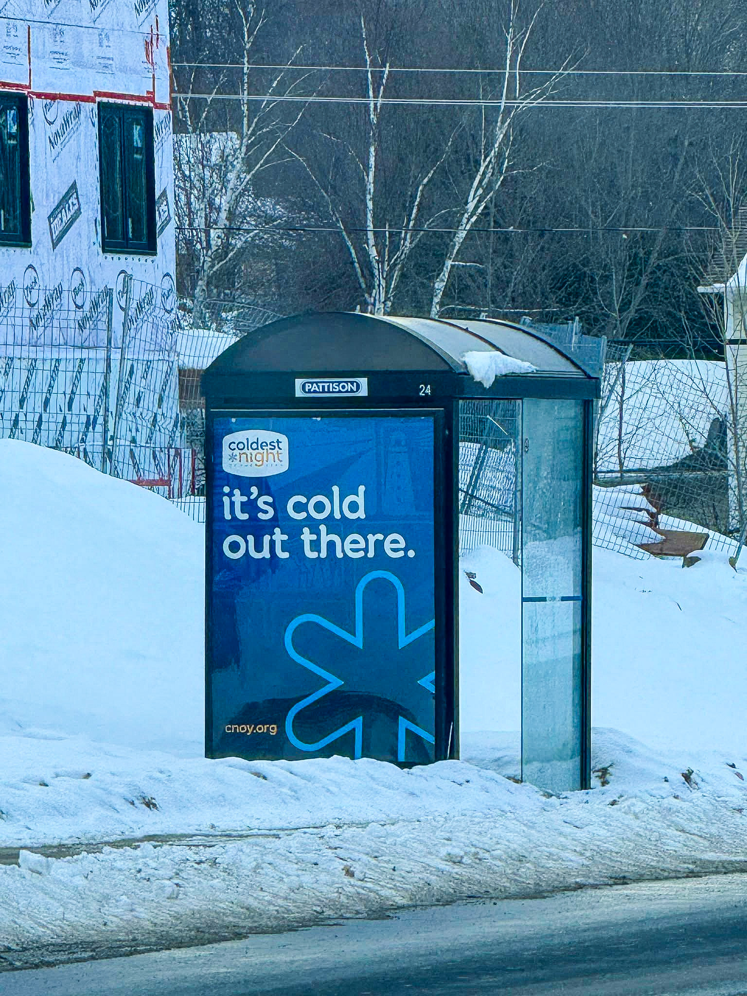
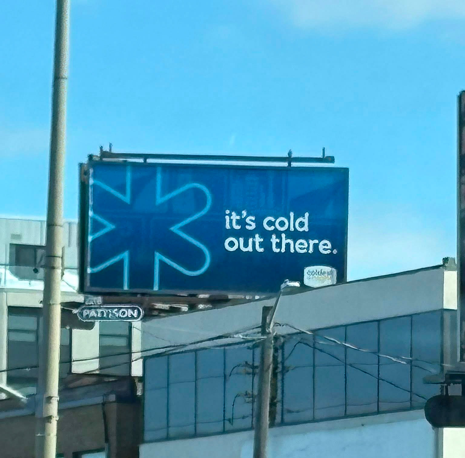
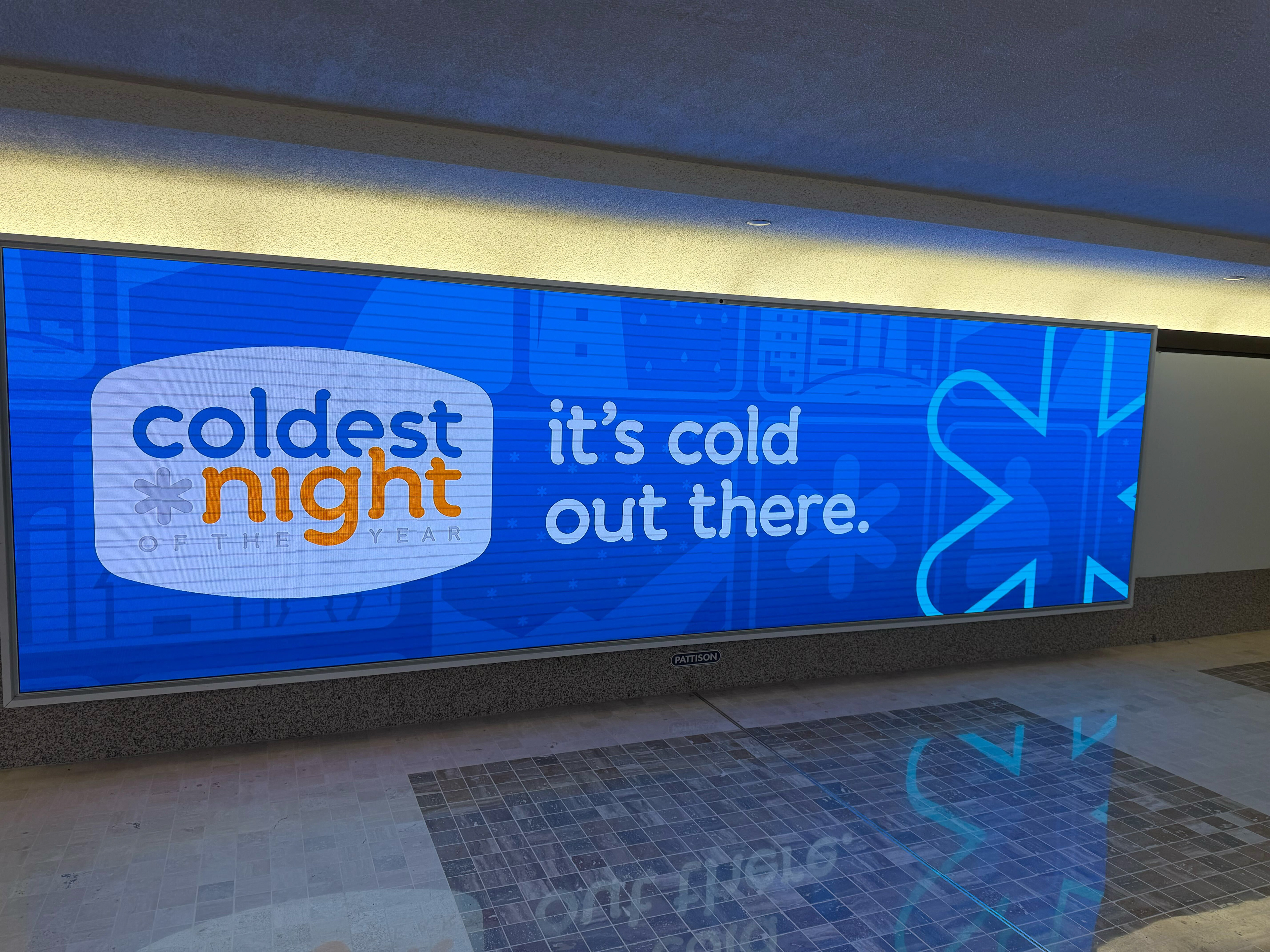
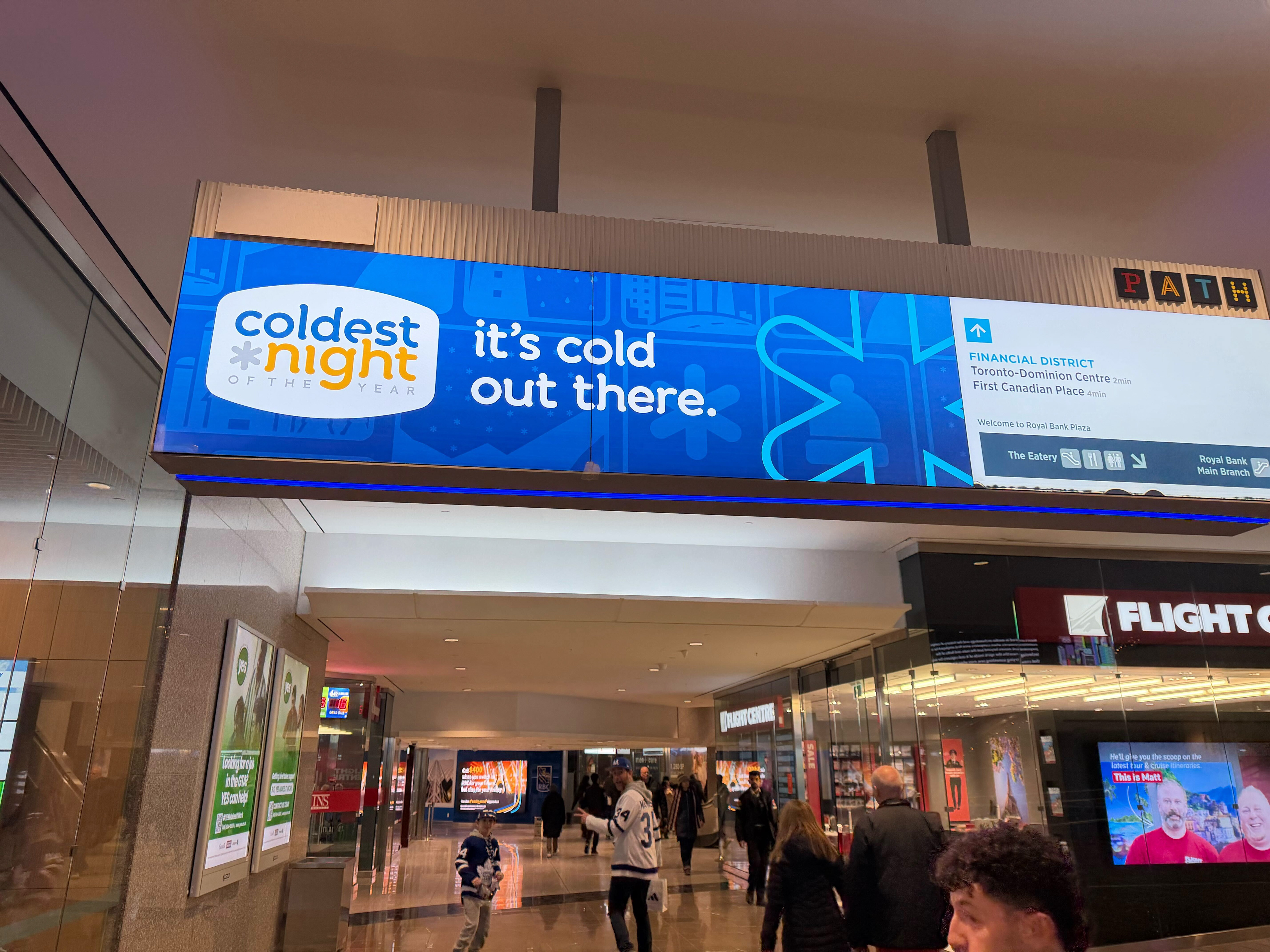
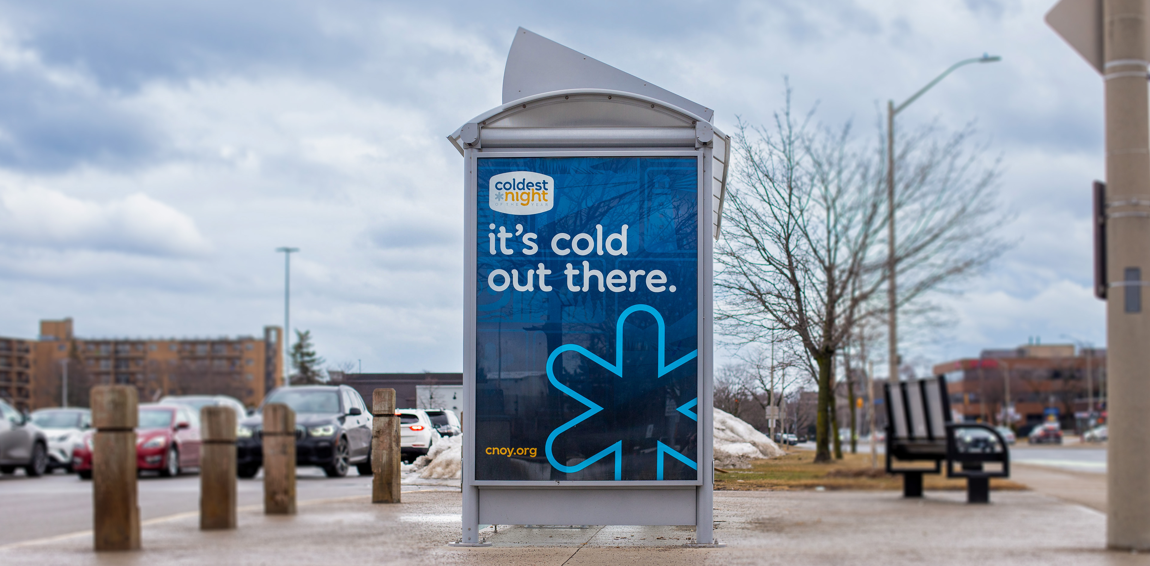
Outdoor & Environmental
Adapted system to a multiple of space including: Billboards, Transit shelters, Large-format placements, and digital displays. High-contrast elements ensured legibility in outdoor conditions.
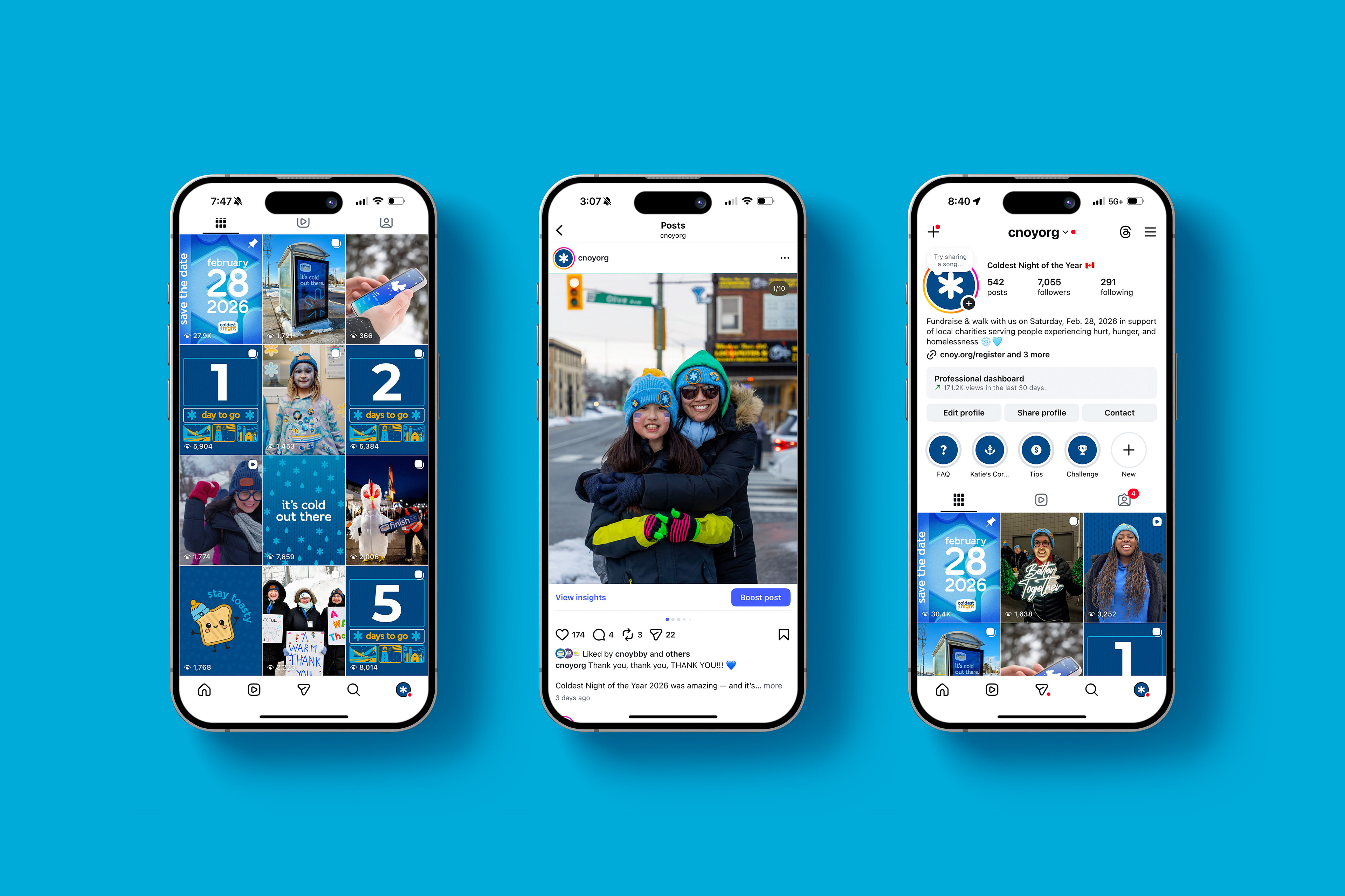
Social Media Management & Paid Campaign
To support the 2026 campaign, I led the creative direction and management of both the organic and paid social media strategy. Over a 90-day organic campaign and a 45-day paid advertising period, social media played a key role in building awareness, driving registrations, and increasing engagement leading up to event day.
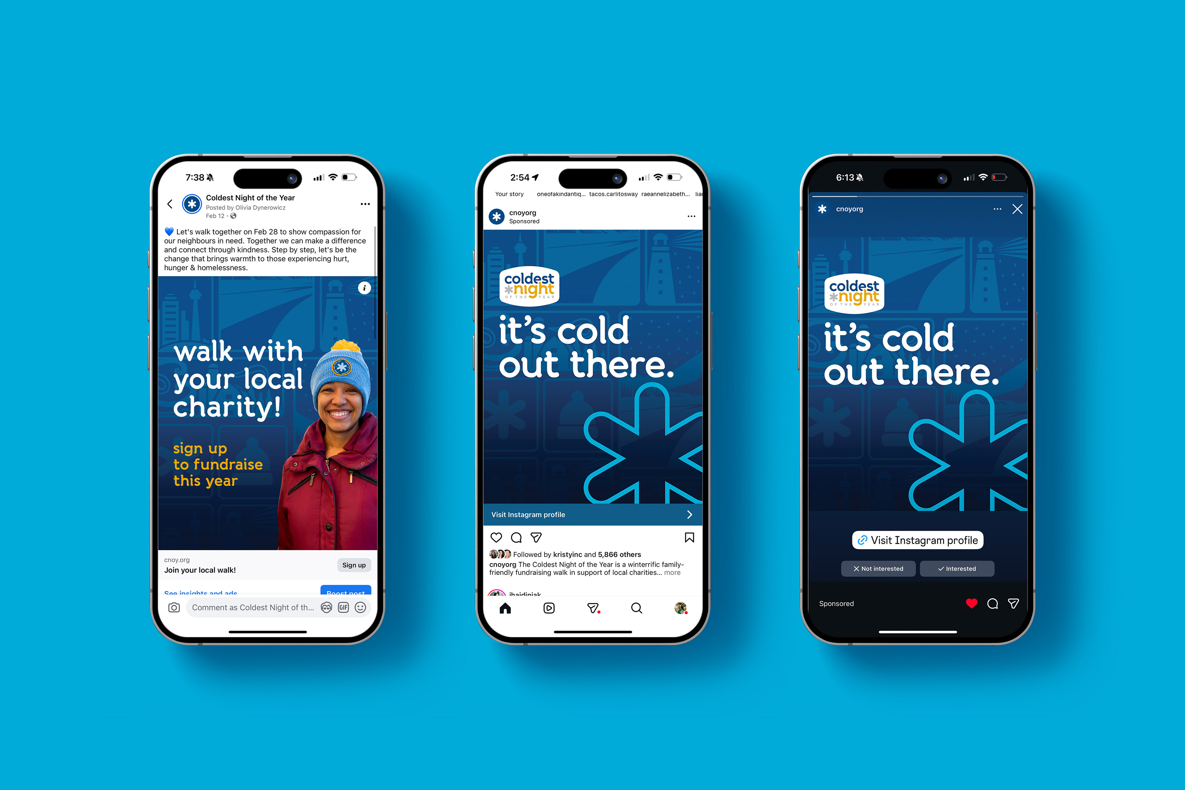
Paid Social Campaign
I led visual direction for the national paid social campaign and managed the Meta advertising strategy.
The campaign used multi-faceted ad sets and tailored call-to-action messaging designed to drive traffic to both the national registration page and campaign social channels.
Ads were developed with clear visual hierarchy and messaging optimized for quick mobile engagement, ensuring strong performance across multiple audience segments.
Performance metrics:
- 1M+ paid impressions
- $0.18–$0.25 CPC
- Contributed to $15M+ raised nationwide
- 1M+ paid impressions
- $0.18–$0.25 CPC
- Contributed to $15M+ raised nationwide
This performance reflects the combination of clear creative direction, targeted messaging, and structured campaign strategy.

Organic Social Media & Creative Direction
In addition to leading visual design for the campaign, I directed the organic social media presence for the national CNOY accounts throughout the 90-day campaign period.
Working alongside a social media assistant, I developed the visual direction and content structure for posts that supported fundraising momentum, participant engagement, and event awareness.
My responsibilities included:
- Art directing social media visuals
- Establishing content structure and post themes
- Creating templates and graphic systems for posts
- Reviewing and approving content before publication
- Guiding the social media assistant on campaign tone and visual consistency
- Art directing social media visuals
- Establishing content structure and post themes
- Creating templates and graphic systems for posts
- Reviewing and approving content before publication
- Guiding the social media assistant on campaign tone and visual consistency
This ensured that the social presence aligned with the broader campaign identity while maintaining a steady cadence of engaging content. During the 90-day campaign window, the organic social media presence contributed to increased community engagement and visibility with 1,000+ new followers across campaign channels
Impact
The 2026 visual system:
- Unified execution across national and local partners
- Strengthened asset usability for hundreds of communities
- Improved clarity and readability
- Supported strong campaign performance
- Unified execution across national and local partners
- Strengthened asset usability for hundreds of communities
- Improved clarity and readability
- Supported strong campaign performance
The campaign raised over $15 million, while social creative delivered strong engagement and efficient cost-per-click results.
Reflection
National campaign design requires systems that are flexible, accessible, scalable, and emotionally resonant.
National campaign design requires systems that are flexible, accessible, scalable, and emotionally resonant.
By refining typography, colour hierarchy, and modular design, I helped elevate CNOY’s visual identity into a cohesive, impactful system — one that supports diverse applications while amplifying mission-driven impact.