Overview
For Pulse SUP, I developed a collection of paddleboard surface designs that blend bold illustration with performance-driven product design.
Each board was created as part of a cohesive visual system — balancing expressive artwork with manufacturing realities and long-format proportion.
The goal: create boards that feel iconic on the water, stand out at retail, and remain production-ready at scale.
My Role
Surface & Product Designer
Surface & Product Designer
I was responsible for:
- Annual concept development and seasonal direction
- Market and trend research
- Illustration creation and scaling for 10–12 ft surfaces
- Demographic targeting by board size and model
- Colour palette development and Pantone selection
- Preparing production-ready files
- Sample review and revision with manufacturer
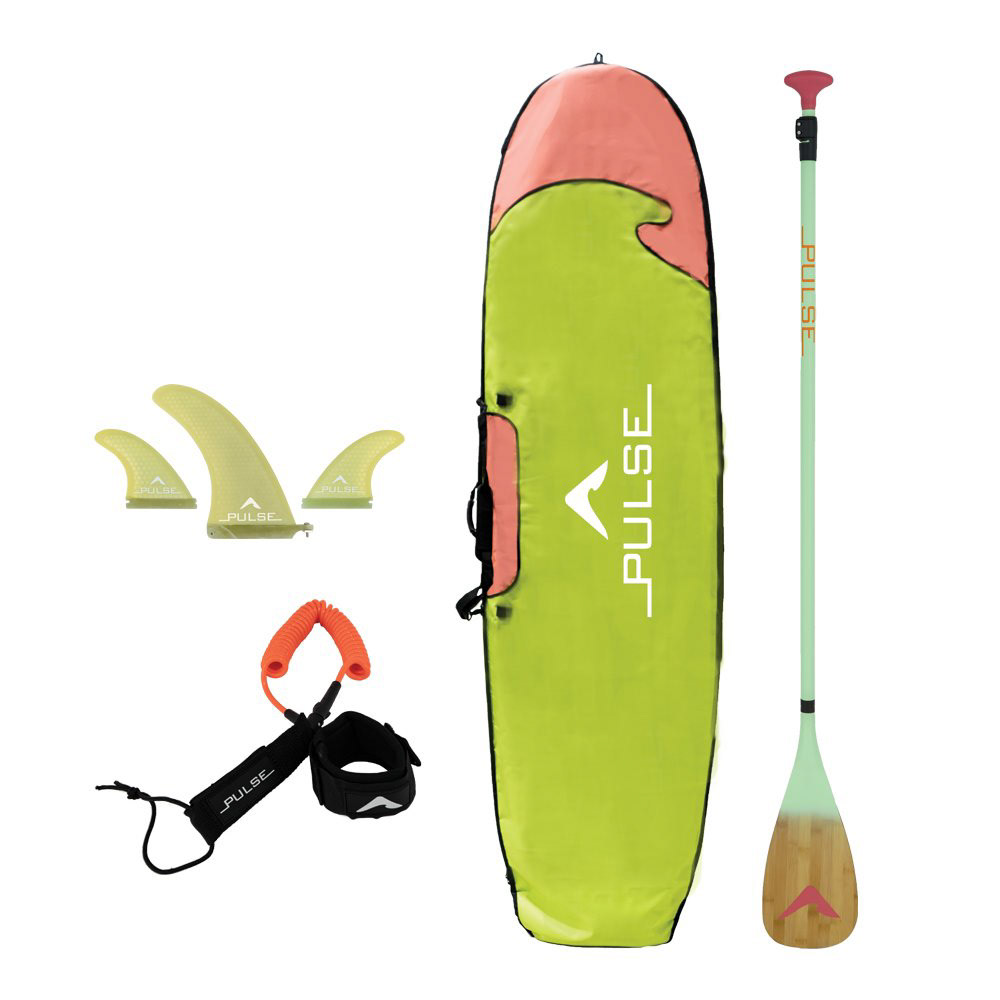
- Coordinating matching accessories (bags, leashes, paddles)
- Market and trend research
- Illustration creation and scaling for 10–12 ft surfaces
- Demographic targeting by board size and model
- Colour palette development and Pantone selection
- Preparing production-ready files
- Sample review and revision with manufacturer
- Coordinating matching accessories (bags, leashes, paddles)
On average, I developed approximately 10 SUP designs per season.
The Opportunity
The paddleboard market was becoming increasingly saturated with minimal, safe graphics.
The paddleboard market was becoming increasingly saturated with minimal, safe graphics.
Pulse SUP had the opportunity to stand apart through bold, illustration-forward surfaces that appealed to specific rider demographics.
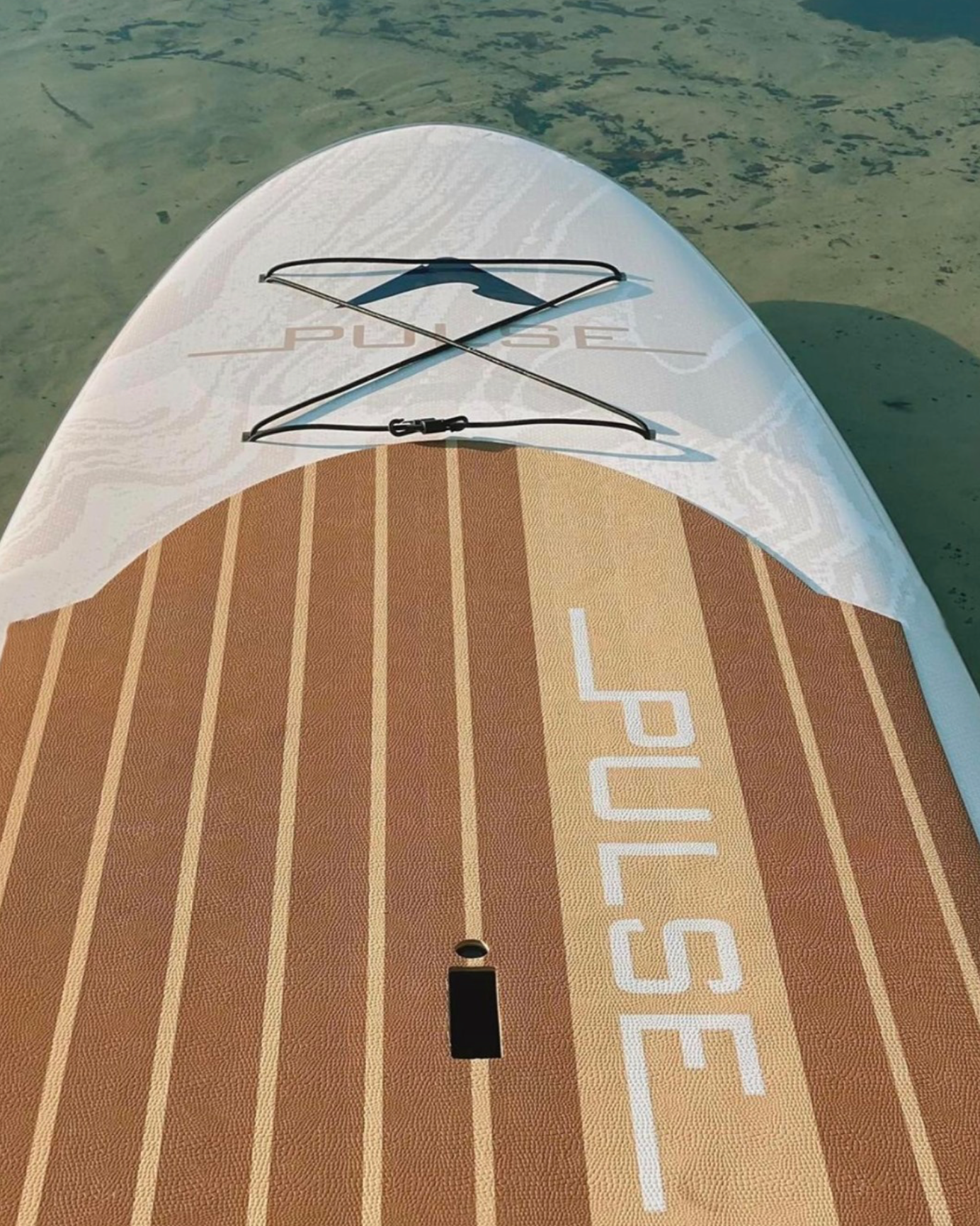
I also identified a growing demand in the inflatable (iSUP) market due to portability and accessibility, creating an opportunity to expand our illustrated language into this emerging category.
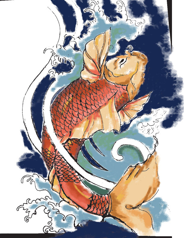
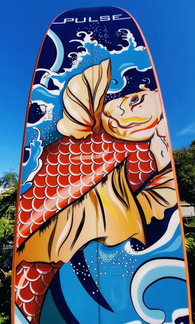
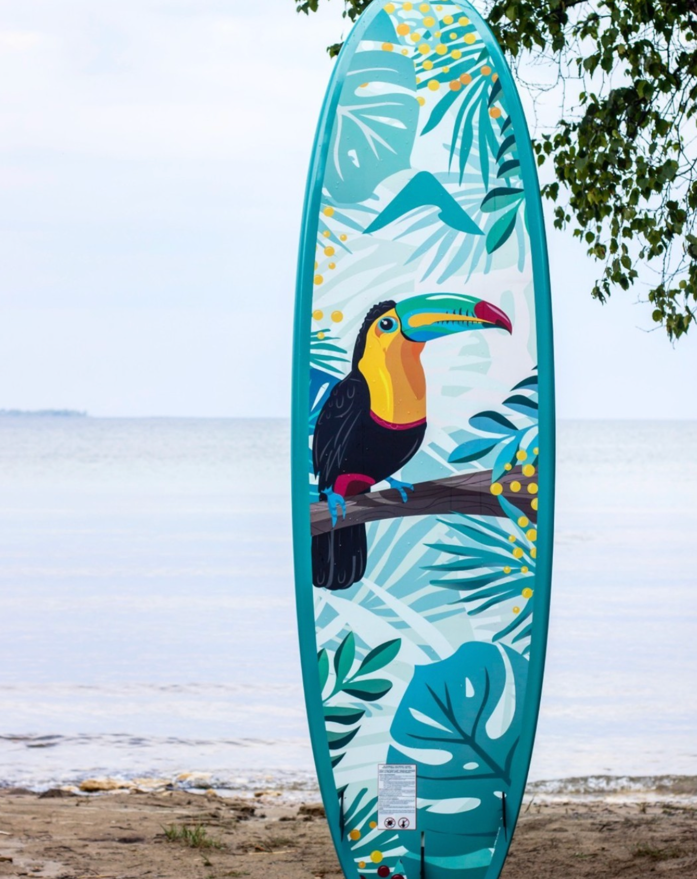
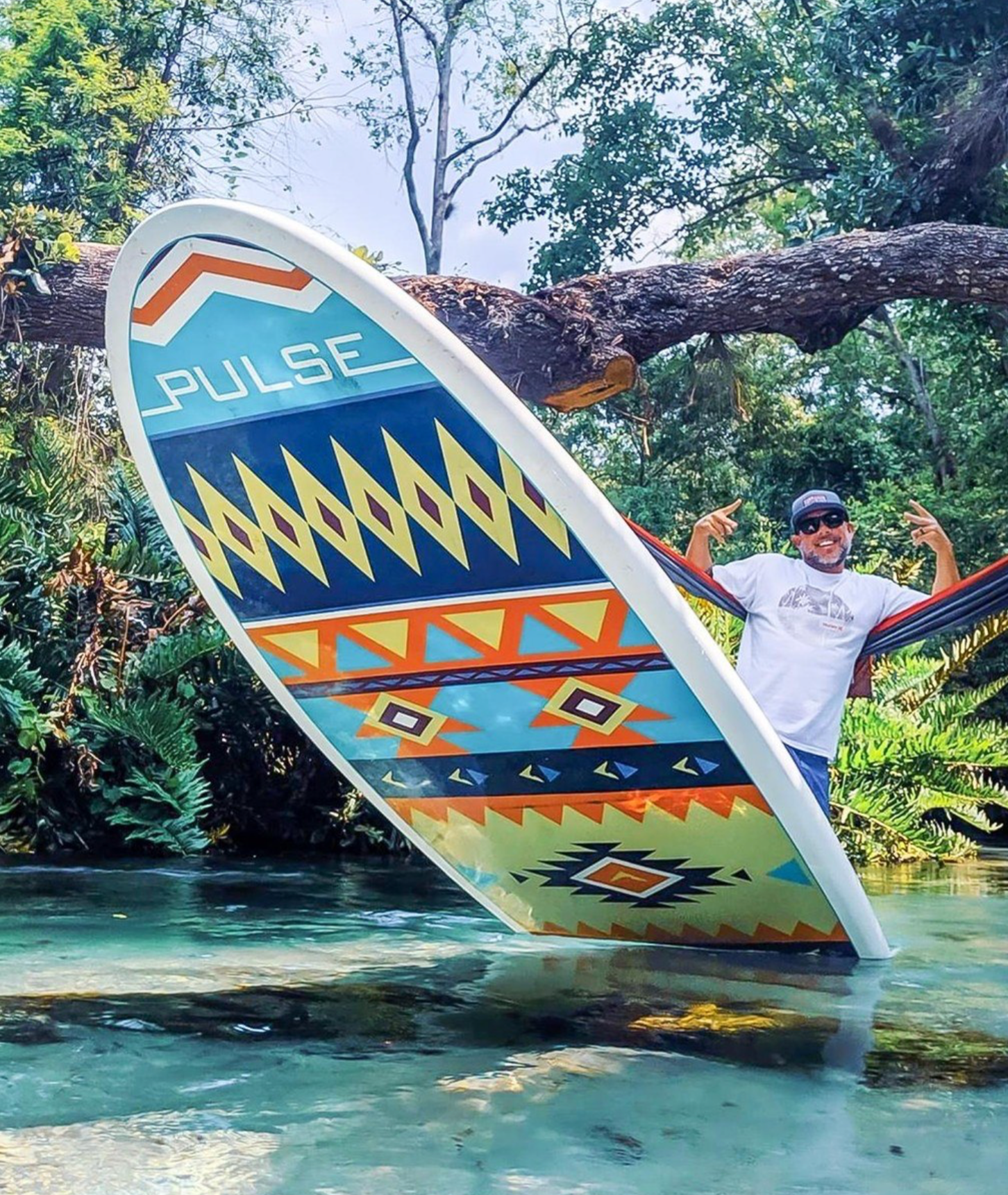
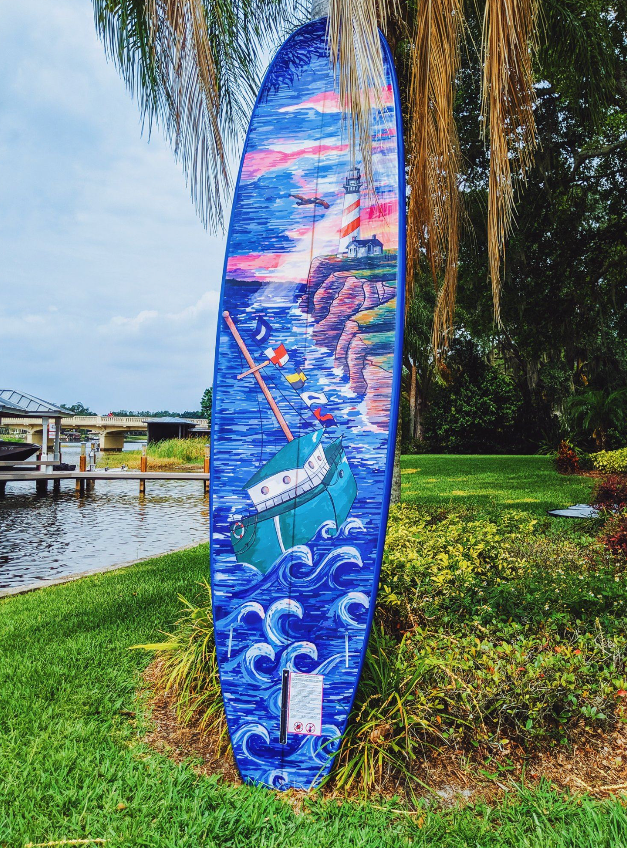
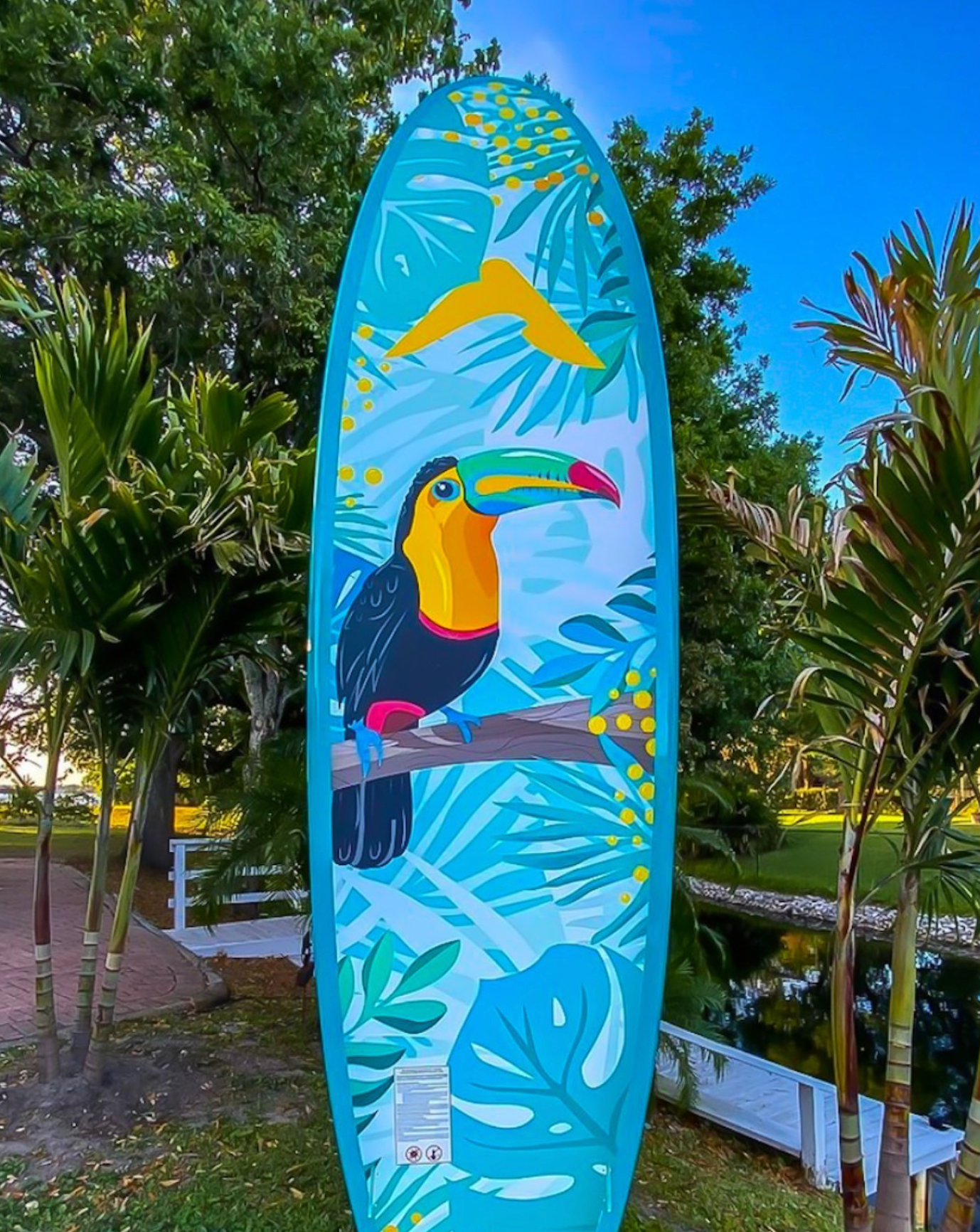
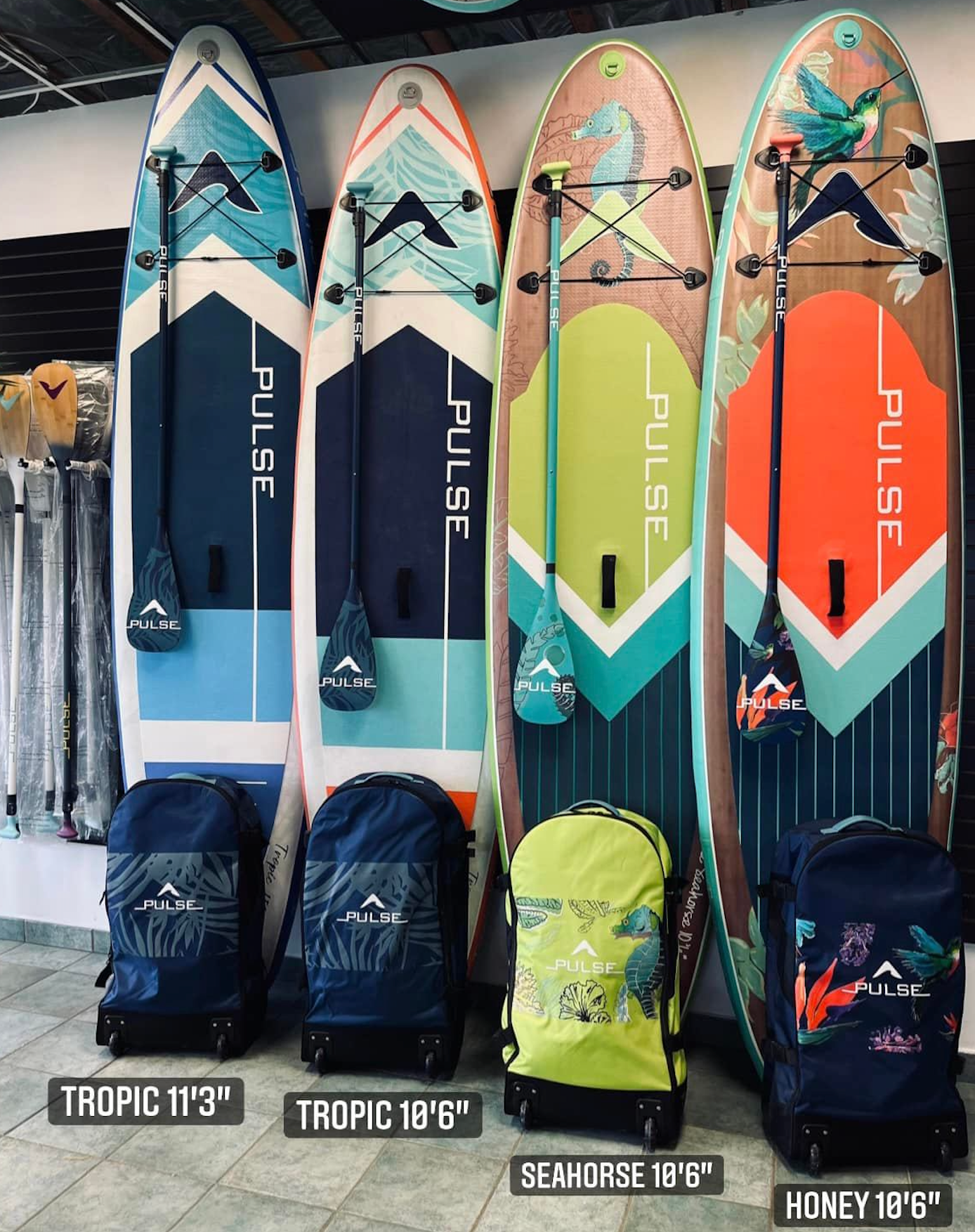
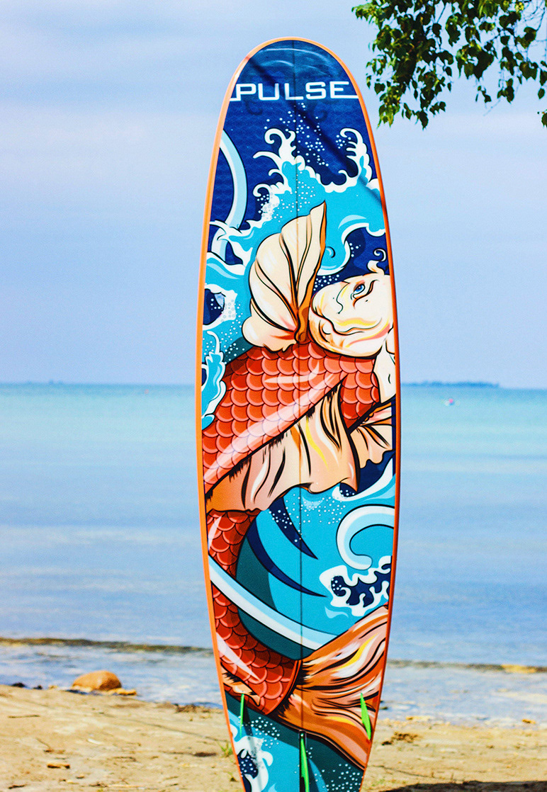
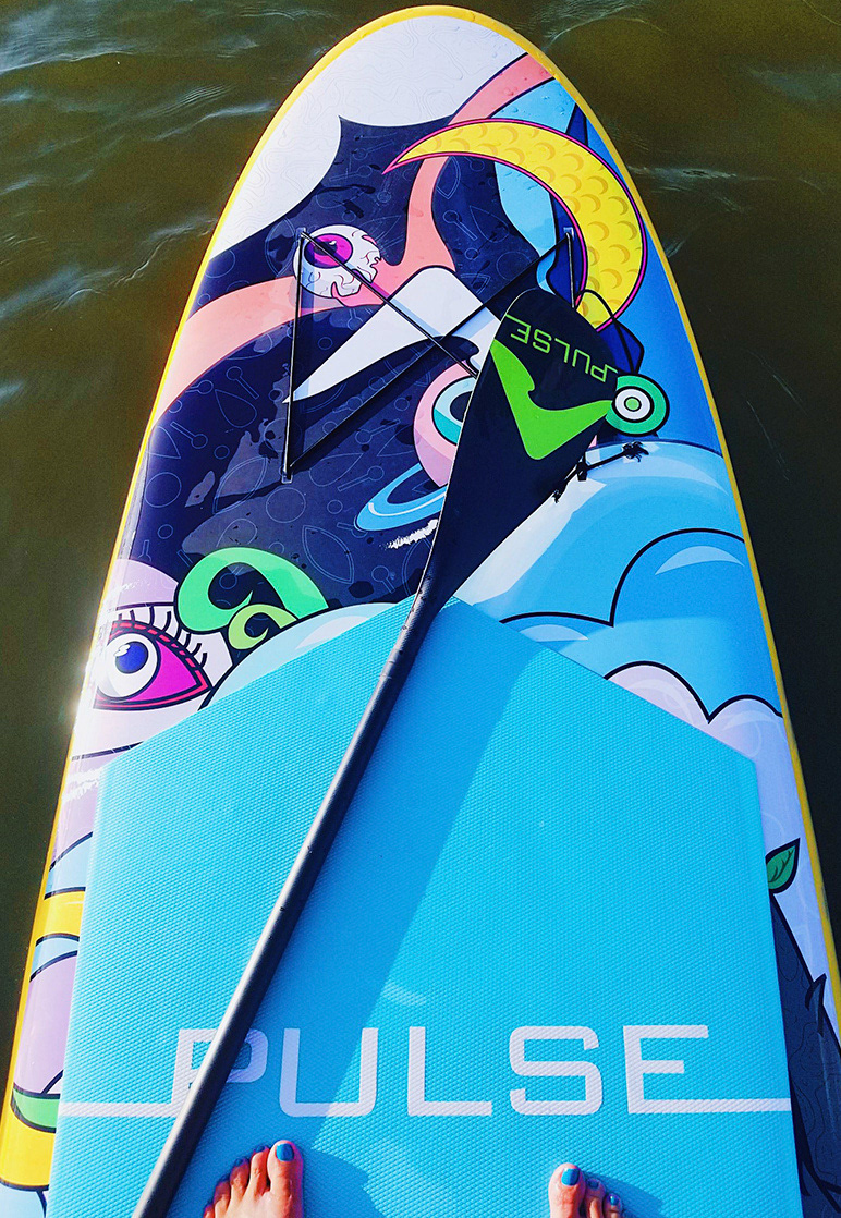
Designing for Scale & Proportion
Paddleboards present a uniquely tall and narrow canvas.
Each design was:
- Illustrated to scale
- Composed specifically for elongated proportions
- Balanced for visual weight from nose to tail
- Adapted depending on board size (10'4" and 11'4") and target rider
- Artwork was created in Illustrator or Photoshop depending on required texture and detail, ensuring clarity at both close range and distance on the water.
These were not surface graphics placed onto a product, they were designed for the product’s physical form.
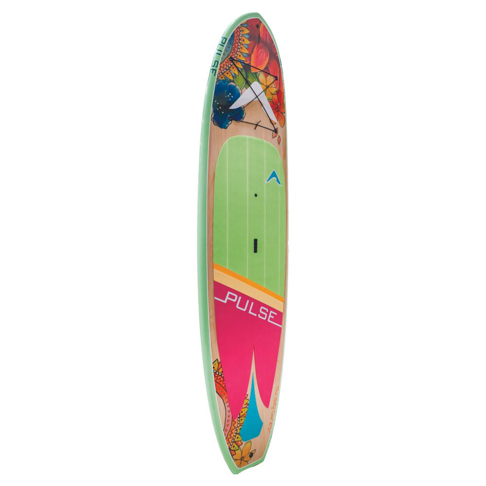
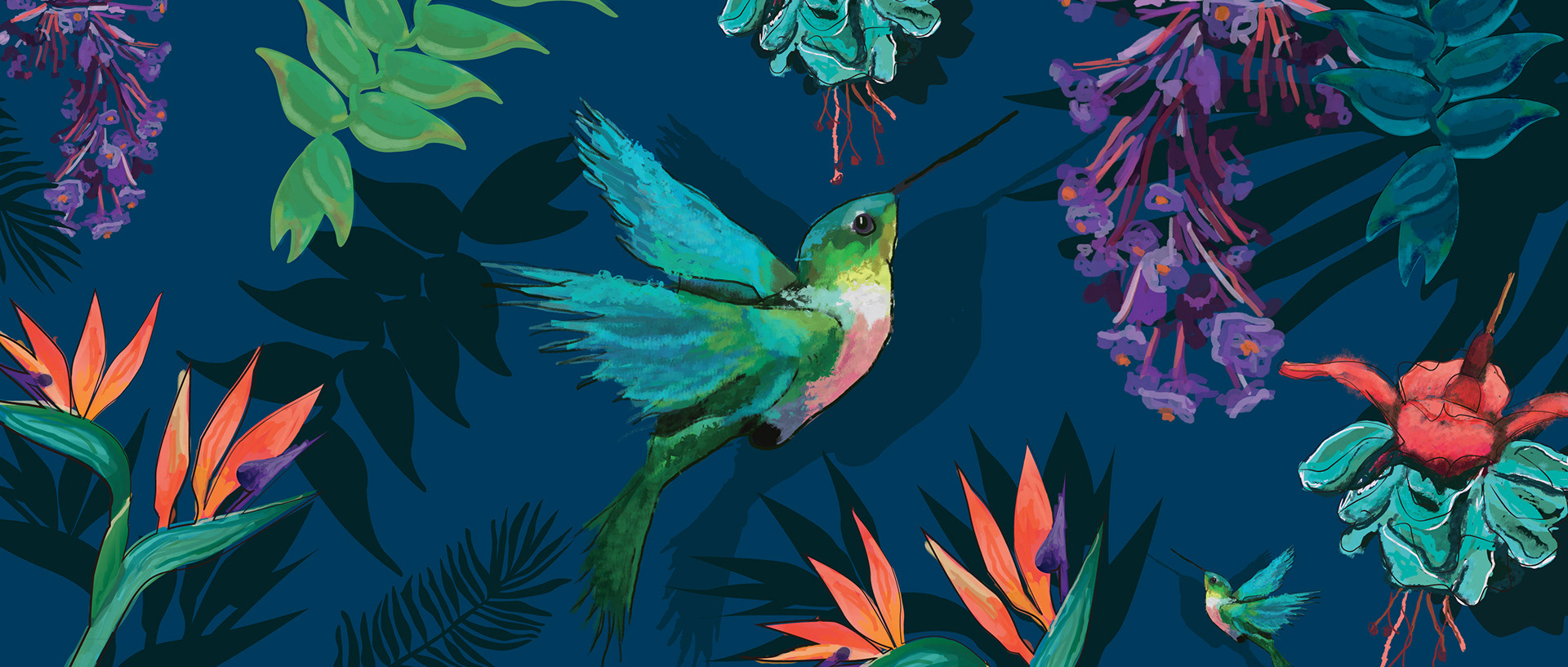
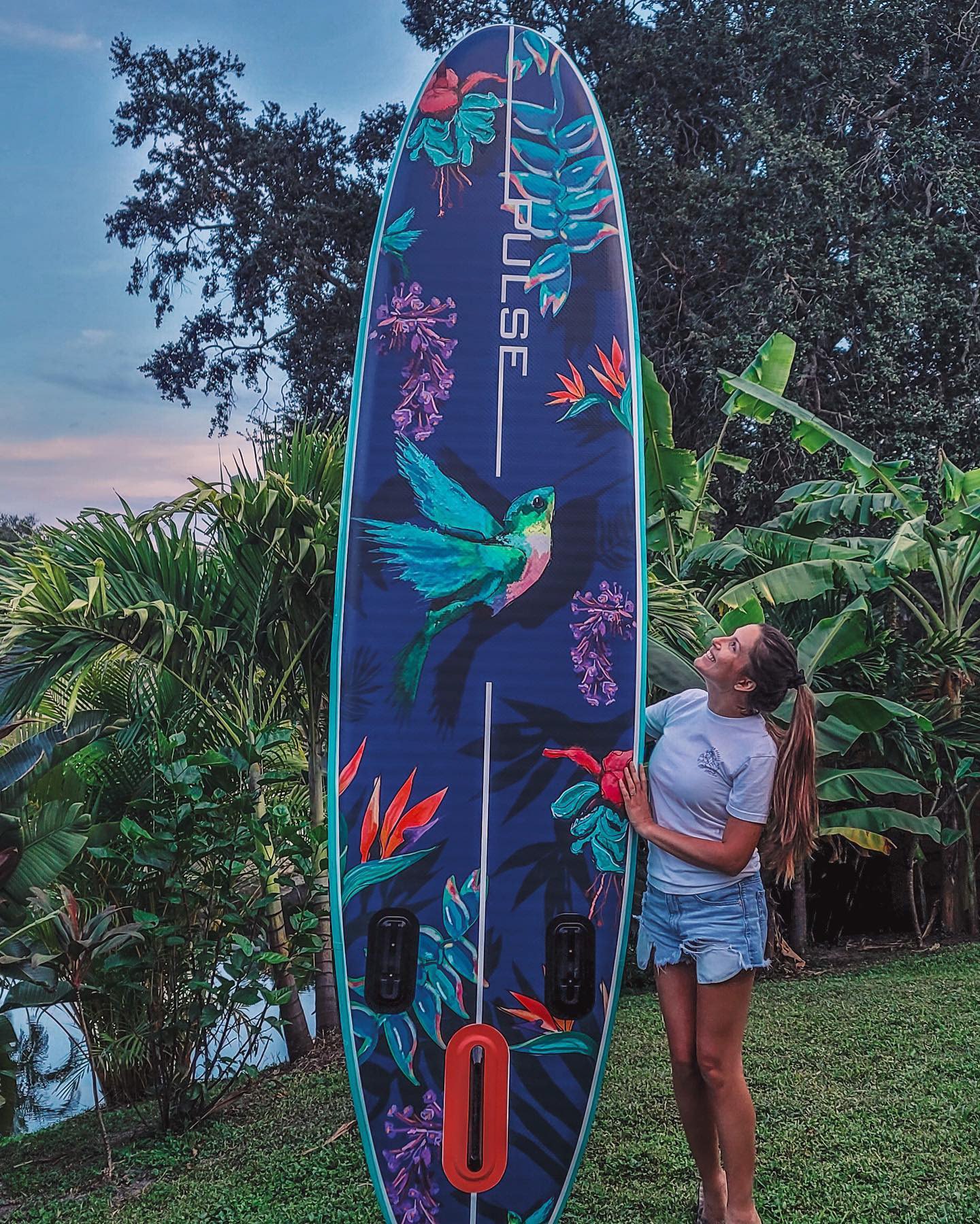
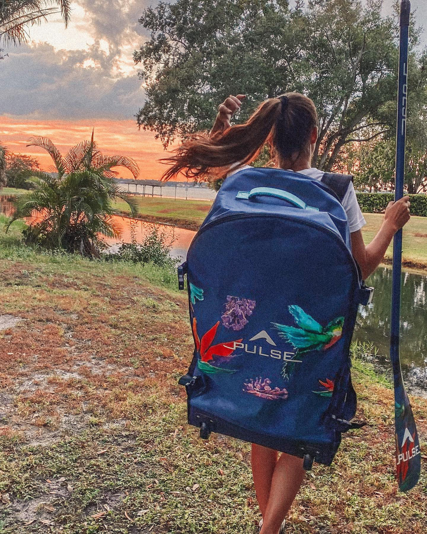
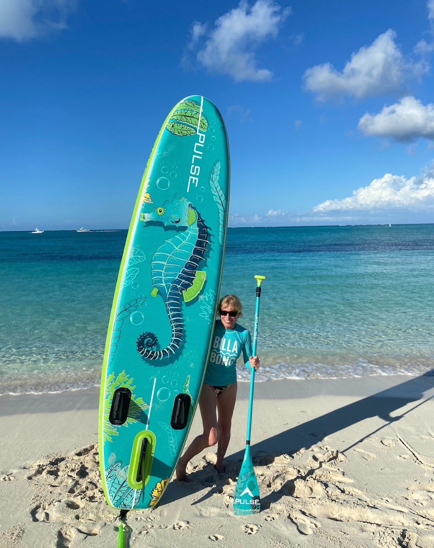
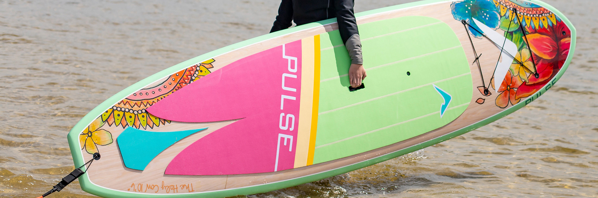
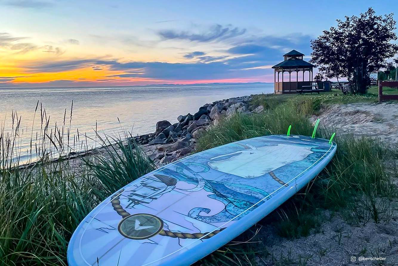
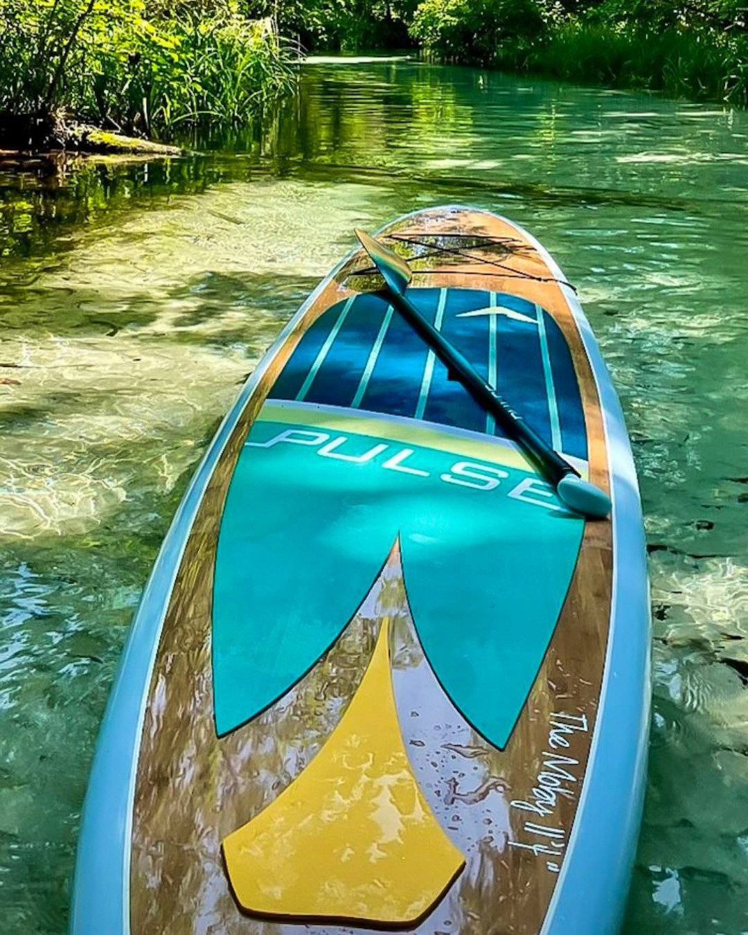
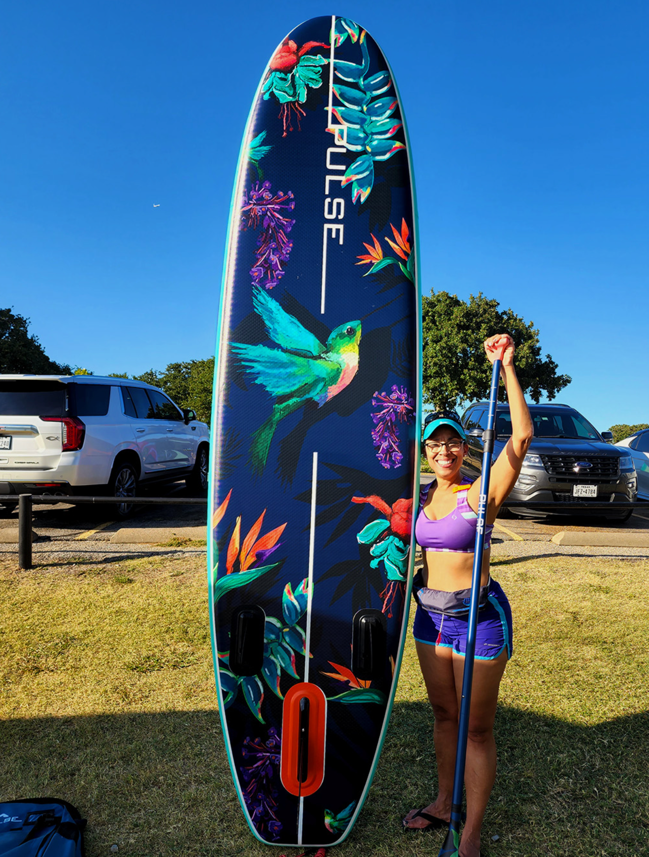
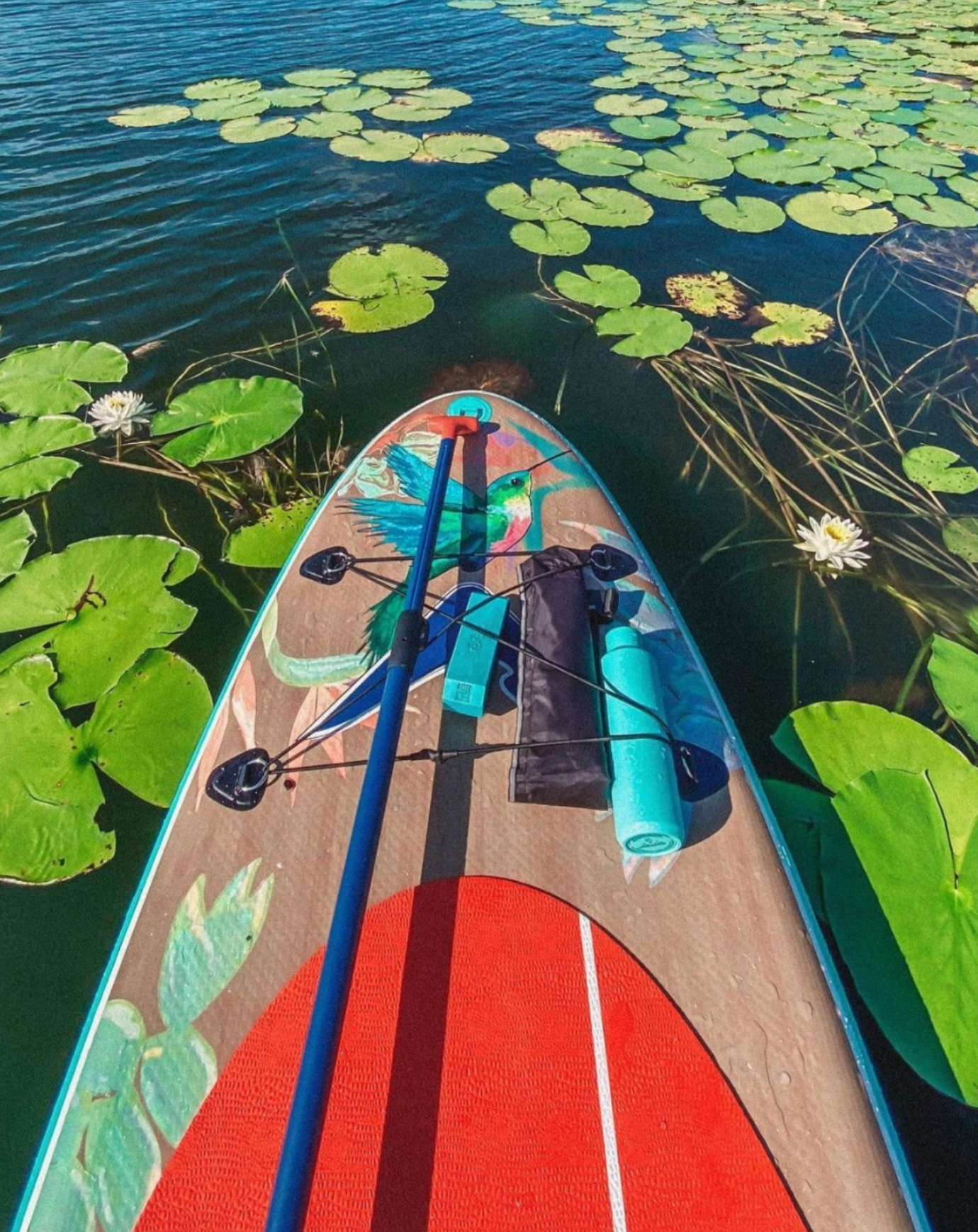
Highlight: The Honey iSUP
Recognizing the upward trend in inflatable boards, I pitched the concept of introducing illustration-forward iSUPs to the lineup.
The Honey was a botanical-inspired inflatable design featuring hand-drawn plants, blossoms, and hummingbirds. Each element was illustrated in Photoshop using custom brushes to create depth and movement.
The composition was carefully arranged to maintain harmony along the narrow vertical surface while preserving bold shelf presence.
Matching accessories were developed to extend the visual system, and Pantone colours, bamboo swatches, and pad treatments were selected to ensure material consistency.
The Honey became one of our best-selling inflatable boards.
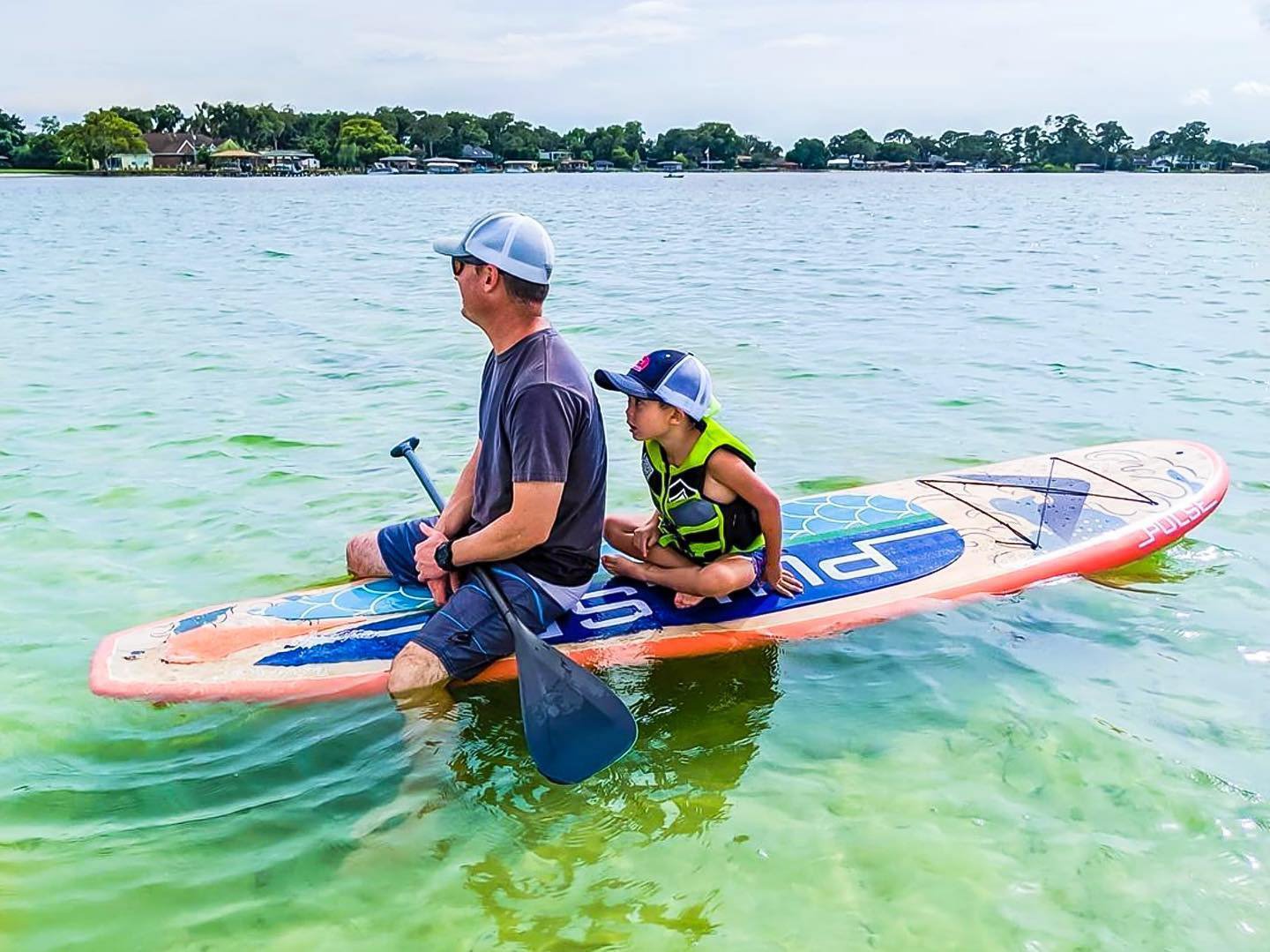
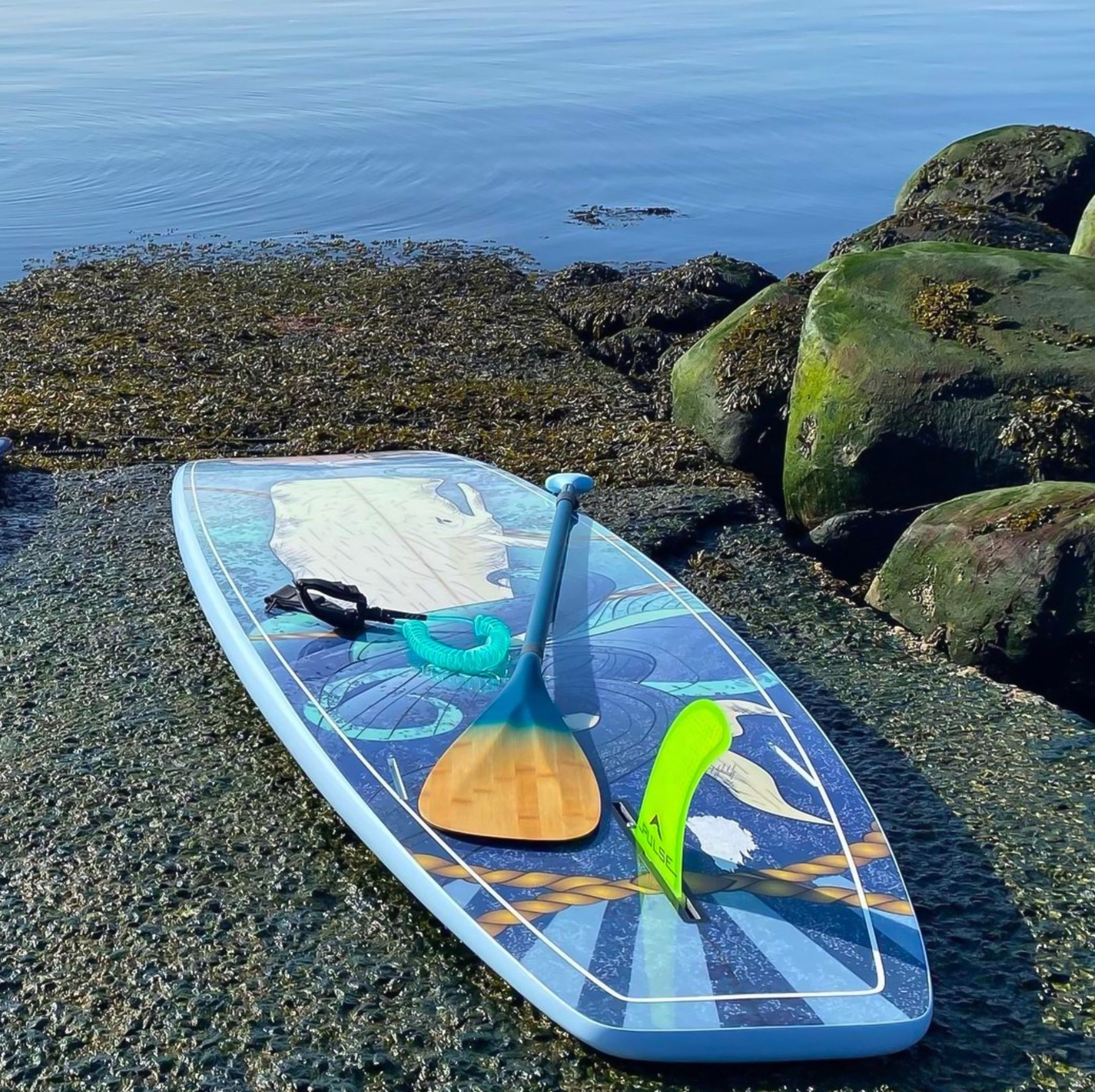
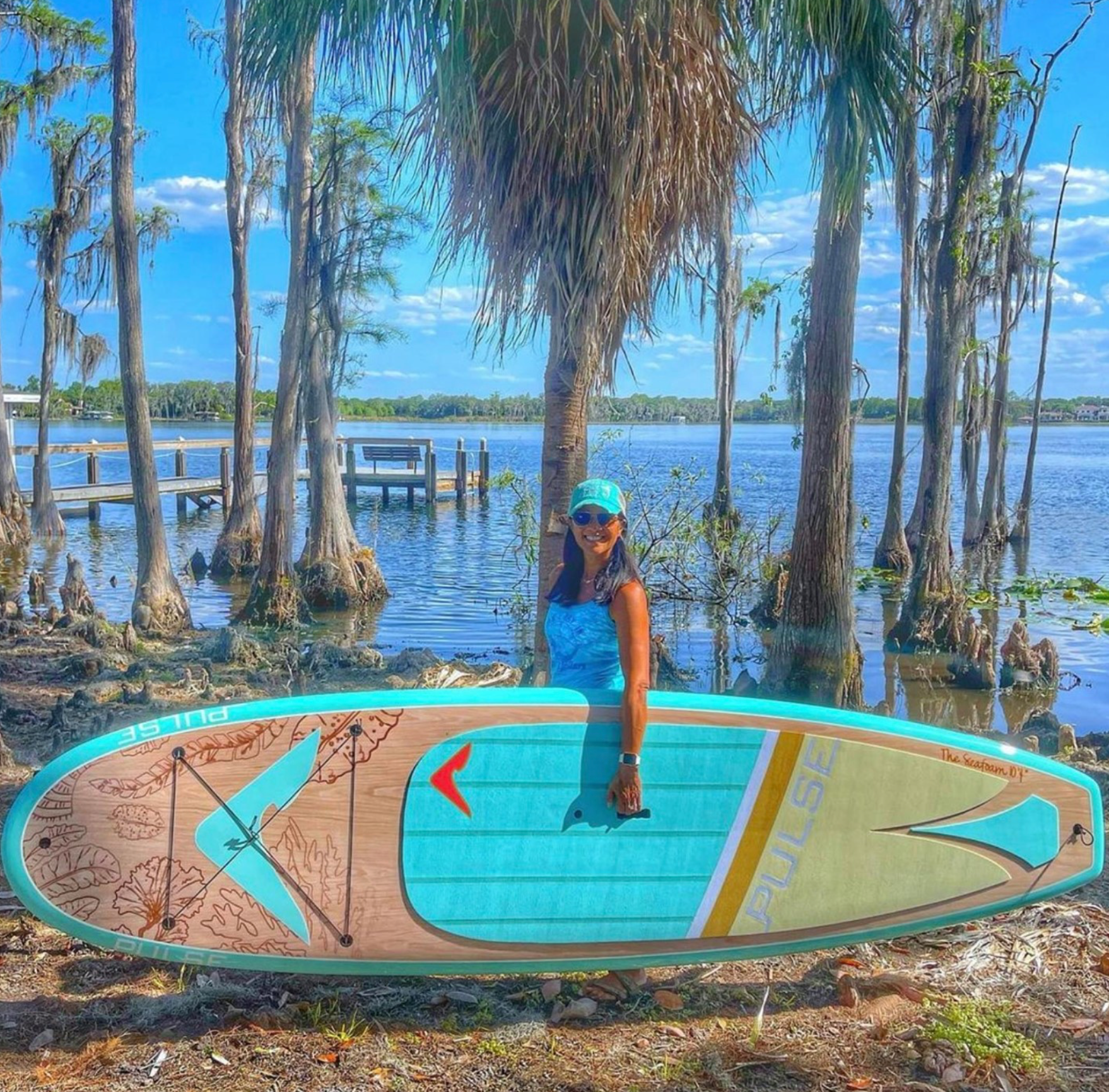
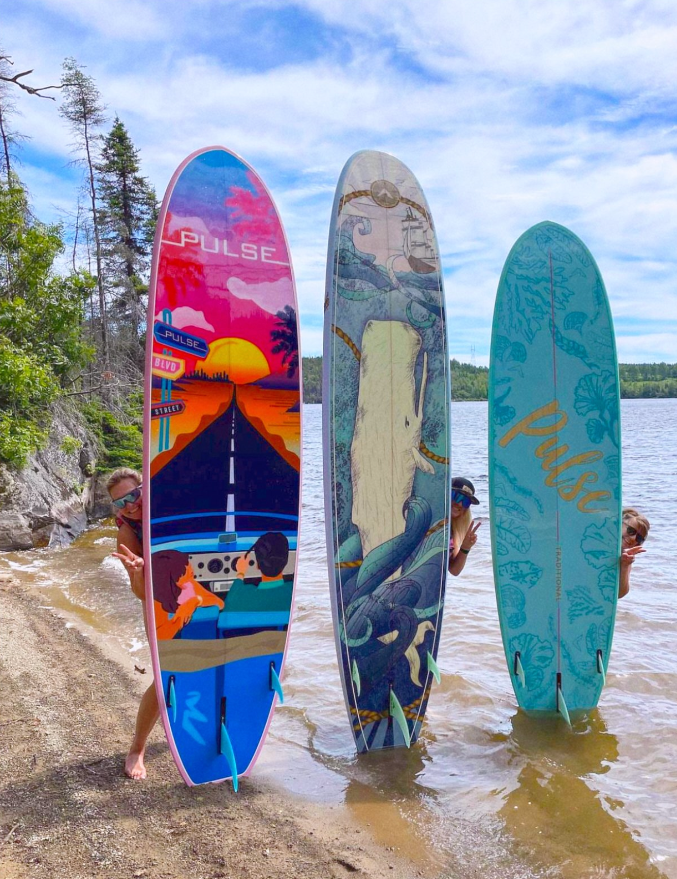
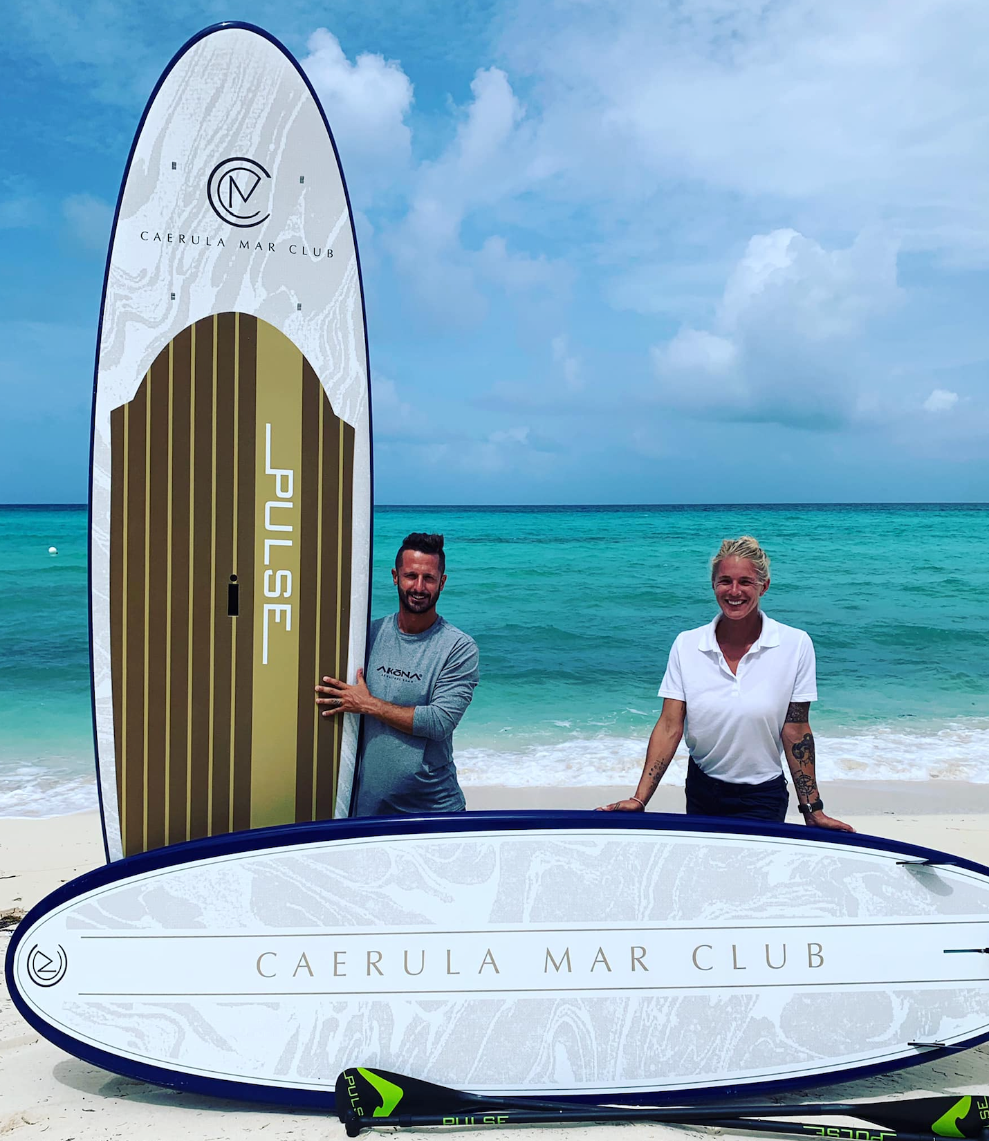
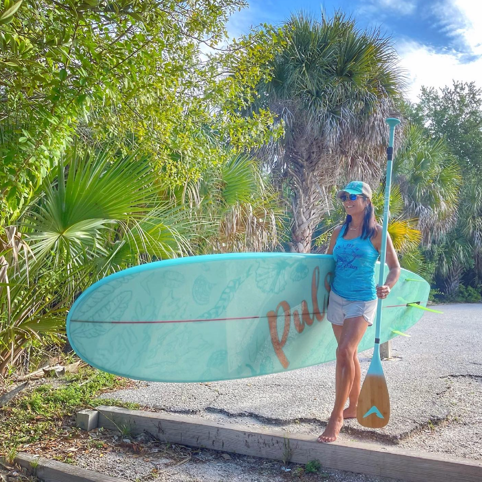
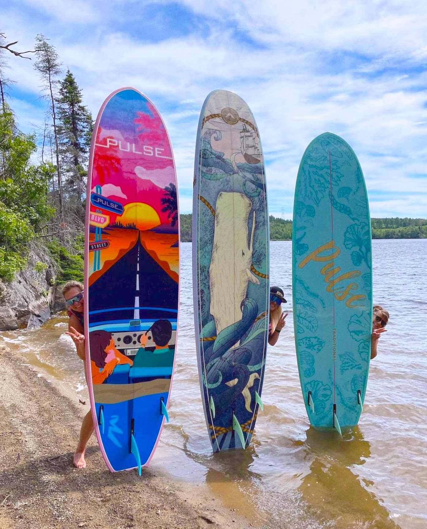
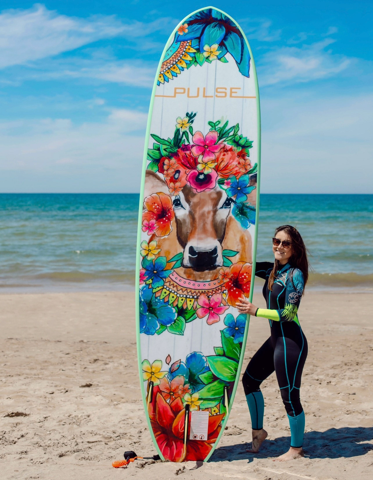
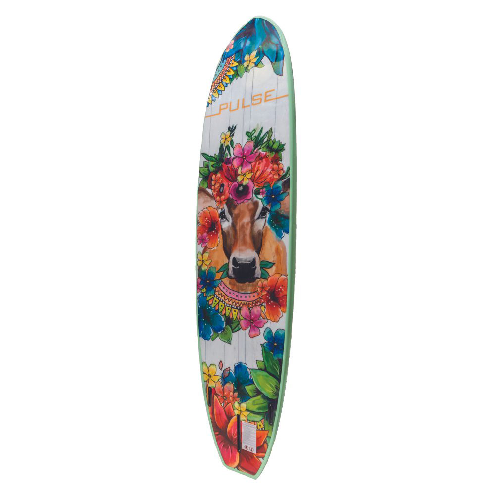
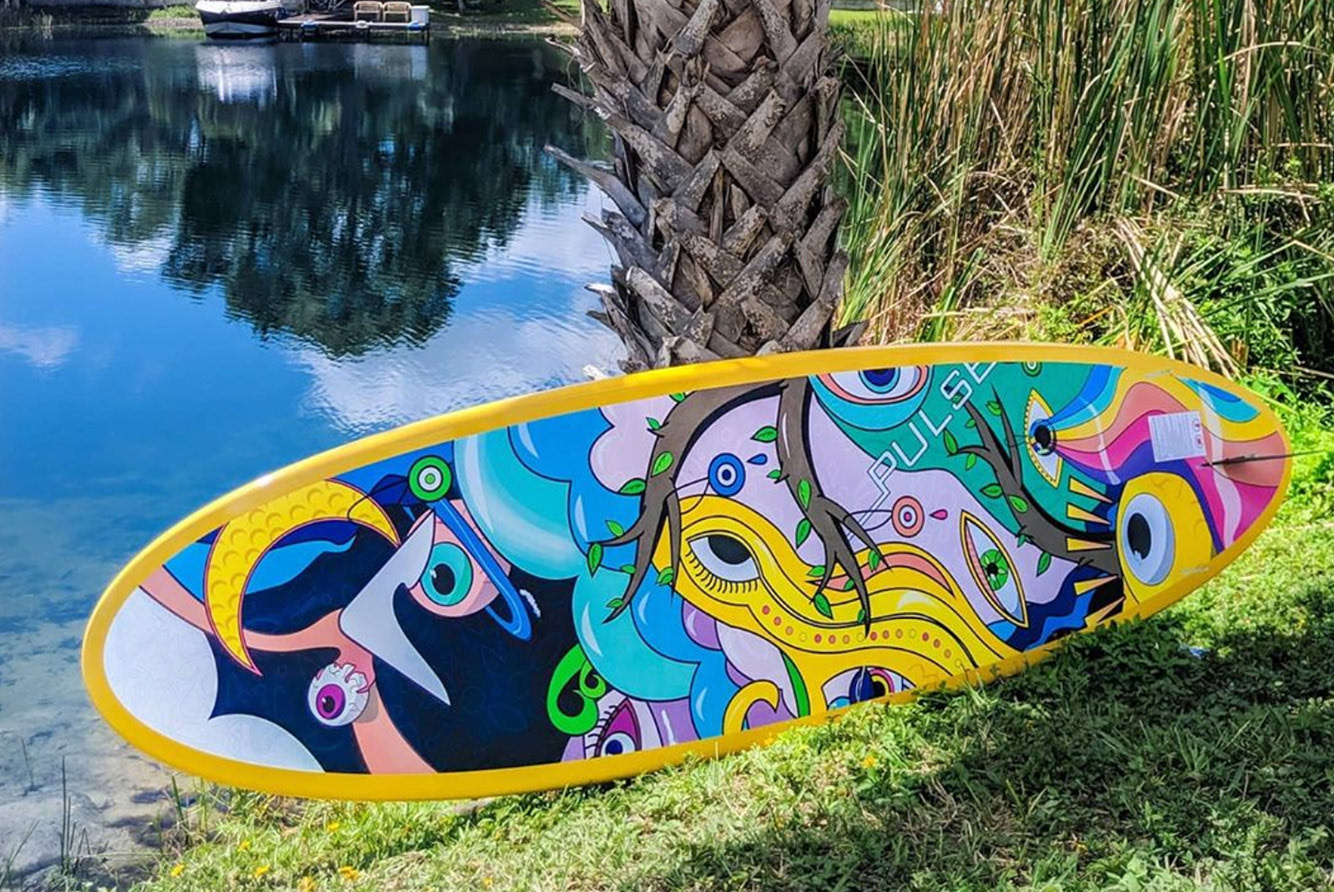
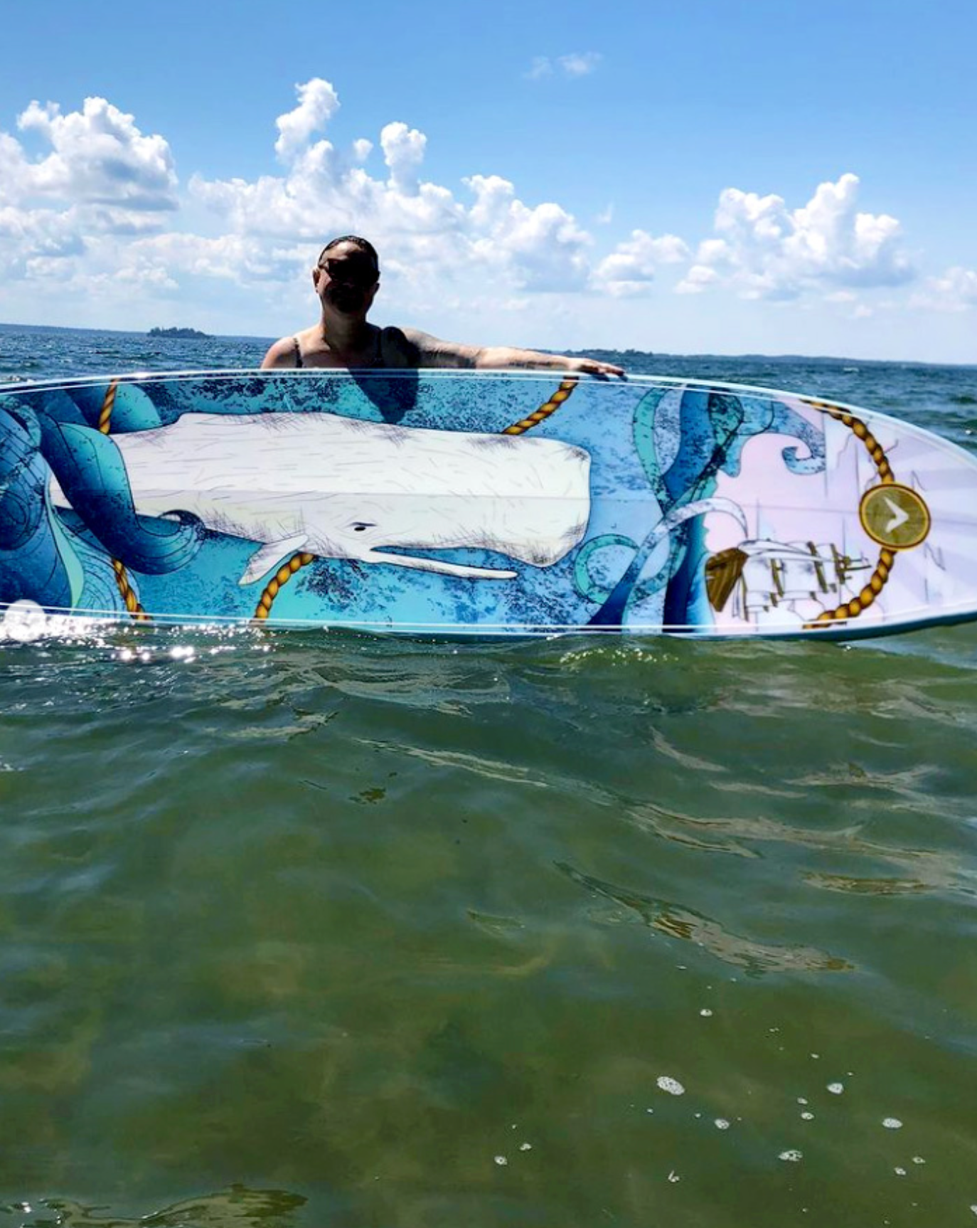
The Collection
Wanda, Honey, Holy Cow, Moby, and Good Karma each express distinct personalities while remaining cohesive within the Pulse visual language.
The collection balances:
- Confident colour blocking
- Clean graphic silhouettes
- Controlled negative space
- Strong readability at distance
- Confident colour blocking
- Clean graphic silhouettes
- Controlled negative space
- Strong readability at distance
Each board was engineered to maintain integrity when wrapped across rails and curved surfaces.
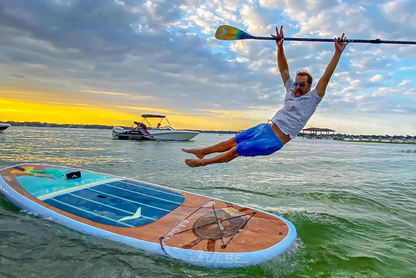
Commercial Impact
Many of the boards I designed, including The Honey, The Moby, The Wanda, and The Holy Cow, became top-performing products at retail.
Several exceeded their typical 2–3 year lifecycle due to sustained demand.
These designs contributed to hundreds of thousands of dollars in wholesale sales across Canada and the United States and generated strong repeat interest from retailers.
Reflection
Surface design in performance products sits at the intersection of illustration, branding, and industrial production.
By pairing expressive artwork with disciplined manufacturing execution and market awareness, I helped position Pulse SUP as a bold, recognizable brand in a competitive watersports market.
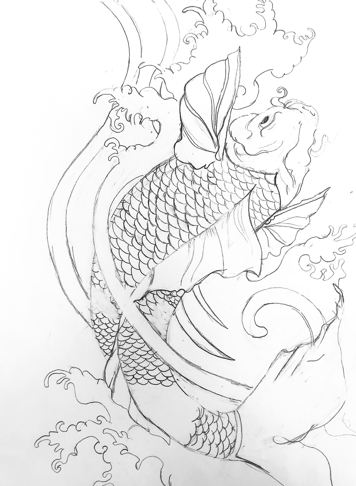
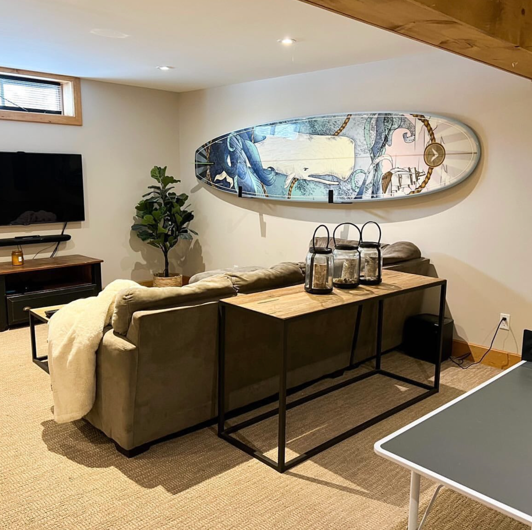
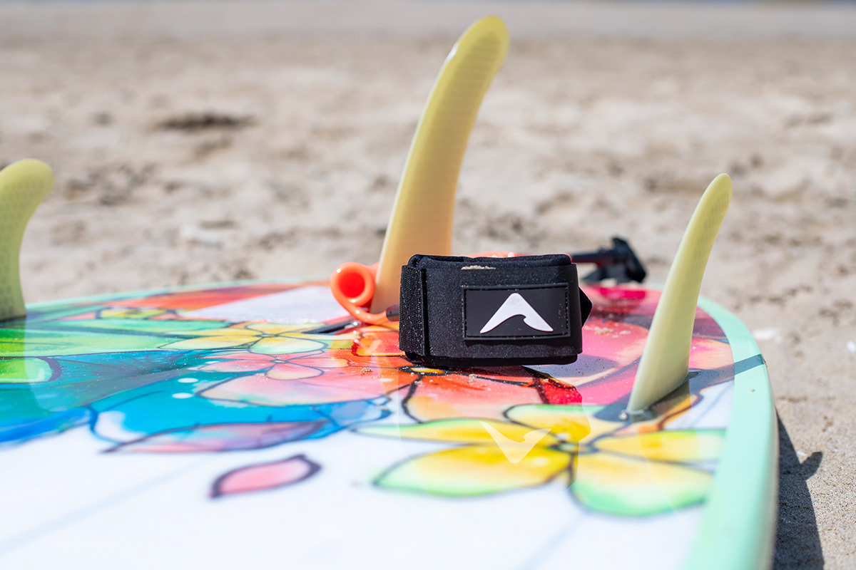
A quick look at other original designs + illustrations I created for Pulse SUP Paddleboards: