

Overview
Steps for Pets is a peer-to-peer fundraising event supporting animal care, rescue, and adoption. The goal was to create a joyful, community-driven brand that balanced emotional warmth with high-energy participation while remaining aligned with the tone of the parent organization.
Inspired by the structure of an existing national fundraising event, the challenge was to develop a distinct identity that could stand on its own while maintaining credibility and trust. The brand needed to capture both the urgency of animal welfare and the hopeful, celebratory spirit of adoption and community support.
Built around the tagline For Hearts of All Sizes, the concept centers on connection — between people and pets, between communities and local shelters, and between compassion and celebration.
My Role
Visual Design Lead | Art Director & Graphic Designer
Visual Design Lead | Art Director & Graphic Designer
I led the creative direction and development of the brand identity system from concept through execution.
Responsibilities included:
- Developing the core brand concept and tagline
- Designing the logo and full identity system
- Establishing colour, typography, illustration, and photography guidelines
- Creating scalable assets for digital, print, and environmental applications
- Defining accessibility and usability standards for multi-channel rollout
Visual Identity
Logo
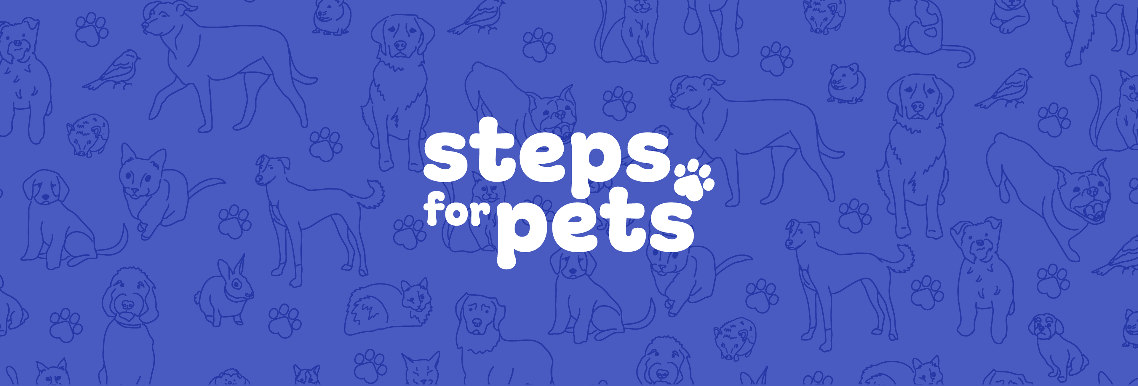
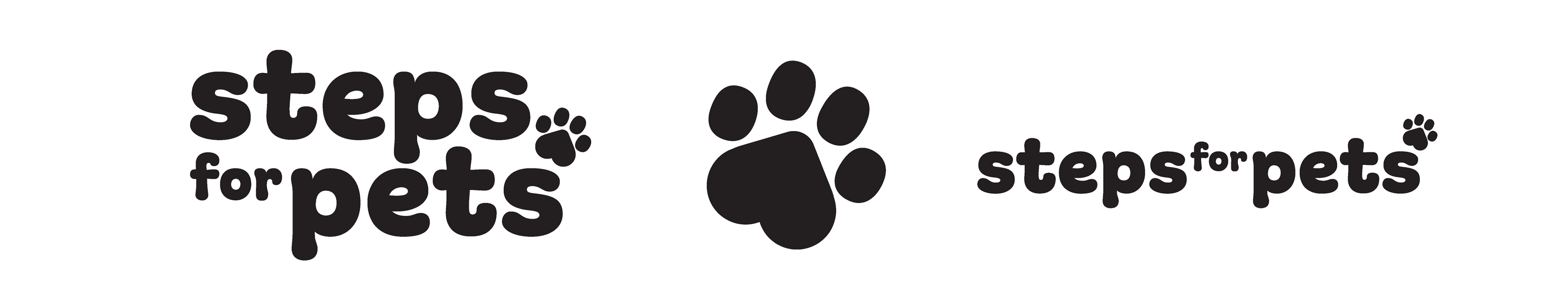
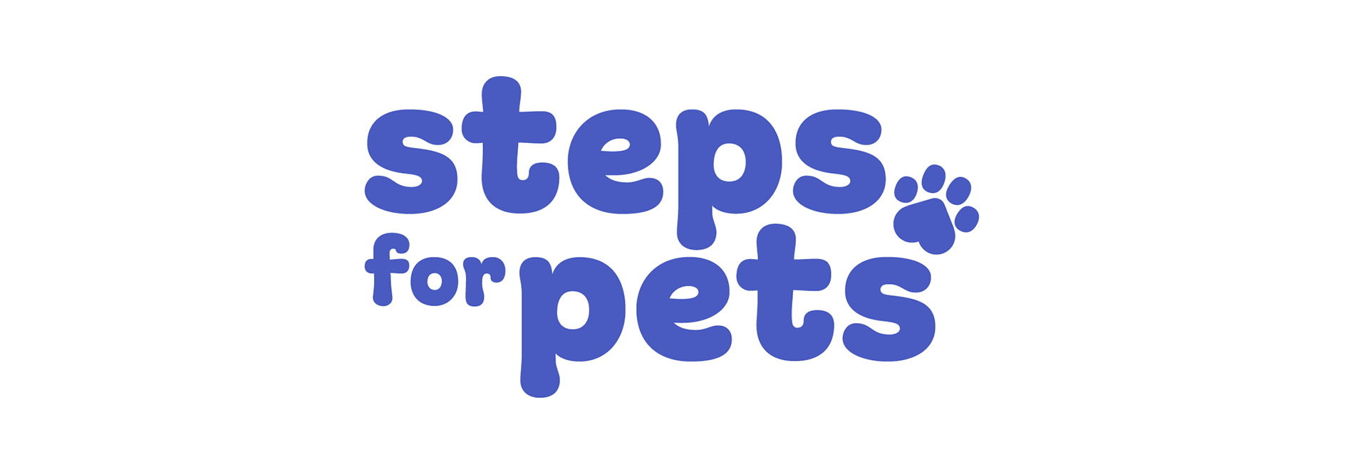
The wordmark uses rounded, friendly typography to create immediate warmth and approachability. A stylized pawprint is integrated into the design, symbolizing movement, presence, and the animals at the heart of the event.
The wordmark uses rounded, friendly typography to create immediate warmth and approachability. A stylized pawprint is integrated into the design, symbolizing movement, presence, and the animals at the heart of the event.
The logo balances boldness and softness — confident enough to rally a crowd, gentle enough to reflect the emotional core of adoption and care.
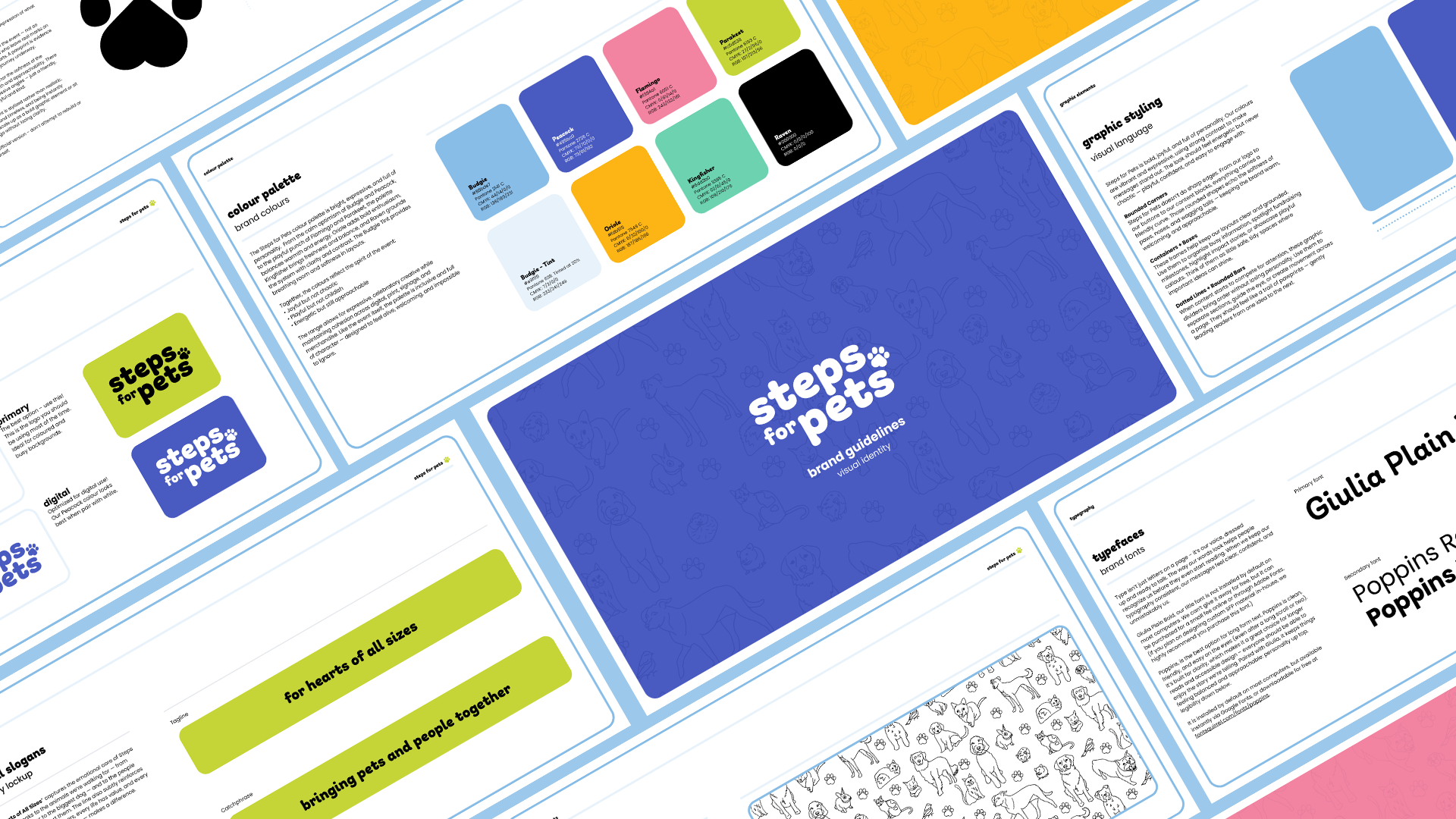
Colour System
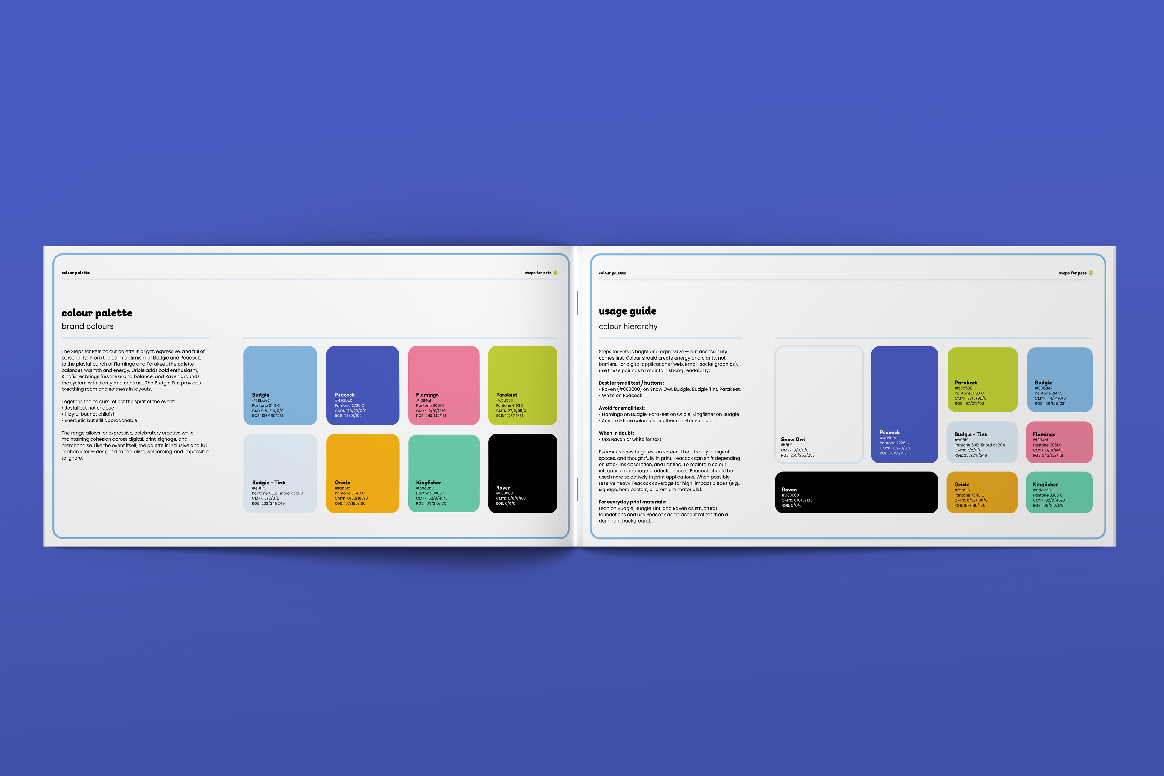
The palette is vibrant, expressive, and personality-driven, with each colour named after a bird species to reinforce life and movement.
The palette is vibrant, expressive, and personality-driven, with each colour named after a bird species to reinforce life and movement.
Bright accents like Flamingo, Oriole, and Parakeet inject energy and playfulness, while Budgie Tint and Raven provide balance and clarity. Peacock functions as a digital-first anchor colour, optimized for screen vibrancy while used more selectively in print. A defined ratio system (60/30/10) ensures layouts remain energetic but controlled. Accessibility standards were prioritized across digital applications to ensure inclusive contrast and readability.
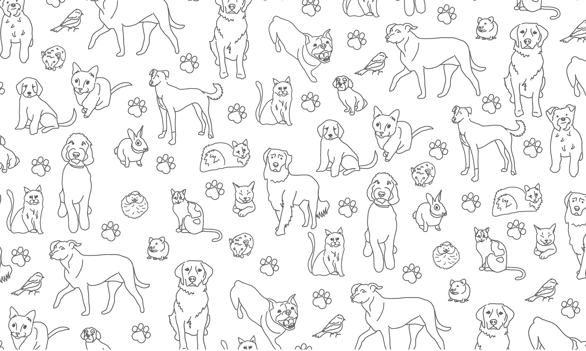
Illustration & Pattern
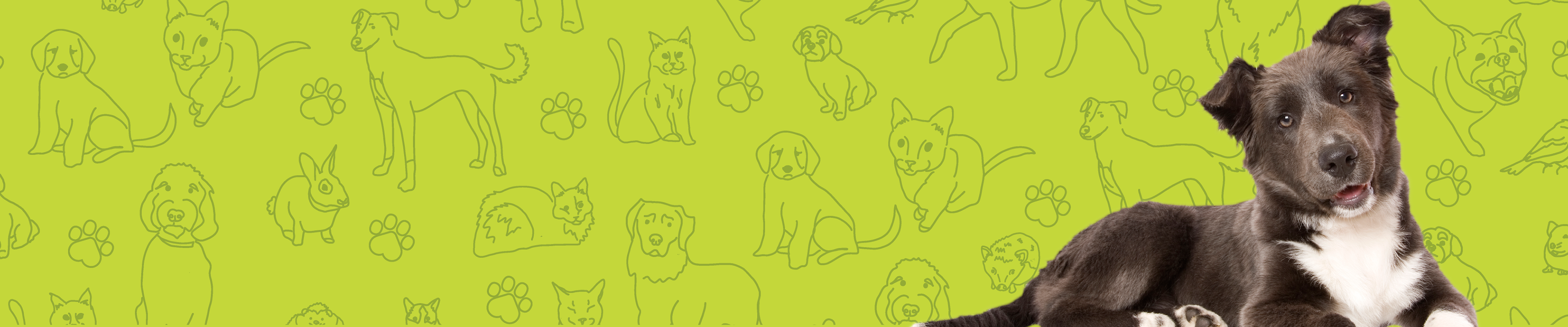
A custom hand-drawn illustration pattern was created using pets from the internal team. This added authenticity and emotional depth to the system, reinforcing that the brand is about real relationships — not abstract concepts. The monochromatic execution allows the pattern to layer seamlessly across applications without overpowering the design.
A custom hand-drawn illustration pattern was created using pets from the internal team. This added authenticity and emotional depth to the system, reinforcing that the brand is about real relationships — not abstract concepts. The monochromatic execution allows the pattern to layer seamlessly across applications without overpowering the design.
Texture & Graphic Elements
A subtle grain texture was introduced to soften large colour fields and add tactile warmth. Rounded containers, dotted dividers, and curved shapes echo the softness of paws and tails, reinforcing the brand’s approachable personality.
A subtle grain texture was introduced to soften large colour fields and add tactile warmth. Rounded containers, dotted dividers, and curved shapes echo the softness of paws and tails, reinforcing the brand’s approachable personality.
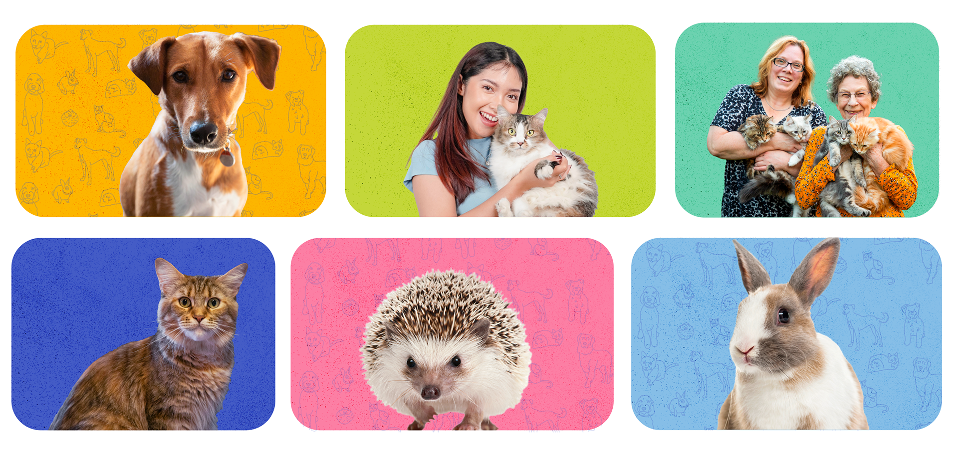
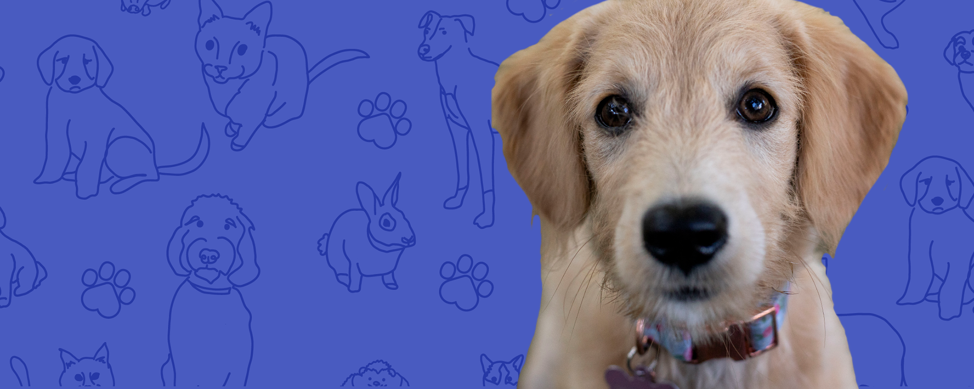
Photography Direction
Photography centers on genuine connection. Bright, optimistic imagery showcases real moments between people and pets — laughter, movement, affection, personality.
Photography centers on genuine connection. Bright, optimistic imagery showcases real moments between people and pets — laughter, movement, affection, personality.
The visual tone avoids somber or overly staged imagery, instead celebrating the hopeful arc of adoption and belonging.
Voice & Tone
The brand voice is warm, conversational, and human. It avoids nonprofit jargon and speaks directly, with sincerity and lightness. The tone embraces joy without diminishing the meaningful work behind animal care and rescue.
The brand voice is warm, conversational, and human. It avoids nonprofit jargon and speaks directly, with sincerity and lightness. The tone embraces joy without diminishing the meaningful work behind animal care and rescue.
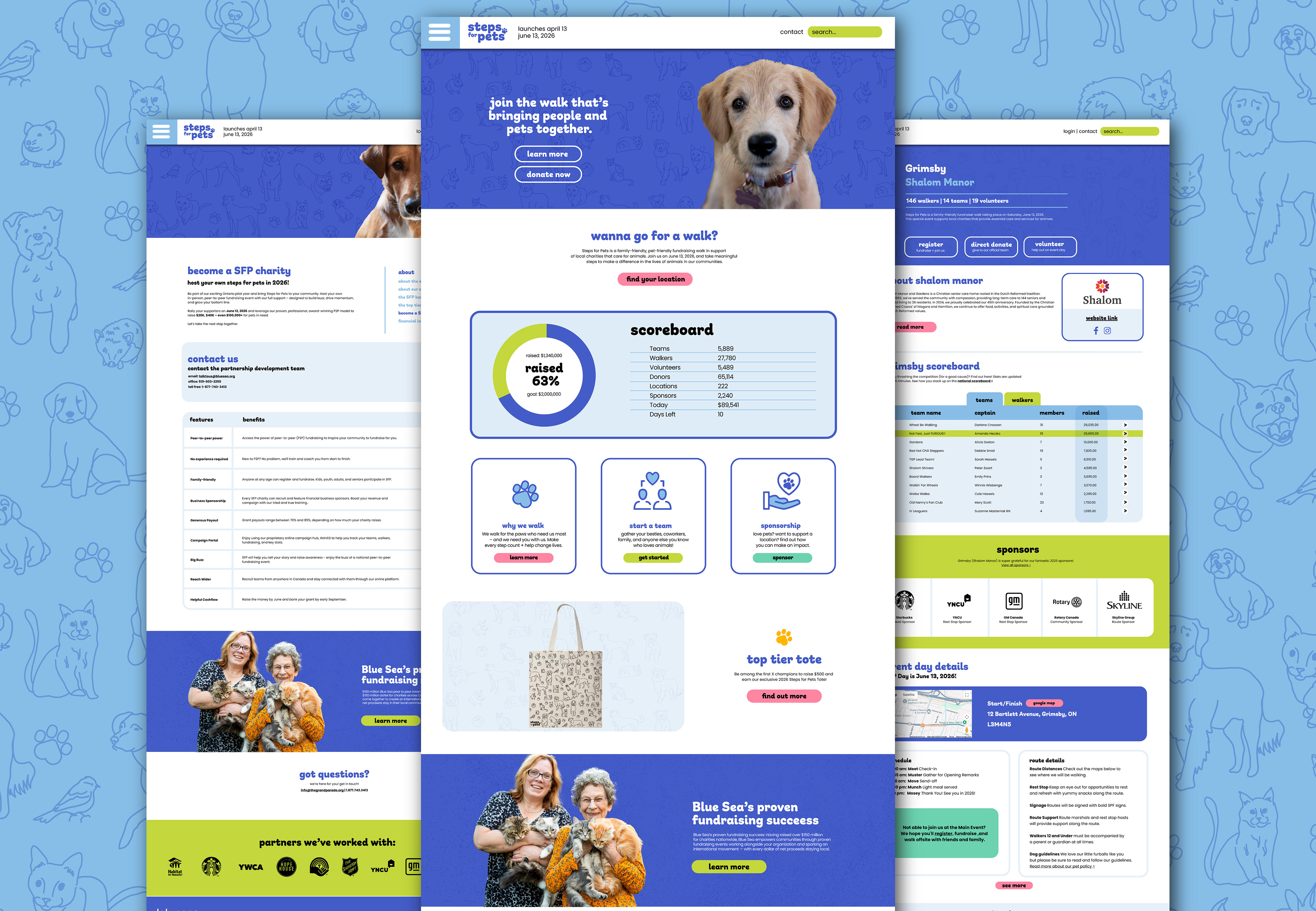
Web Design & Layout System
Website layout system designed within existing platform templates, aligning the event’s digital experience with the new visual identity.
Website layout system designed within existing platform templates, aligning the event’s digital experience with the new visual identity.
Reflection
Designing for cause-driven events requires balancing emotional storytelling with clarity and scalability. The identity needed to feel joyful and welcoming while still carrying the weight of the mission behind animal care and rescue.
By building a flexible visual system rooted in warmth, inclusivity, and connection, the brand creates space for both celebration and compassion — reflecting the spirit of the communities and animals it supports.