Overview
The Grand Parade is a Blue Sea Foundation peer-to-peer fundraising event supporting charities that serve seniors and aging communities.
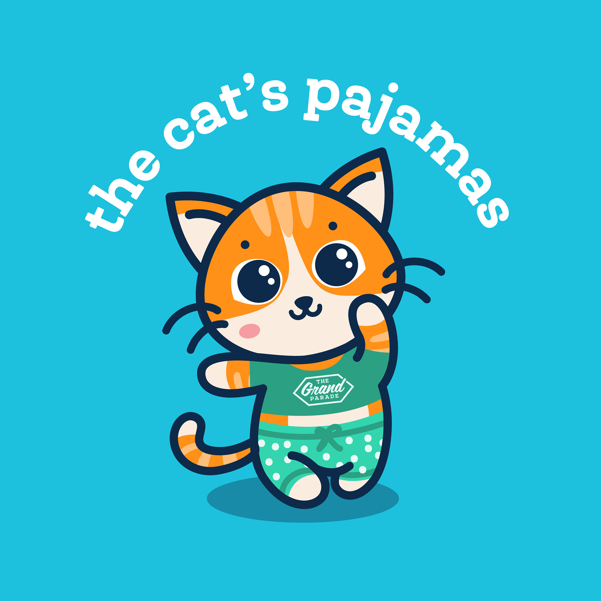
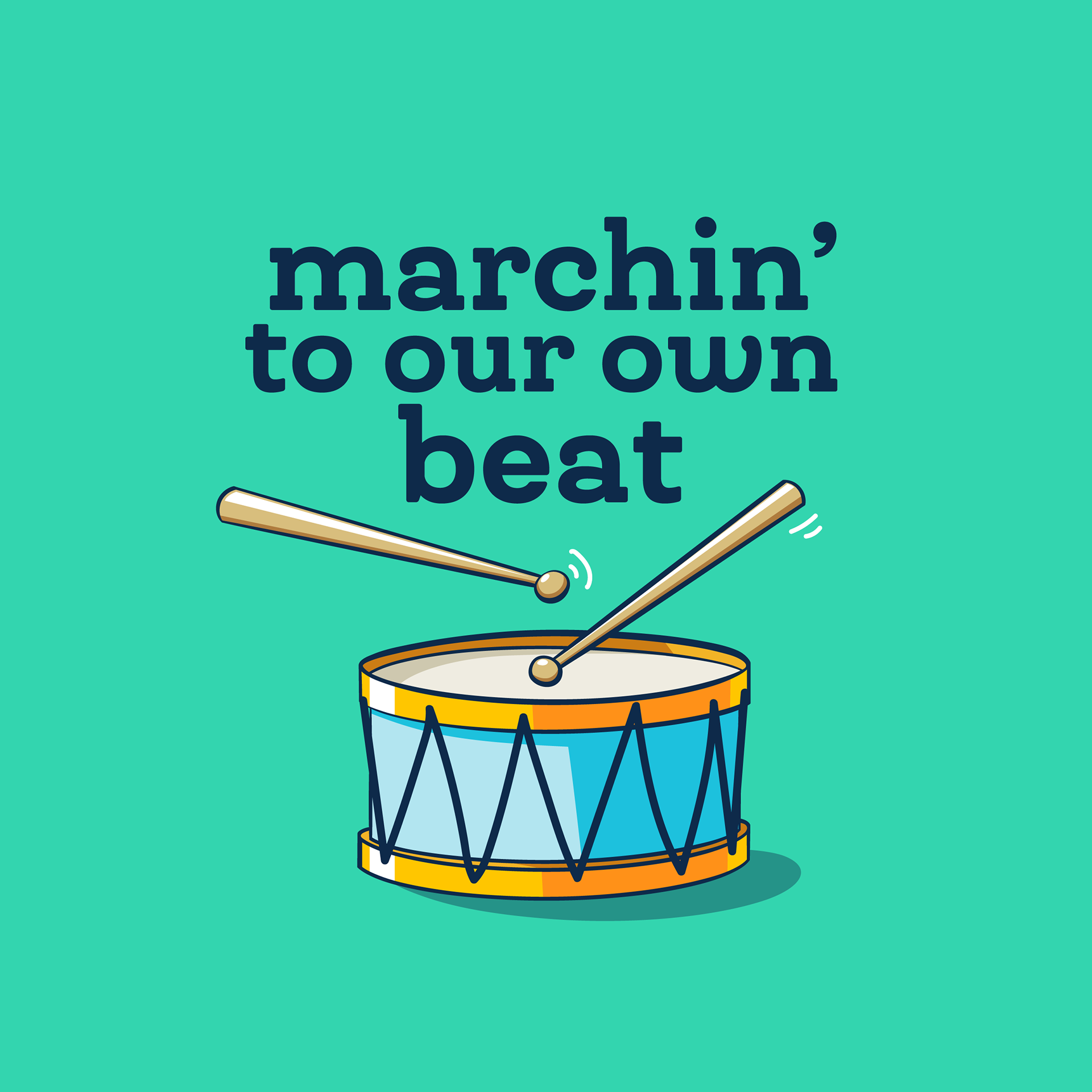
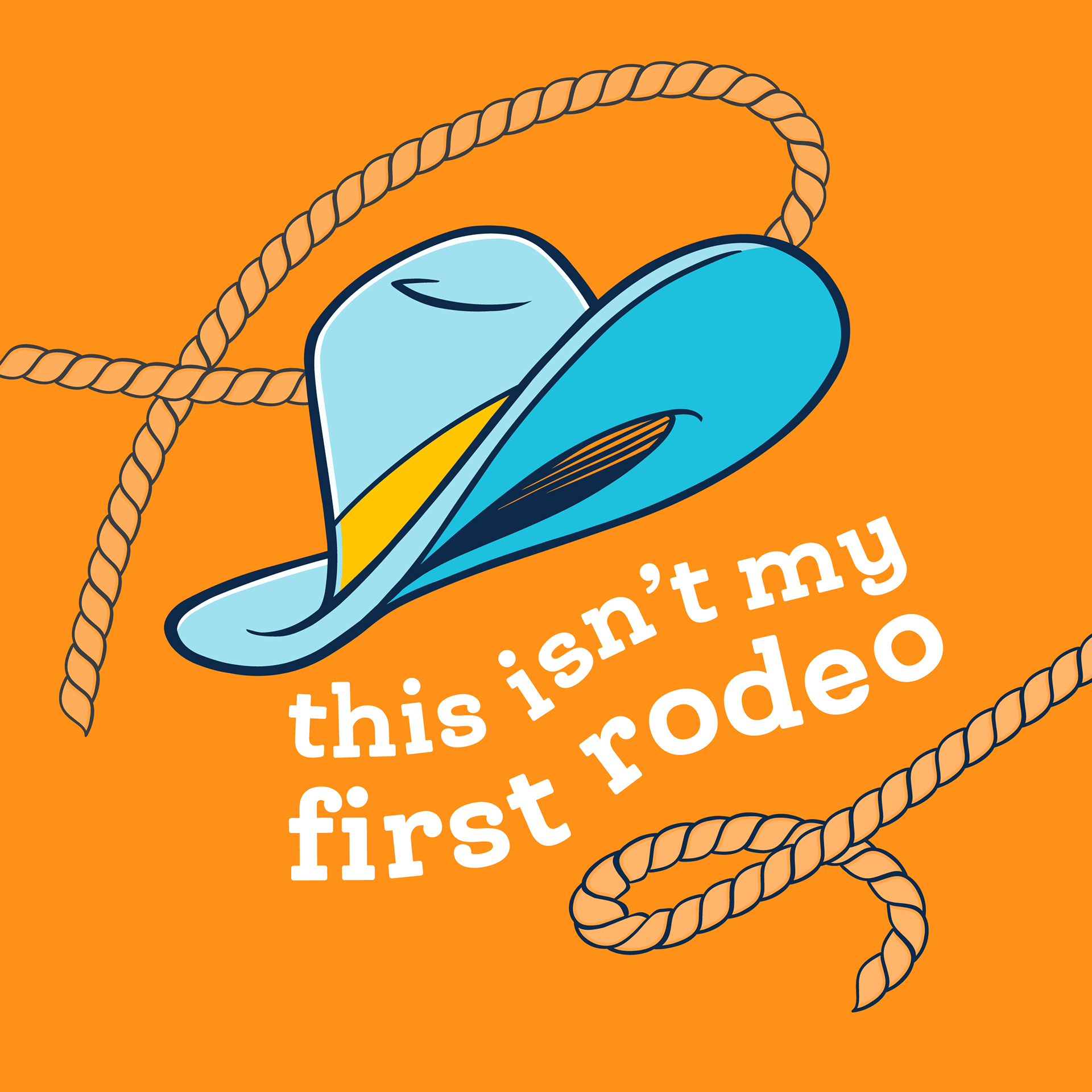
As the sole designer, I led a full visual refresh of the brand — redesigning the logo, refining the colour system, improving AODA compliance, and introducing a new campaign tagline: “Life is Grand.”
The goal was to modernize the identity, increase clarity and accessibility, and shift the event’s tone toward a more uplifting, celebratory message.
My Role
Visual Design Lead (Solo Designer)
Visual Design Lead (Solo Designer)
Responsible for:
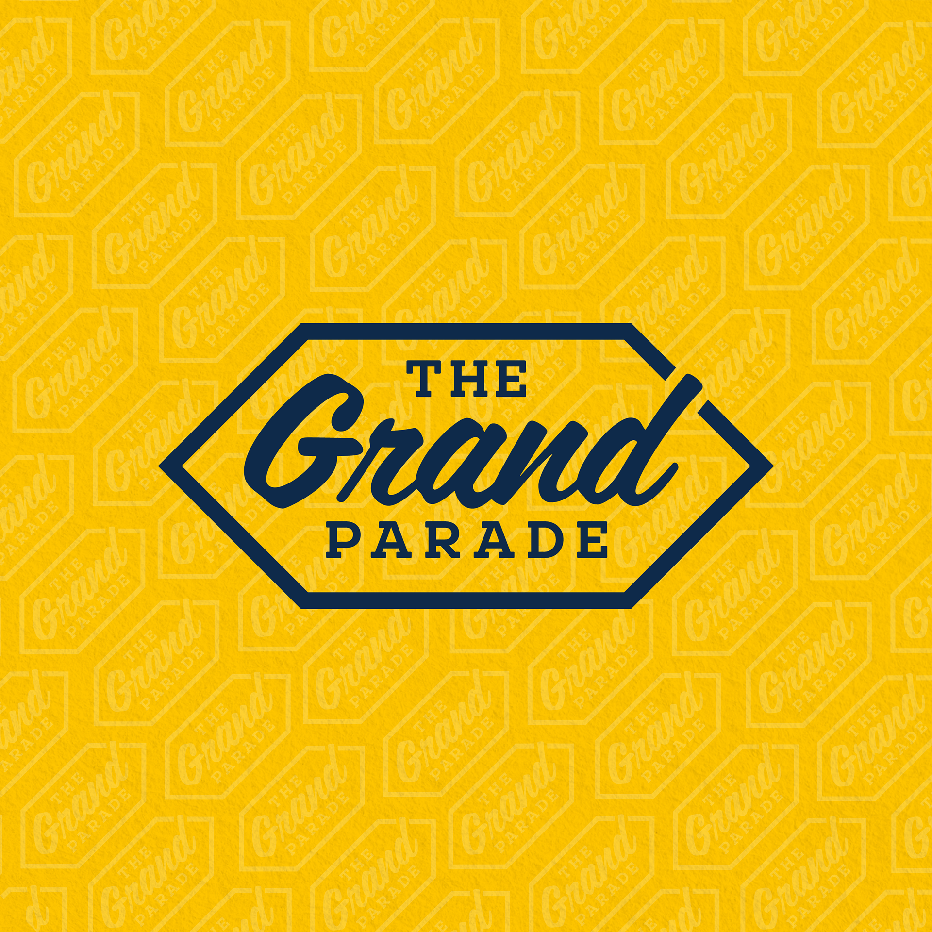
- Logo redesign and simplification
- Colour system development
- Typography refinement
- AODA-compliant accessibility updates
- Brand system guidelines
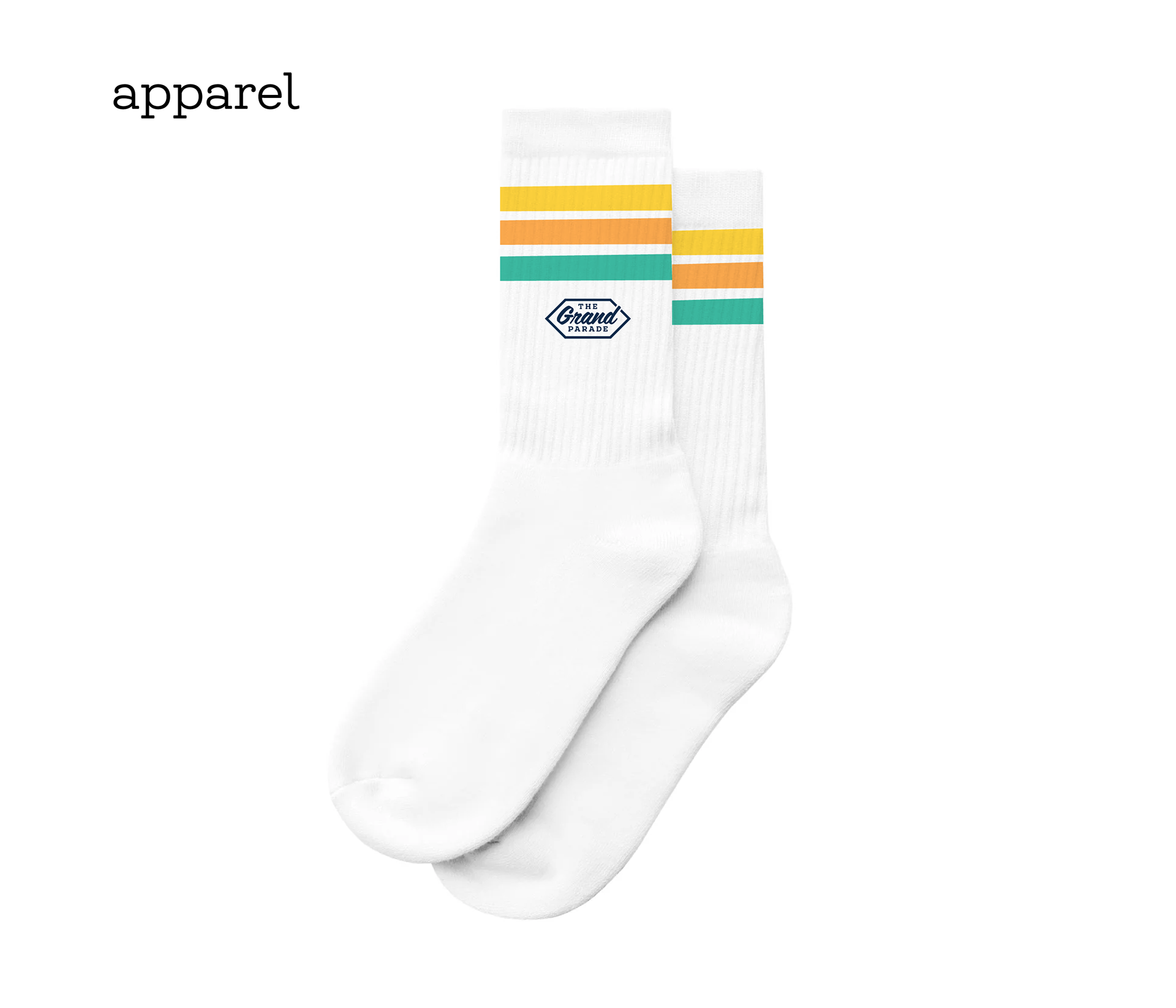
- Application across campaign materials
- Logo redesign and simplification
- Colour system development
- Typography refinement
- AODA-compliant accessibility updates
- Brand system guidelines
- Application across campaign materials
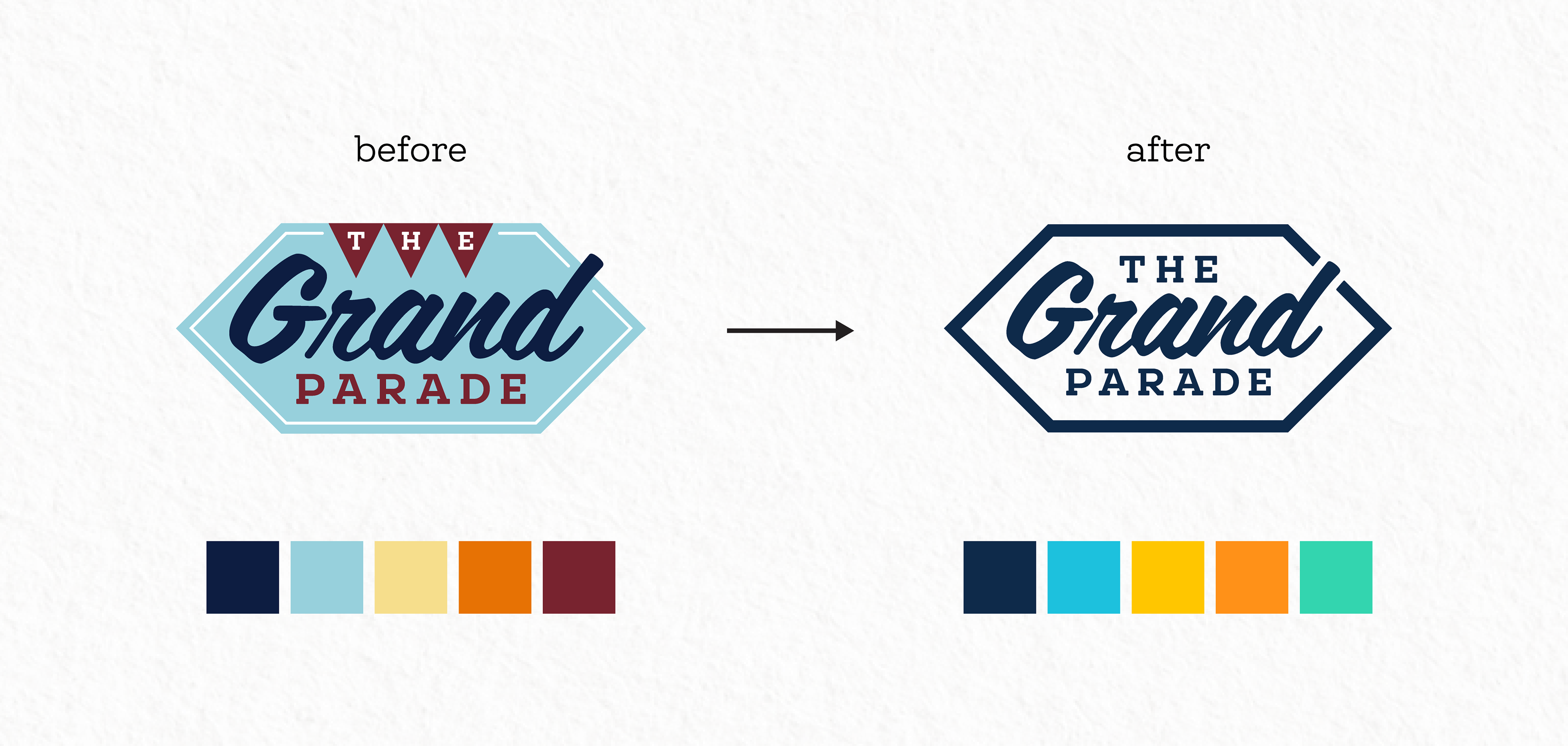
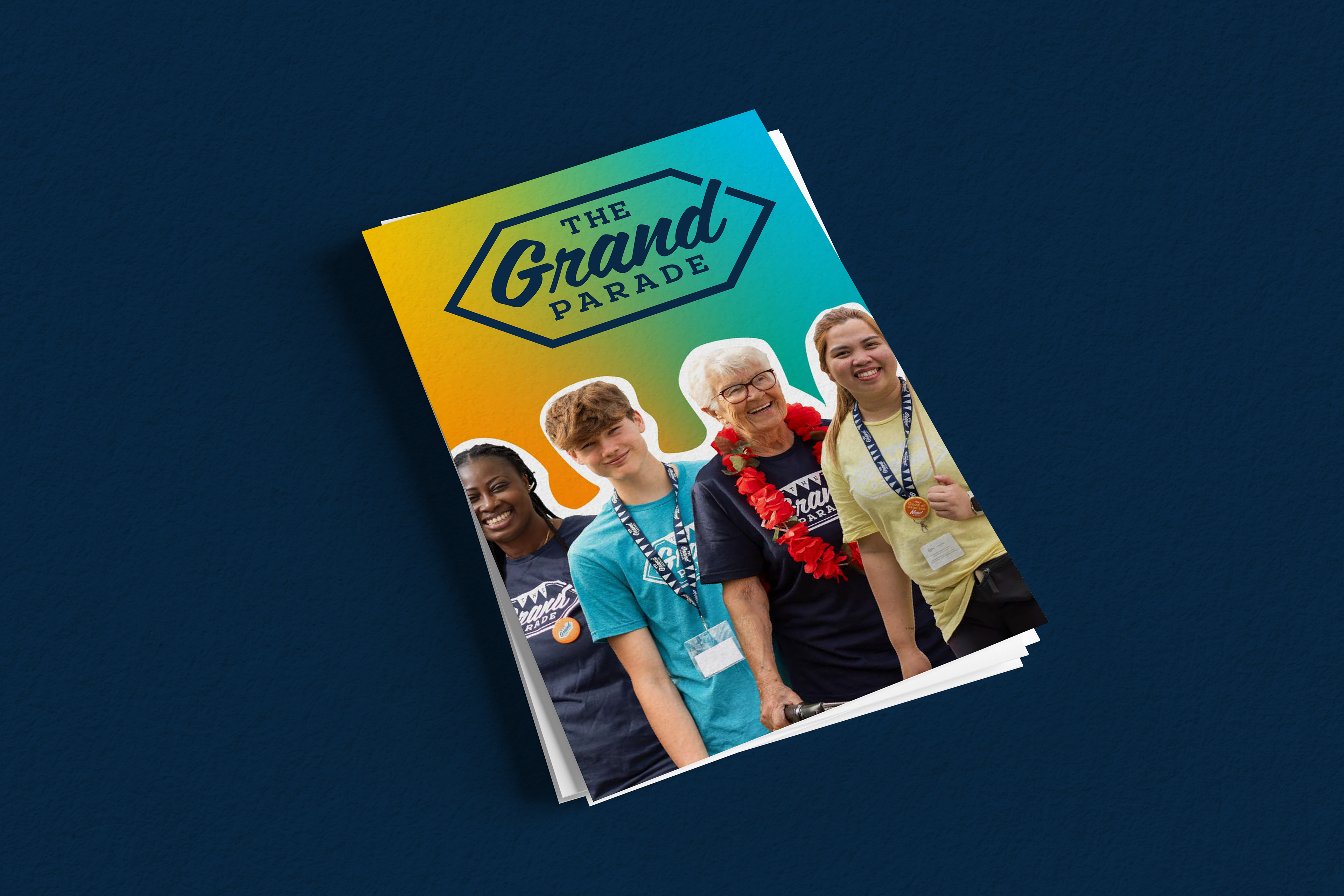
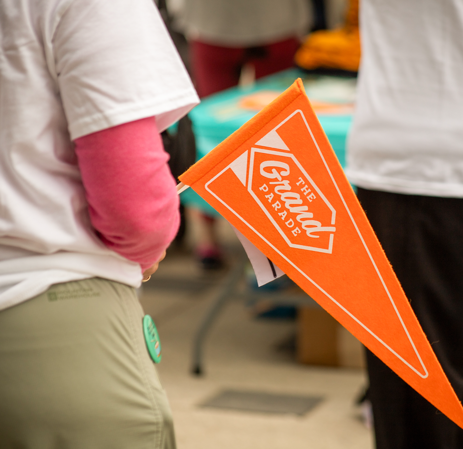
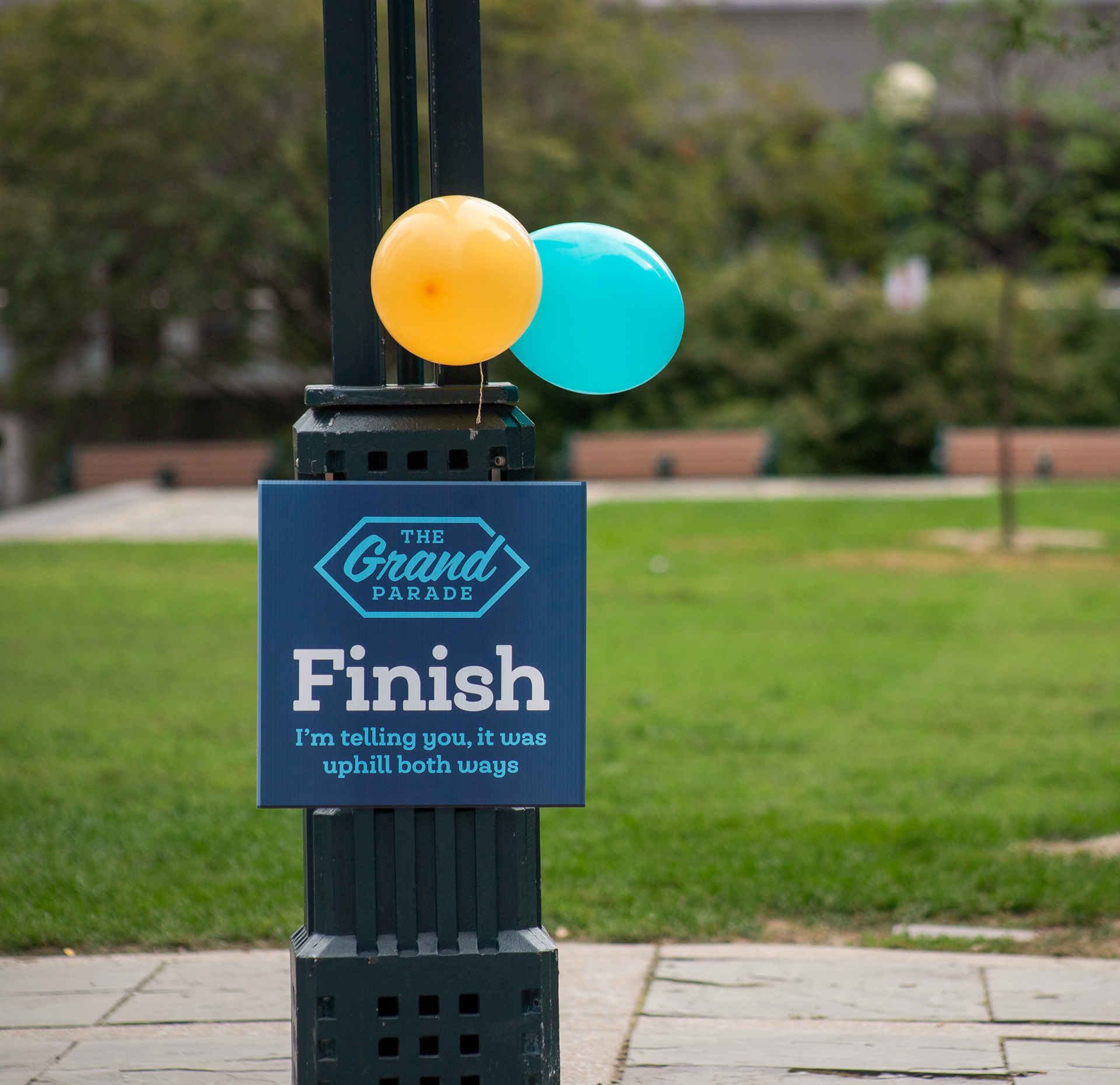
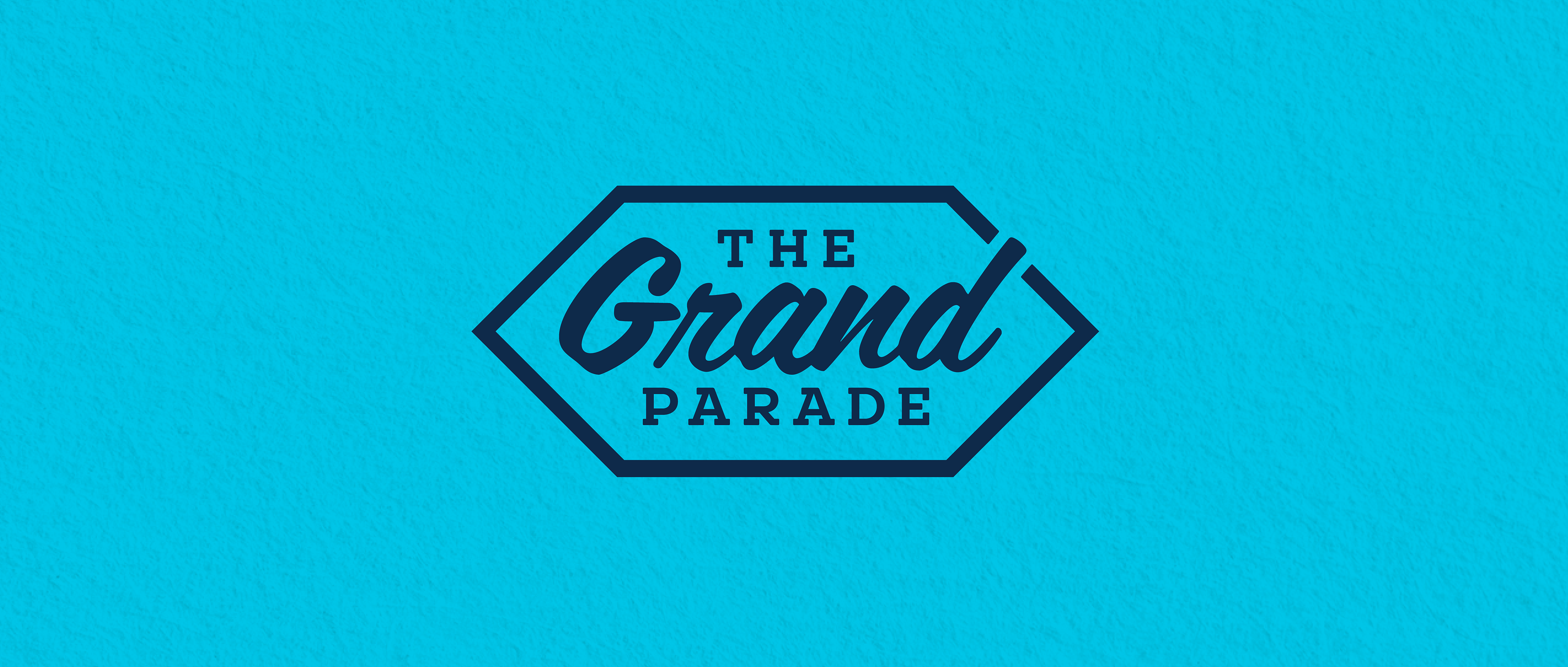
Logo Evolution
The updated logo was designed to be:
- Cleaner and more legible at small and large sizes
- Simplified in structure
- More adaptable across digital and print formats
- Cleaner and more legible at small and large sizes
- Simplified in structure
- More adaptable across digital and print formats
The refinement preserved brand recognition while strengthening clarity and versatility.
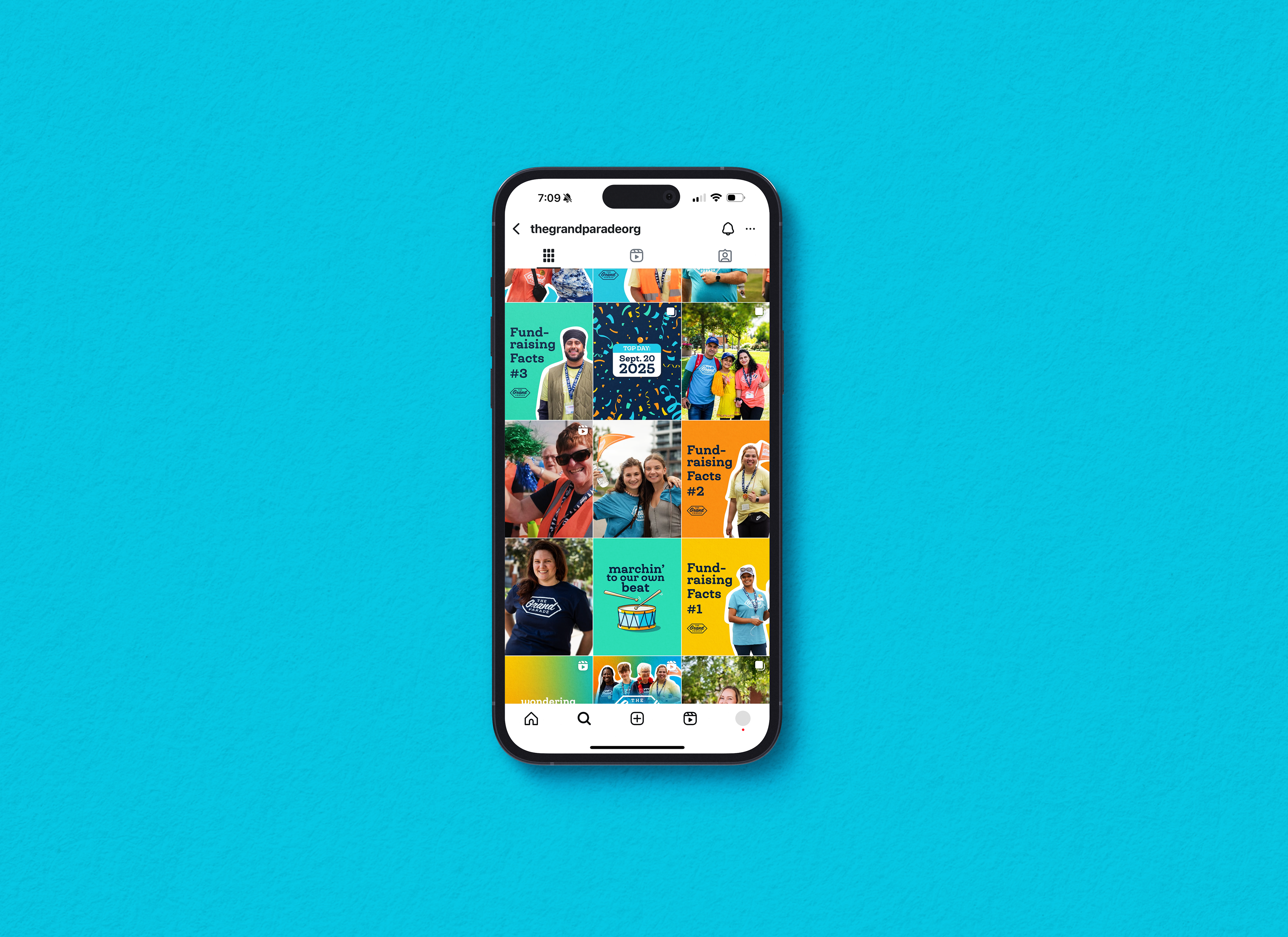
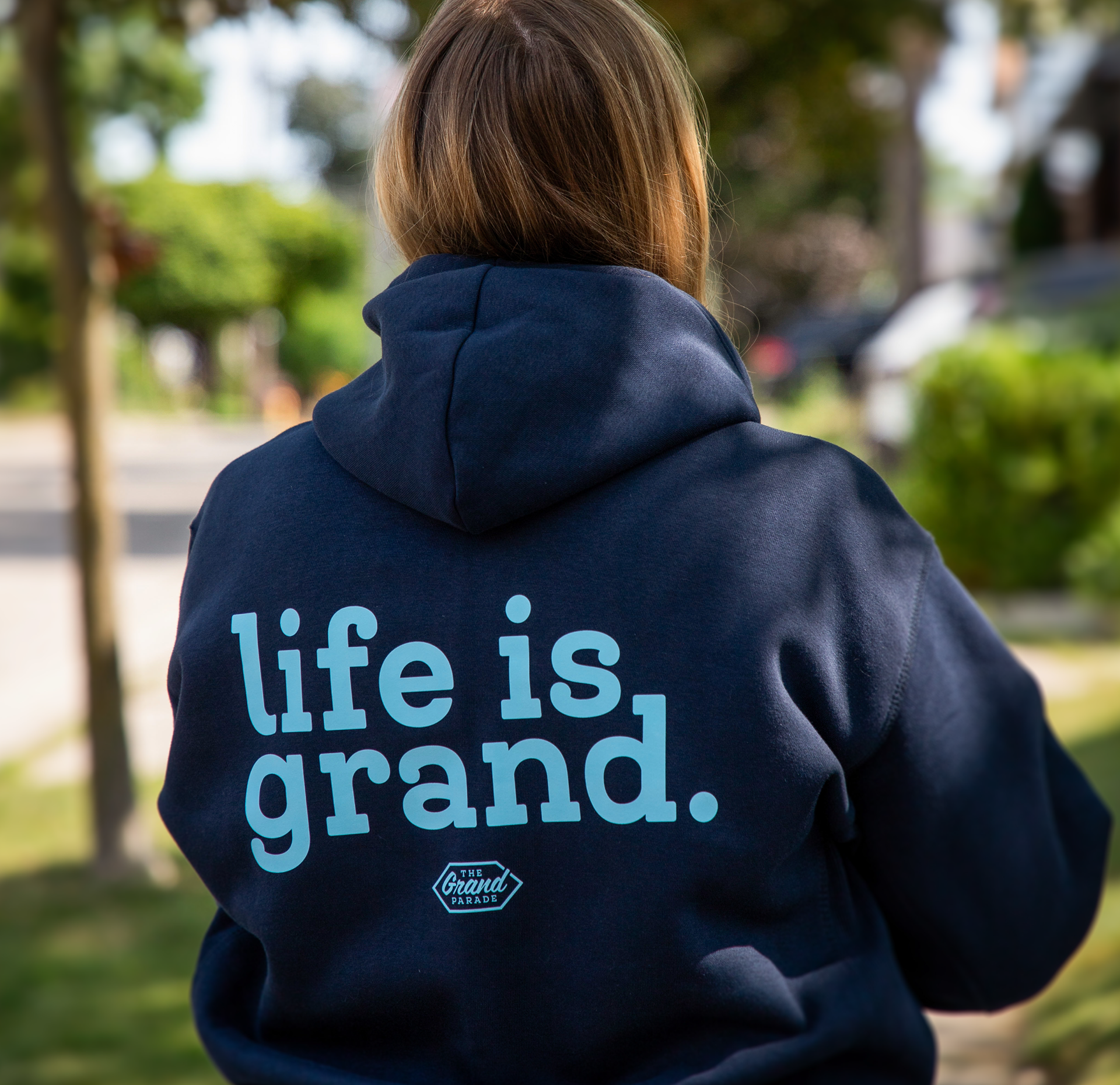
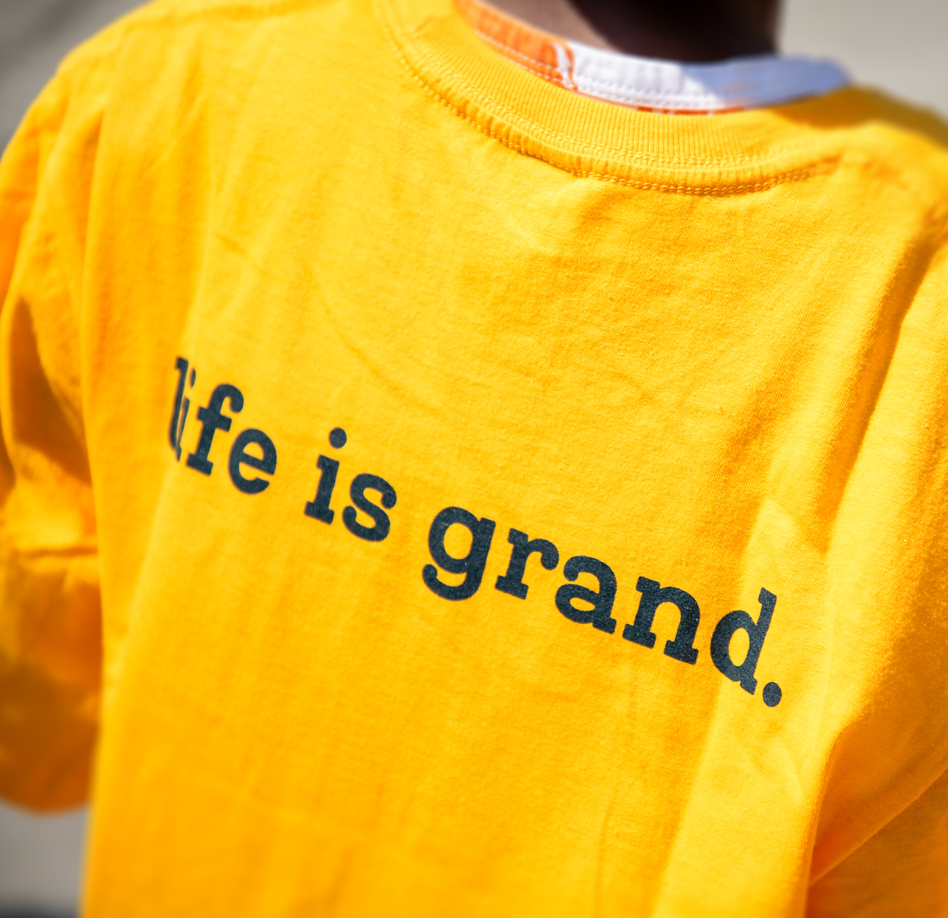
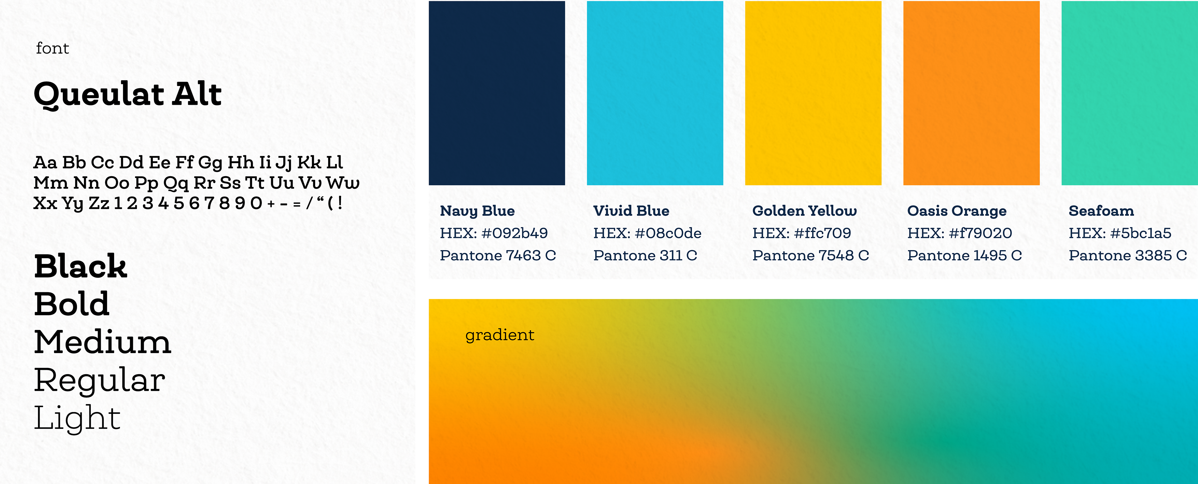
Visual System & Tone
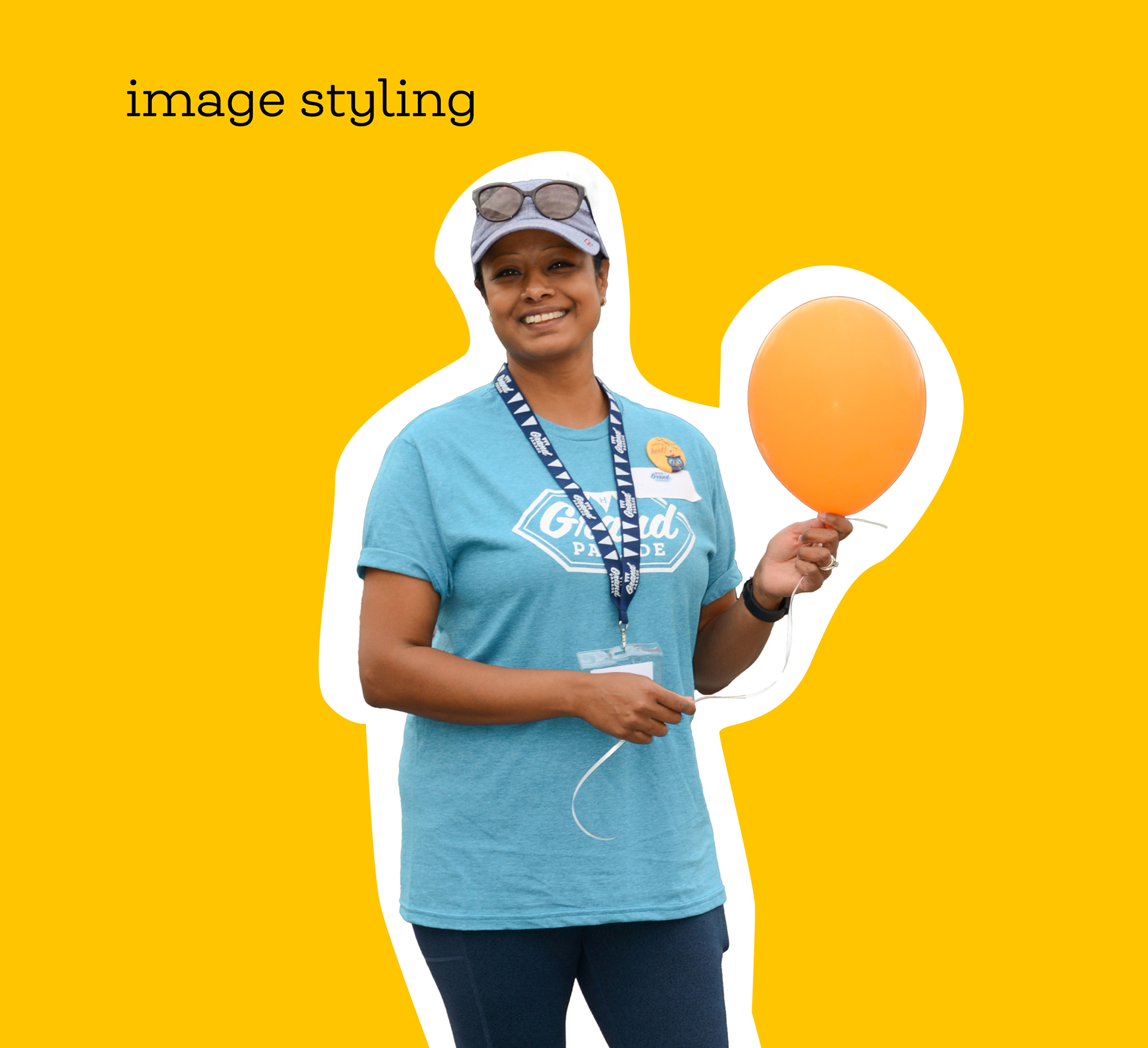
The revised colour palette emphasized warmth and approachability while maintaining high contrast for readability.
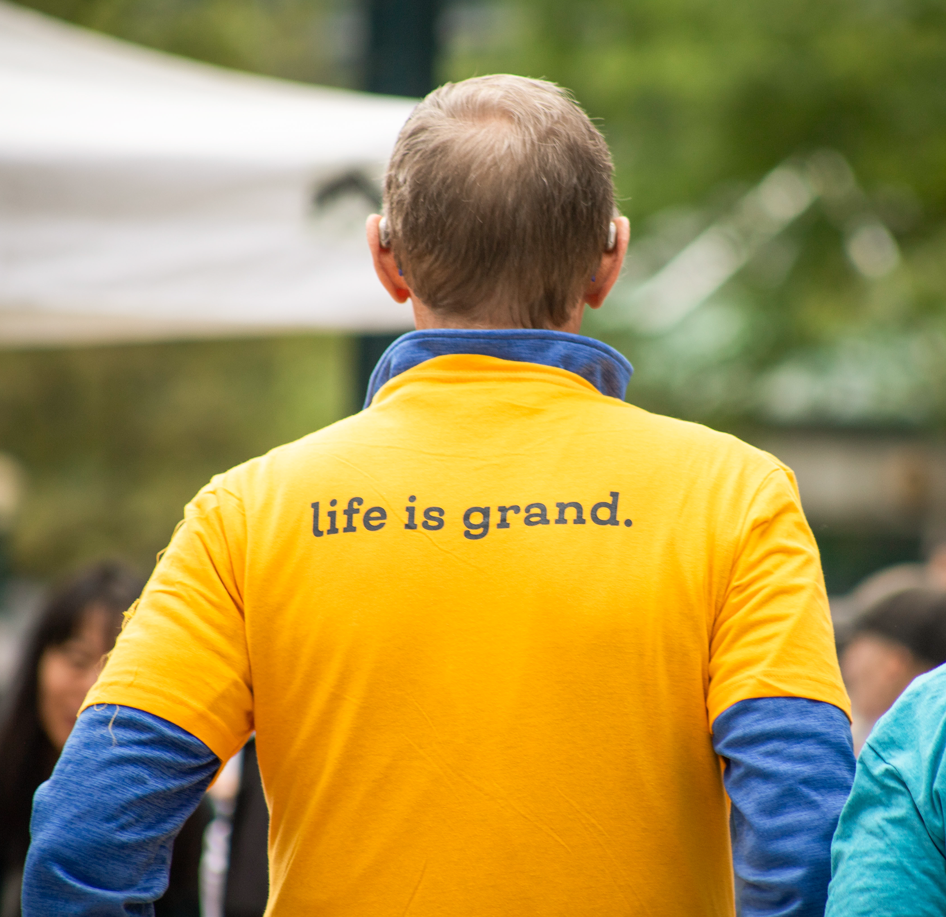
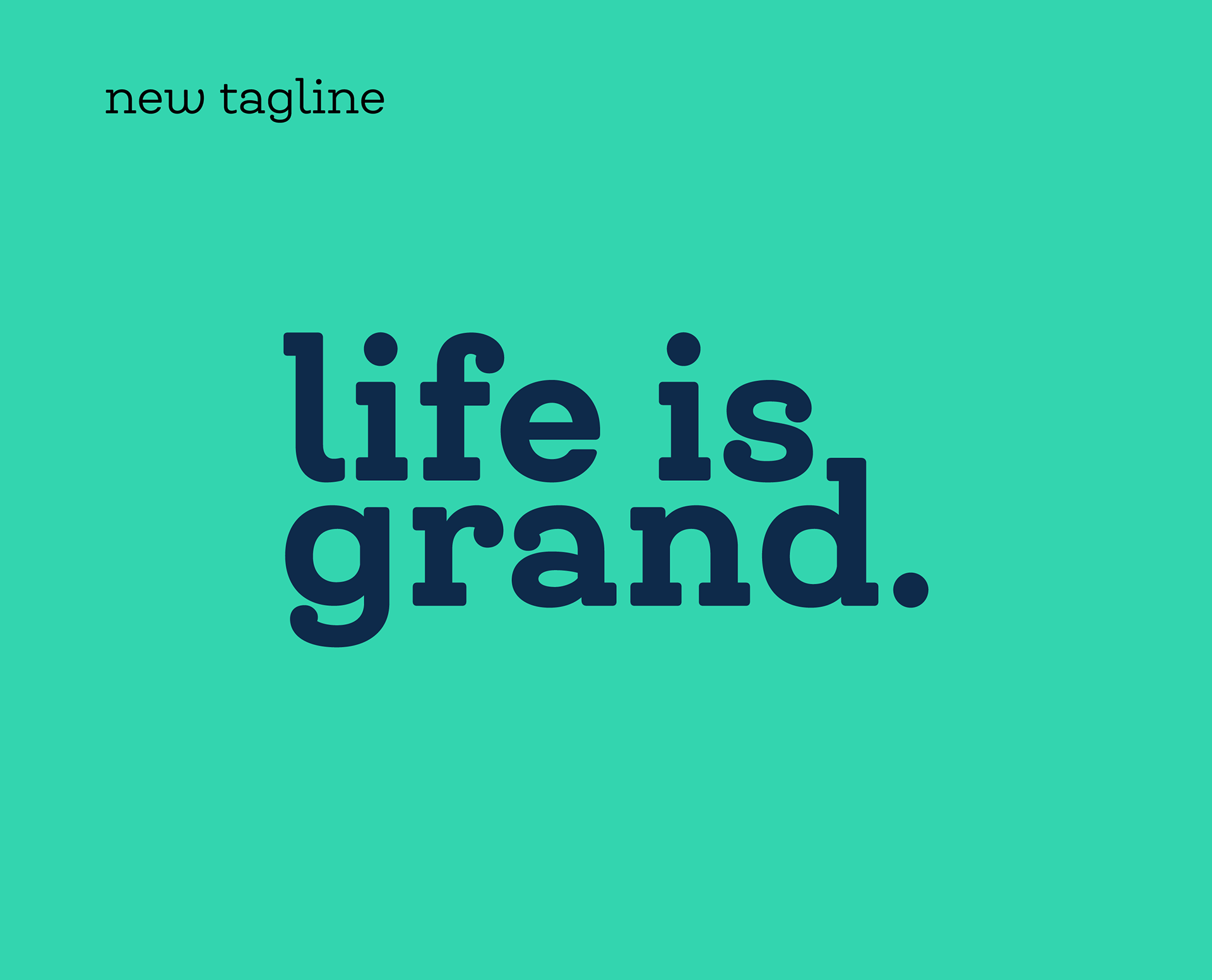
The tagline “Life is Grand.” anchored the emotional direction of the campaign — balancing celebration with purpose and bringing a human, optimistic energy to the event’s communications.
The visual system was designed to scale nationally while remaining cohesive for local partners.
Impact
The rebrand strengthened consistency across campaign materials, improved accessibility compliance, and modernized the event’s presence within Blue Sea’s portfolio.By pairing clarity with positivity, the refreshed identity better reflected the spirit of the communities it serves.
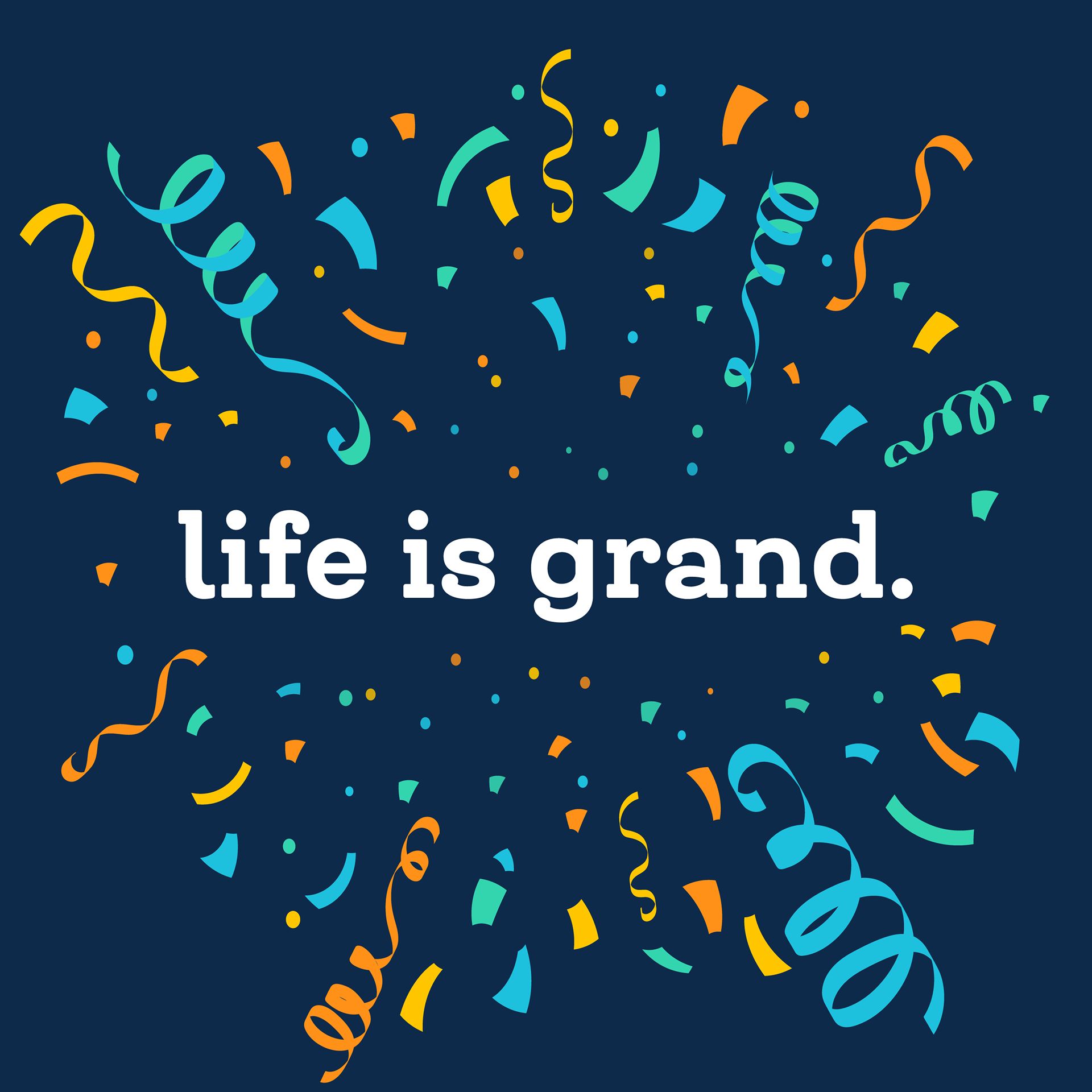
Life is Grand.
Life is Grand.
This reframed the campaign around dignity, joy, and celebration — reinforcing the event’s mission while creating a more optimistic emotional tone.
Reflection
Rebranding within an established nonprofit framework requires both restraint and conviction.
With The Grand Parade, I focused on clarity, accessibility, and emotional tone — demonstrating how thoughtful brand evolution can strengthen both message and impact.